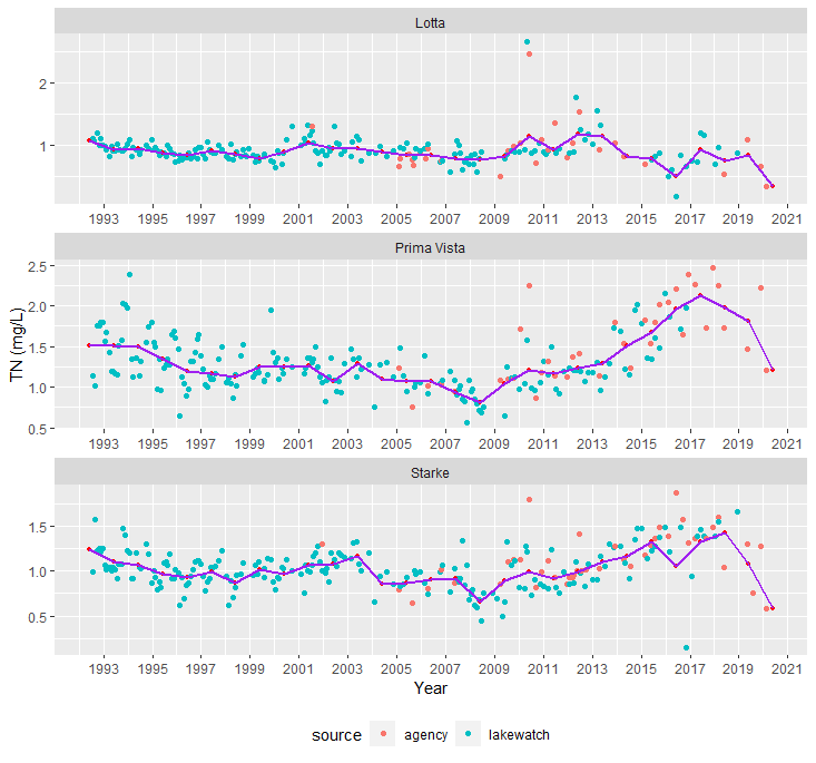
Hello, I am trying to plot concentration of total phosphorus (tp) over a long (mulit-decade) time period. Samples were collected varying number of times per year. I am able to make the scatterplot, but I need to plot a line with points representing the annual geometric means. Is there a way to do this, or do I have to make multiple graphs (after calculating annual geometric means)?
I have looked at SteveXD solution, but in his example he only has values for each year (e.g., 1, 2, etc.), and not months within those years: Plot an average line over the scatter plot within each cell of facet_grid
Here is a mall subset of my data (I actually have several lakes, and parameters ("parm"), with 20 years,. Datafile is named "tpexample", with six columns:
tpexample <- tibble::tribble(
                 ~lake,     ~source,       ~date, ~parm, ~value,  ~unit,
               "lake1", "lakewatch", "30-Jul-92",  "tp",   0.06, "mg/L",
               "lake1", "lakewatch", "18-Aug-92",  "tp",   0.07, "mg/L",
               "lake1", "lakewatch", "29-Sep-92",  "tp",   0.13, "mg/L",
               "lake1", "lakewatch", "29-Oct-92",  "tp",    0.1, "mg/L",
               "lake1", "lakewatch", "16-Nov-92",  "tp",   0.16, "mg/L",
               "lake1", "lakewatch", "16-Dec-92",  "tp",   0.13, "mg/L",
               "lake1", "lakewatch", "19-Jan-93",  "tp",   0.09, "mg/L",
               "lake1", "lakewatch", "10-Feb-93",  "tp",   0.09, "mg/L",
               "lake1", "lakewatch", "24-Mar-93",  "tp",   0.05, "mg/L",
               "lake1", "lakewatch", "28-Apr-93",  "tp",   0.05, "mg/L",
               "lake1", "lakewatch", "28-May-93",  "tp",   0.04, "mg/L",
               "lake1", "lakewatch", "29-Jun-93",  "tp",   0.04, "mg/L",
               "lake1", "lakewatch", "29-Jul-93",  "tp",   0.04, "mg/L",
               "lake1", "lakewatch", "20-Aug-93",  "tp",   0.03, "mg/L",
               "lake1", "lakewatch", "27-Sep-93",  "tp",   0.03, "mg/L",
               "lake1", "lakewatch", "20-Oct-93",  "tp",   0.04, "mg/L",
               "lake1", "lakewatch", "22-Nov-93",  "tp",   0.04, "mg/L",
               "lake1", "lakewatch", "22-Dec-93",  "tp",   0.05, "mg/L",
               "lake1", "lakewatch", "26-Jan-94",  "tp",   0.06, "mg/L",
               "lake1", "lakewatch", "23-Feb-94",  "tp",   0.05, "mg/L",
               "lake1", "lakewatch", "23-Mar-94",  "tp",   0.04, "mg/L",
               "lake1", "lakewatch", "27-Apr-94",  "tp",   0.03, "mg/L",
               "lake1", "lakewatch", "28-Jun-94",  "tp",   0.05, "mg/L",
               "lake1", "lakewatch",  "9-Jul-94",  "tp",   0.05, "mg/L",
               "lake1", "lakewatch",  "5-Oct-94",  "tp",   0.08, "mg/L",
               "lake1", "lakewatch",  "1-Nov-94",  "tp",   0.09, "mg/L",
               "lake1", "lakewatch", "22-Dec-94",  "tp",   0.11, "mg/L",
               "lake1", "lakewatch", "31-Jan-95",  "tp",    0.1, "mg/L",
               "lake1", "lakewatch", "16-Feb-95",  "tp",   0.08, "mg/L",
               "lake1", "lakewatch", "14-Mar-95",  "tp",   0.08, "mg/L",
               "lake1", "lakewatch", "13-Apr-95",  "tp",   0.06, "mg/L",
               "lake1", "lakewatch", "11-May-95",  "tp",   0.05, "mg/L",
               "lake1", "lakewatch", "20-Jun-95",  "tp",   0.03, "mg/L",
               "lake1", "lakewatch", "25-Jul-95",  "tp",   0.03, "mg/L",
               "lake1", "lakewatch", "21-Aug-95",  "tp",   0.17, "mg/L",
               "lake1", "lakewatch", "12-Sep-95",  "tp",   0.15, "mg/L",
               "lake1", "lakewatch", "16-Oct-95",  "tp",    0.1, "mg/L",
               "lake1", "lakewatch", "14-Nov-95",  "tp",    0.1, "mg/L",
               "lake1", "lakewatch", "12-Dec-95",  "tp",   0.06, "mg/L",
               "lake1", "lakewatch", "23-Jan-96",  "tp",   0.05, "mg/L",
               "lake1", "lakewatch", "15-Feb-96",  "tp",   0.07, "mg/L",
               "lake1", "lakewatch", "20-Mar-96",  "tp",   0.06, "mg/L"
               )
Created on 2020-11-12 by the reprex package (v0.3.0)
I made lake, source, parm and unit factors, and date as a date. I then wrote the following script, but again, not sure how to overlay annual geometric mean values over this plot.:
I also made new factors for year, month, and day:
tpexample <- tpexample %>%
  dplyr::mutate(date = ymd(date)) %>%
  mutate_at(vars(date), funs(year, month, day))
Created on 2020-11-12 by the reprex package (v0.3.0)
And here is the code for the graph
graph2 <- tpexample %>%
  filter(lake=="lake1", parm =="tp") %>%
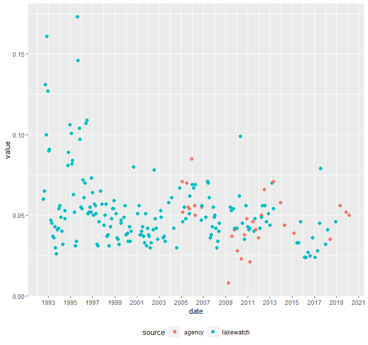
  ggplot(aes(x=date, y=value, color=source)) +
  geom_point(size =2) +
  scale_x_date(date_breaks = "2 years", date_labels = "%Y") +
  theme(legend.position = "bottom")
This is the plot:
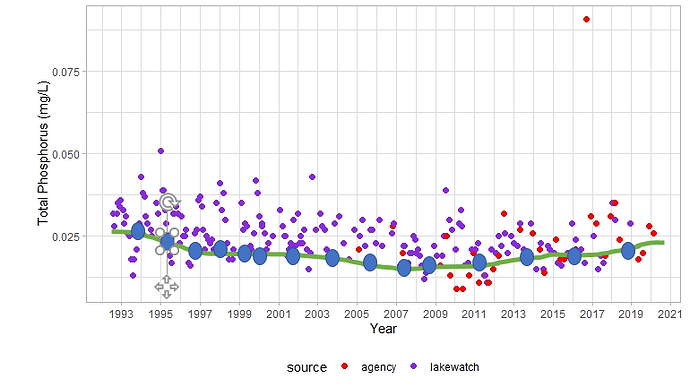
And this is the plot I want to create, with a hand-drawn green line and blue dots as an a example.
Thank you
(I think I finally did my reprex correctly....)
