Ahoy,
Say I have population data on four cities (a, b, c and d) over four years (years 1, 2, 3 and 4). The population data is broken down into two age groups (age1 and age2). The cities also belong to two regions (region1 and region 2).
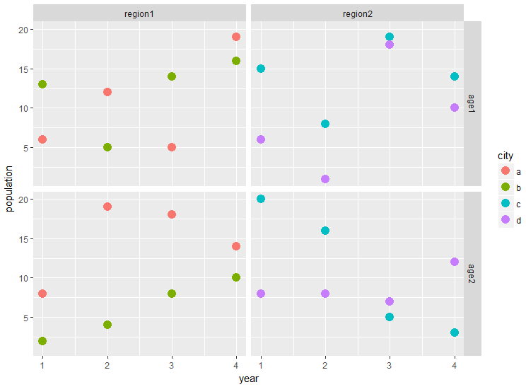
I have created a scatter plot showing how the cities' population have changed over time, broken down by region and age band using facet_grid. This is as follows:
The data and code used to produce this are as follows:
library(tidyverse)
set.seed(1)
df <- data.frame(city = rep(letters[seq(1,4)],each =8),
                 region = as.factor(rep(c('region1','region2'), each = 16)),
                 year = as.integer(rep(rep(seq(1,4), each = 2),4)),
                 age = as.factor(rep(c('age1','age2'), 16)),
                 population = sample(1:20,32, replace = TRUE))

ggplot(data = df, aes(x = year, y = population, color = city)) +
  geom_point(size = 4) +
  facet_grid(age~region)
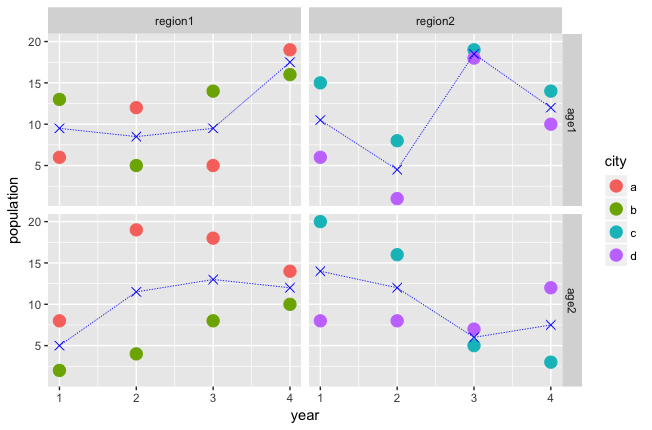
What I am trying to do is overlay each scatter plot with a line showing the changing average population of the cities. So, like a geom_line(), where the value for each year is the average of the two city's population in each of the four grids.
I hope that makes sense, but please let me know if I can clarify,
Thank you!

