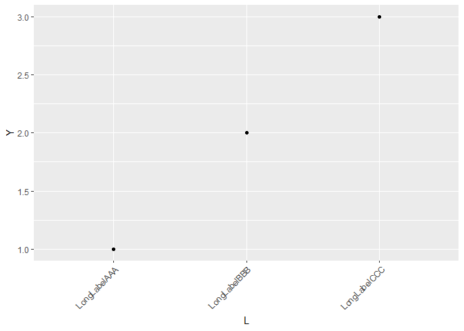
with my own data. However, my variable names are longer than those in mtcars. Using that code, how can I rotate the labels on the x-axis 45º to keep them from overlapping?
You can add + theme_classic() to your ggplot to see what it does. ggplot has several built-in "themes" that customize the overall look of the plot in various ways. The default theme is theme_grey(). You can change this for all future plots by running, for example:
theme_set(theme_classic())
To see available themes in ggplot, see the help for any theme. For example, run ?theme_classic(). The help page that opens will list all of the available themes. The ggthemes package has more, and you can of course create your own.
To tweak any theme, add a theme() statement to a ggplot after setting the overall theme. For example: