Visualization of Covid-19 Cases
Authors: Nico Hahn
Working with Shiny more than 1 year
Abstract: A shiny app using Leaflet, Plotly and Highcharter to document and visualize the outbreak of the novel coronavirus..
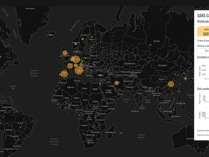
Full Description: This shiny app takes a slightly different approach to visualizing the outbreak of the coronavirus. While the confirmed and deceased cases can still be viewed on a world map, the main goal was to tell the story of the virus. Where it came from, how it spread and what consequences it had.
It is basically a reading through of the history so far and is updated regularly. The story is supplemented by various plots to underline the significance of different events.
The data used comes from the Johns Hopkins University and is updated daily.
Built using Shiny, Leaflet, Plotly and Highcharter.
Category: Healthcare
Keywords: geodata, leaflet, coronavirus, geospatial, visualization
Shiny app: https://nicohahn.shinyapps.io/covid19/
Repo: GitHub - nicoFhahn/covid_shiny
RStudio Cloud: Posit Cloud
Thumbnail:
Full image:

