Polar graphing of data

I am attempting to graph data (here, a sine wave) in polar coordinates in ggplot, but am seeing undesired behavior and am questioning my approach.

Below is my reprex/ thought process.

The problem I want to solve: unwanted gaps as shown in attempt 4.

More generally, is my plotting approach correct?

Thank you

library(tidyverse)

# first, generate some data: 2*pi radians in a circle; we have three circles' worth of rads
x <- tibble(x = head(seq(0, 3 * (2 * pi), by = pi / 180), -1)) 

# compute our sine wave; also, we may need to compute rads, because we'll want our plot theta 
# to be restricted from 0 to 2pi, and as far as the axis is concerned, 2pi = 4pi = 6pi = etc
x <- x %>% mutate(sine = sin(3*x)/3 + 1 + x/180, rads = x %% (2*pi))

# Attempt 1
ggplot(x) + 
  geom_line(aes(x = x, y = sine)) + 
  ylim(c(0,1.5)) + 
  coord_polar(theta = 'x')

## THE PROBLEM: the above spreads the theta over the entire x, 
# ie, it ranges up to 3 * (2 * pi), instead of the standard 2*pi

# Attempt 2. Let's change the x aes to our rads variable  
ggplot(x) + 
  geom_line(aes(x = rads, y = sine)) + 
  ylim(c(0,1.5)) + 
  coord_polar(theta = 'x')

## THE PROBLEM: this generates strange behavior, with plotting jumping around, but at least theta is on 0,2*pi

# Attempt 3. since the values of the sine are in order, maybe I can use geom_path...
ggplot(x) + 
  geom_path(aes(x = rads, y = sine)) + 
  ylim(c(0,1.5)) + 
  coord_polar(theta = 'x')

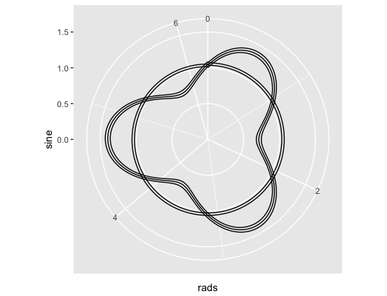
## THE PROBLEM: this looks a little better, but the plot is drawing circles at each 0/2*pi transition

# Attempt 4: let's try adding a grouping variable

y <- x %>% mutate(circle_no = rep(1:3, each = 2*180))

ggplot(y) + 
  geom_path(aes(x = rads, y = sine, group = circle_no)) + 
  ylim(c(0,1.5)) + 
  coord_polar(theta = 'x')

Incidentally, if I inspect a simple linear graph of the sine wave, I don't see any discontinuities...

ggplot(y) + geom_path(aes(x = x, y = sine))
Hello @cawthm,

I am not sure yet why you are seeing gaps, but does converting back to cartesian coordinates get you what you need?

library(tidyverse)

x <- tibble(x = head(seq(0, 3 * (2 * pi), by = pi / 180), -1)) 

x <- x %>% mutate(sine = sin(3*x)/3 + 1 + x/180, rads = x %% (2*pi))

x <- x %>% mutate(x = sine*cos(rads), y = sine*sin(rads))
ggplot(x) + geom_path(aes(x = x, y = y))
2 Likes

that works nicely --thank you-- though I'm trying to understand why it works.

for future reference (for me), I also tried specifying the x axis limits, which mostly worked though there's now a gap:

ggplot(y) + 
  geom_path(aes(x = rads, y = sine, group = circle_no)) + 
  xlim(c(0, 2*pi)) + 
  ylim(c(0,1.5)) + 
  coord_polar(theta = 'x')

but the re-transform to cartesian followed by geom_path() seems to work well. Thanks again.

A shot at the why:

This is based on your example 3: Rplot

There is an interaction between geom_path and coord_polar going on. At the end of the first circuit (0 to 2pi) here is x:

x[360:362,]
# A tibble: 3 x 3
         x     sine       rads
     <dbl>    <dbl>      <dbl>
1 6.265732 1.017364 6.26573201
2 6.283185 1.034907 0.00000000
3 6.300639 1.052449 0.01745329

geom_path connects the points in the order they appear. You see it goes from 6.26 (2pi - epsilon) to 0, so geom_path draws a segment from (6.26, 1.017) to (0,1.03). Segments in polar coordinates are arcs around the circle (not really a circle here because the radius is changing) and the segment goes backward in radians. Hence the 'circle' going backward to the next point which starts the next circuit.

The gaps appear when you did your grouping for the same reason - just those backward circles are not drawn anymore.

Based on its documentation ggplot2::coord_polar appears to have been designed mainly for pie charts and not actually plotting functions in the standard polar coordinate system. This would explain some of the behavior (e.g. expanding the x's from 0, 6*pi in your first example). Perhaps that's a new topic...