This question is motivated by this post from @cawthm.
The goal was to plot a function in polar coordinates. Several attempts are shown below (note: reprex mostly by @cawthm, posted here for convenience). :
library(tidyverse)
#> Loading tidyverse: ggplot2
#> Loading tidyverse: tibble
#> Loading tidyverse: tidyr
#> Loading tidyverse: readr
#> Loading tidyverse: purrr
#> Loading tidyverse: dplyr
#> Conflicts with tidy packages ----------------------------------------------
#> filter(): dplyr, stats
#> lag(): dplyr, stats
# first, generate some data: 2*pi radians in a circle; we have three
# circles' worth of rads
x <- tibble(x = head(seq(0, 3 * (2 * pi), by = pi/180), -1))
# compute our sine wave; also, we may need to compute rads, because we'll
# want our plot theta to be restricted from 0 to 2pi, and as far as the axis
# is concerned, 2pi = 4pi = 6pi = etc
x <- x %>% mutate(sine = sin(3 * x)/3 + 1 + x/180, rads = x%%(2 * pi))
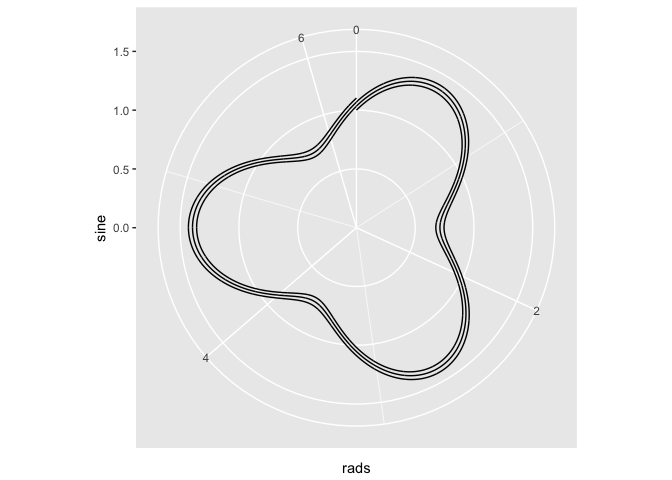
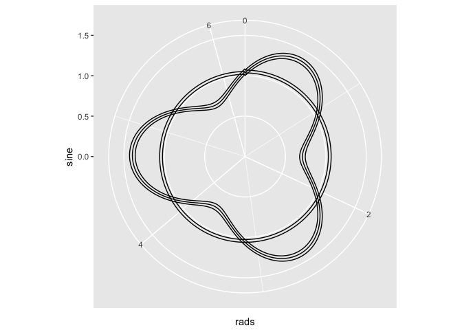
# Atempt 1
ggplot(x) + geom_line(aes(x = x, y = sine)) + ylim(c(0, 1.5)) + coord_polar(theta = "x")
## THE PROBLEM: the above spreads the theta over the entire x, ie, it ranges
## up to 3 * (2 * pi), instead of the standard 2*pi
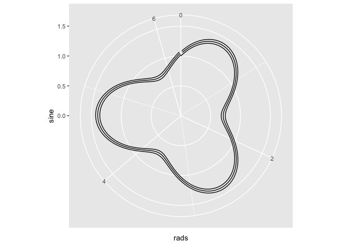
# Attempt 2. Let's change the x aes to our rads variable
ggplot(x) + geom_line(aes(x = rads, y = sine)) + ylim(c(0, 1.5)) + coord_polar(theta = "x")
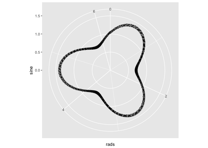
# Attempt 3. since the values of the sine are in order, maybe I can use
# geom_path...
ggplot(x) + geom_path(aes(x = rads, y = sine)) + ylim(c(0, 1.5)) + coord_polar(theta = "x")
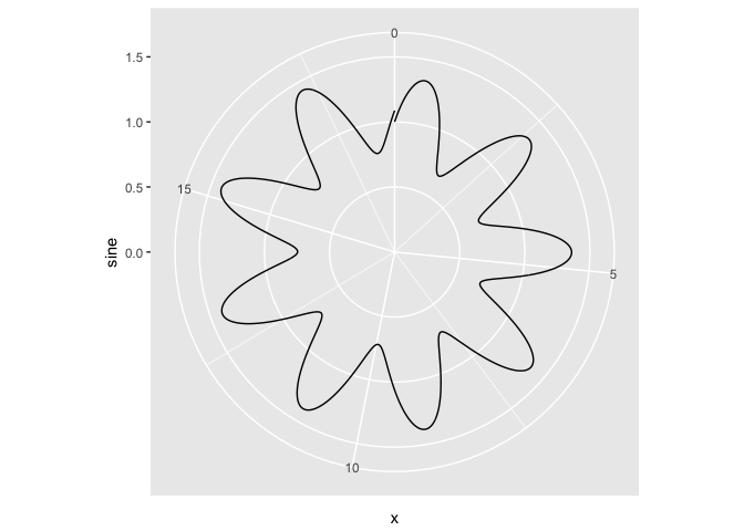
# The fix involves changing to back to cartesian coordinates.

x <- tibble(x = head(seq(0, 3 * (2 * pi), by = pi/180), -1))

x <- x %>% mutate(sine = sin(3 * x)/3 + 1 + x/180, rads = x%%(2 * pi))

x <- x %>% mutate(x = sine * cos(rads), y = sine * sin(rads))
ggplot(x) + geom_path(aes(x = x, y = y))
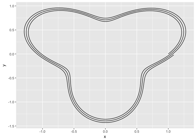
The three attempts have issues because coord_polar naturally extends the 'x-axis' (the angle) to extend the entire range of x. My understanding is it does this for purposes of making pie charts - which makes sense. My fix (last example) was to just convert everything back to cartesian coordinates and avoid using cood_polar altogether. However, is there a way to use coord_polar to plot in standard polar coordinates? That is, all angles are modulo 2*pi and line segments are connected in the order of the angles (before the modulo operation).