Plotting multiple lines gives error: discrete value supplied to continuous scale

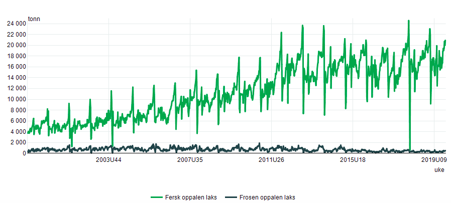
Hi, this is probably extremely basic, but any help would be much appreciated. The main problem I get is Error: Discrete value supplied to continuous scale. My dataset is called Vekt and I want to be able to create multiple lines on the Y axis similar to this in R:

.

This is my script so far:

library(openxlsx)
Vekt <- read.xlsx("../data/Vekt.xlsx")
library(ggplot2)
ggplot(data = Vekt, aes(x = Week, y = Fresh)) + geom_line()
ggplot(Vekt, aes(x = Week)) + geom_line(aes(y = Fresh), color = "darkred") + geom_line(aes(y = Frozen), color = "steelblue", linetype = "twodash"). 

Using the economics dataset in ggplot leaves me with no issues, which leads me to believe that there's something wrong with how I've imported the dataset.

> head(Vekt)
  Week Fresh Frozen
1    1  3728    383
2    2  4054    216
3    3  4043    633
4    4  3730    393
5    5  3831    453
6    6  4415    265

The dataset contains information of frozen and fresh food exported since 2000 in ton which is 1028 weeks for context.

I realize this is probably a terrible explanation but any help is appreciated!

The first thing I would do, given the error you are seeing, is run the command

str(Vekt)

and see if the Week column is a number or character or a factor. I suspect something in the spreadsheet has caused R to interpret the column as character. Excel allows columns with mixtures of numbers and characters and R does not.

You are absolutely right! Right now Week and Fresh are shown as num and frozen is Chr.

Is there a simple way of changing this? I've tried Frozen <- as.numeric() but I'm probably missing something obvious here.

My advice is to look for the values in Frozen that contain whatever it is preventing the column from being interpreted as numeric. In your example data, the values of Frozen are integers. If that is generally true, then

NonNum <- grepl("\\D", Vekt$Frozen)
BadRows <- Vekt[NonNum, ]

will give you a data frame with the rows that have non numeric characters. If there are decimal numbers or scientific notation, the problem is more difficult.

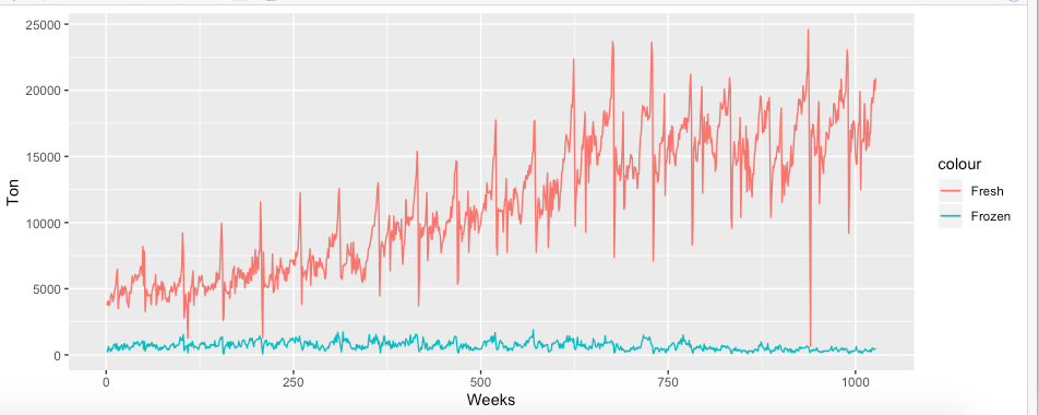
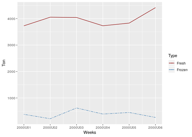
Hi again, just a followup question. I've managed to create the line graph, but I changed the data to weeks, and it looks like this. Showing 1028 weeks instead of a select period does not look ideal, but that is the only way so far that did not give me any errors. I was thinking I should create a vector (with the old data that is in years+weeks), something like this: Labels<-c("2003U44", "2007U35", "2011U26", "2015U18", "2019U09").

Is this the right approach (check opening post for how I would like it to look)? Also how do I include it into this script:

ggplot(data = Vekt, aes(x = Week, y = Fresh)) + geom_line()
ggplot(data = Vekt, aes(x = Week)) + geom_line(aes(y = "Fresh"), color = "darkred") + geom_line(aes(y = Frozen), color = "steelblue", linetype = "twodash")
ggplot(Vekt, aes(Week)) +
geom_line(aes(y = Fresh, colour = "Fresh")) +
geom_line(aes(y = Frozen, colour = "Frozen")) + labs(x="Weeks", y="Ton")

This is how the data looks now:

head(Vekt)
Week Fresh Frozen
1 2000U01 3728 383
2 2000U02 4054 216
3 2000U03 4043 633
4 2000U04 3730 393
5 2000U05 3831 453
6 2000U06 4415 265

str(Vekt)
'data.frame': 1026 obs. of 3 variables:

Week : chr "2000U01" "2000U02" "2000U03" "2000U04" ...
Fresh : num 3728 4054 4043 3730 3831 ...
Frozen: num 383 216 633 393 453 265 344 542 490 738 ...

U = W, short for week. So it's year and week.

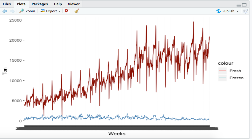
When I run a slightly modified version of one of your ggplot() functions, I get an x axis properly labeled with the year and week. Try running the code below and see what you get.

library(ggplot2)

Vekt <- data.frame(Week = paste0("2000U0", 1:6),
                 Fresh = c(3728, 4054, 4043, 3730, 3831, 4415),
                 Frozen = c(383, 216, 623, 393, 453, 265), stringsAsFactors = FALSE)
str(Vekt)
#> 'data.frame':    6 obs. of  3 variables:
#>  $ Week  : chr  "2000U01" "2000U02" "2000U03" "2000U04" ...
#>  $ Fresh : num  3728 4054 4043 3730 3831 ...
#>  $ Frozen: num  383 216 623 393 453 265
ggplot(data = Vekt, aes(x = Week)) + geom_line(aes(y = Fresh, group = 1), color = "darkred") + 
  geom_line(aes(y = Frozen, group = 1), color = "steelblue", linetype = "twodash")

Created on 2019-09-20 by the reprex package (v0.2.1)

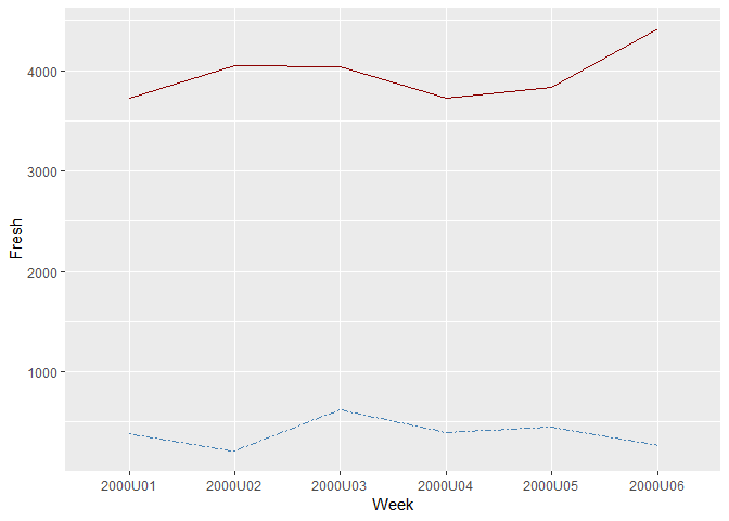
Thanks for your help! Your code does work, but it's not exactly what I'm looking for as it's 5 obs. of 3 variables, and the data I want to use is 1026 obs. of 3 variables. I have been playing around with it a bit and this is the closest I've gotten:

The script I've used is:

ggplot(data = Vekt, aes(x = Week)) + geom_line(aes(y = Fresh, group = 1), color = "darkred") +
geom_line(aes(y = Frozen, group = 1), color = "steelblue", linetype = "twodash") +
geom_line(aes(y = Fresh, colour = "Fresh")) +
geom_line(aes(y = Frozen, colour = "Frozen")) +
labs(x = "Weeks", y = "Ton")

The only thing missing is the week axis not showing 5 different periods.

What's happening is that you have those seemingly thick bars at the bottom, which are actually text overlaid (you can see the 2 shape at the bottom left of the x-axis). To set specific breaks (the distance between labels) and labels, you pass breaks and labels argument to one of the ggplot2 functions scale_x_*(). With the scale_x_date() variant, you can set date_breaks, which you can pass units of time like "2 days", or "5 weeks".

There's a nice example of this here (note the relevant part is where scale_x_date() is used).

1 Like

I think the main problem I'm having is that my data is in year+weeks, and not date format. My x = Week is just a character variable and I can't seem to figure out how to change it in a way that makes sense. I can't change it to specific dates as I don't have that information and it wouldn't make sense. I tried changing it to weeks only, but 1026 weeks doesn't come off as easy to read and whoever is reading it would have to do some math to find out which year a certain point in the line graph would be since the data contains 19 years (2000-2019). Any suggestions?

You could do something like this

library(tidyverse)

# Sample data
Vekt <- data.frame(Week = paste0("2000U0", 1:6),
                   Fresh = c(3728, 4054, 4043, 3730, 3831, 4415),
                   Frozen = c(383, 216, 623, 393, 453, 265), stringsAsFactors = FALSE)

colors <- c("Fresh" = "darkred", "Frozen" = "steelblue")

Vekt %>% 
    mutate(Week = as.Date(paste0(Week, 1), "%YU%U%u")) %>% 
    ggplot(aes(x = Week)) +
    geom_line(aes(y = Fresh, group = 1, color = "Fresh")) + 
    geom_line(aes(y = Frozen, group = 1, color = "Frozen"), linetype = "twodash") +
    scale_x_date(date_labels = '%YU%U') +
    scale_color_manual(values=colors) +
    labs(x = "Weeks",
         y = "Ton",
         color = "Type")

That makes sense, thank you so much!

This topic was automatically closed 7 days after the last reply. New replies are no longer allowed.