Hello ![]()
I want to plot something that looks somewhat like this
[http://www.sthda.com/sthda/RDoc/figure/ggplot2/ggplot2-line-plot-customized-line-graph-data-visualization-1.png]
with my data set i get the Error: "Discrete value supplied to continuous scale" when i take the "T" column as my "y" axis (this is what i orginally thought would i be able to do)
i checked 3 other threads that already treat the "same" issue
- https://forum.posit.co/t/error-discrete-value-supplied-to-continuous-scale-on-rstudio/45586/3
- https://forum.posit.co/t/understanding-when-and-why-discrete-value-supplied-to-continuous-scale-happens/26011/2
- https://forum.posit.co/t/plotting-multiple-lines-gives-error-discrete-value-supplied-to-continuous-scale/39752/4
unfortunately i cannot make by "T" column as numeric and the other suggestions are not close to what i want to to with my data
snapshop of my data:
@andresrcs thanks for the reminder ![]()
tibble::tribble(
~schaetz_m, ~m_unt, ~m_ob,    ~T, ~Date,        ~schaetz_g, ~g_unt, ~g_ob,
-1.20,      -1.27,   -1.13,  a_a, "2019-07-04", -0.89,     -0.98,   -0.79,
-0.34,      -0.49,   -0.19,  c,   "2019-07-04", -0.38,     -0.55,   -0.21,
-0.77,      -0.92,   -0.63,  d_d, "2019-07-04", -0.50,     -0.68,   -0.32,
 0.50,       0.25,    0.75,  a_a, "2019-09-06",  0.20,      0.01,    0.40,
-0.95,      -1.20,   -0.70,  c,   "2019-09-06", -1.37,     -1.64,   -1.09,
-1.20,      -1.37,   -1.03,  d_d, "2019-09-06", -0.78,     -0.93,   -0.63,
 0.91,       0.79,    1.03,  a_a, "2019-10-13",  0.96,      0.81,    1.10,
-0.80,      -0.94,   -0.67,  c,   "2019-10-13", -0.53,     -0.70,   -0.41,
-0.75,      -0.93,   -0.56,  d_d, "2019-10-13", -1.19,     -1.31,   -1.08,
)
#> Error in list2(...): object 'a_a' not found
Created on 2020-03-11 by the reprex package (v0.3.0)
@andresrcs does that work? my actual data.frame has 140 rows
my code
visualization <- ggplot(data, aes(x=Date, y=schaetz_m, group = T))+
  geom_errorbar(aes(ymin=m_unt, ymax=m_ob), width=.1,
                position=position_dodge(0.05)) +
  geom_line(aes(x=Date, y=schaetz_g)) +
  geom_point()+
  labs(title="Plot123",x="Date", y = "Name")+
  theme_classic()
p + theme_classic() + scale_color_manual(values=c('#999999','#E69F00'))
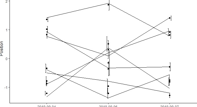
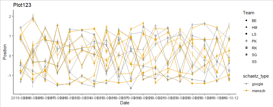
with this i get a very unsatisfying plot

in the end i want to have all of the information of the dataset in one or maybe a paired plot
i want the following information in the plot:
- as you can see the T values repeat themselves. i want two lines for each of them. one taking the value of the "schaetz_m" column and the other the value of the "schaetz_g" column (with different colour?/shape?)
- i want to have them labelled with their values as in column "T"
- (optional) i want to have additional lines/point/shapes/boxplot-like-objects that represent the information of all the other columns (which are not standard deviation, but otherwise related to the main lines "schaetz_m" and "schaetz_g")
I hope you can understand what i am imagining. I think i it very helpful to look at the following link, which captures already most of what i want to visualize with my data., except i will have more lines that this example:
http://www.sthda.com/sthda/RDoc/figure/ggplot2/ggplot2-line-plot-with-error-bar-data-visualization-1.png
Thanks a lot and i hope i was clear enough. dont hesitate to ask if you couldnt couldnt follow. sorry for my basic english. ![]()
