Plotting Line Graph in R with Multiple Lines for Each Site

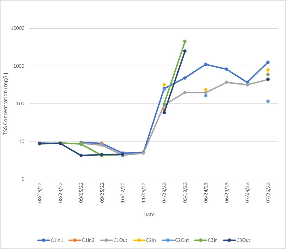
I have the following dataset

TSSdata.dat = structure(list(Date = c("2022-08-05", "2022-08-18", "2022-02-23", 
                                  "2022-09-09", "2022-09-25", "2022-10-12", "2022-11-06", "2023-04-29", 
                                  "2023-05-19", "2023-06-24", "2023-06-29", "2023-07-09", "2023-07-26"), 
                         C1In1 = c(NA, 8.794, NA, 9.38, 8.86, 4.866, 5.124, 250, 484.63, 
                                   1107.53, 821.92, 367.5, 1265.6), 
                         C1In2 = c(NA, 8.794, NA, NA, 8.66, NA, NA, 70.59, 
                                   NA, NA, NA, NA, NA), 
                         C1Out = c(NA, 8.898, NA, 8.9, 7.98, 4.28, 4.88, 
                                   91.95, 197.91, 196.26, 367.92, 317.3, 433.3), 
                         C2In = c(NA, NA, NA, 8.64, NA, 4.38, NA, 313.87, NA, 
                                  233.01, NA, NA, 788.6), 
                         C2Out = c(NA, NA, NA, 8.5, NA, 4.21, NA, 237.7, NA, 
                                   162.16, NA, NA, 117.2), 
                         C3In = c(NA, 8.52, 9.1, 8.5, 4.21, 4.46, NA, 98.16, 
                                  4494.04, NA, NA, NA, 606.6), 
                         C3Out = c(NA, 8.96, 8.85, 4.23, 4.48, 4.54, NA, 
                                   57.43, 2487.91, NA, NA, NA, 447.6)), 
                    row.names = c(NA, 13L), 
                    class = "data.frame")```

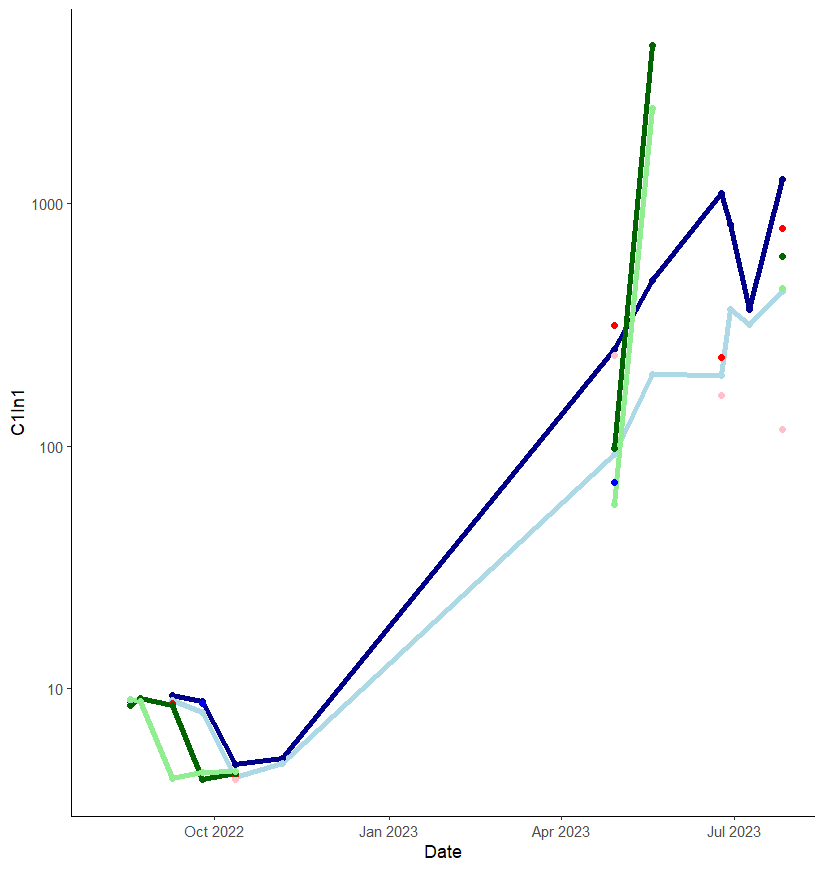
I want to create a line graph (with points representing the observations) with a different colored line for each site (i.e., C1In1 as "darkblue", C1In2 as "blue",  C1Out as "lightblue", C2In as "red", C2Out as "pink", C3In as "darkgreen", and C3 out as "lightgreen"). 

I tried running the code

plot(TSSdata.dat$Date, TSSdata$C1In1, type = "l", col = "darkblue", xlab = "Date", ylab = "TSS Concentration (mg/L)")


However, I am now getting the error:

> Error in plot.window(...) : need finite 'xlim' values
In addition: Warning messages:
1: In xy.coords(x, y, xlabel, ylabel, log) : NAs introduced by coercion
2: In min(x) : no non-missing arguments to min; returning Inf
3: In max(x) : no non-missing arguments to max; returning -Inf

Does anyone have any advice on how to produce this plot? 

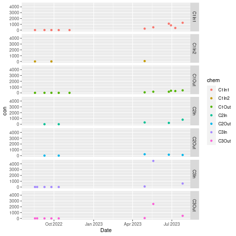
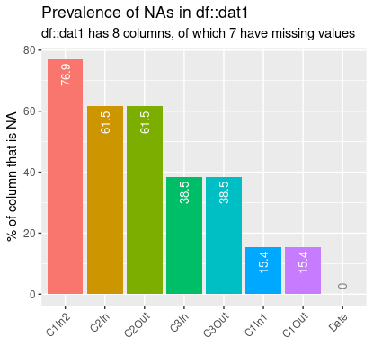
This is my current plot, but I would like to show it as a line graph rather than a bar plot. 

![image|639x500](upload://P1hfJBpqRLmxylvsohitnqHJTZ.png)
  1. Your dates should be dates, and not character strings with a similar look to dates
    TSSdata.dat$Date <- as.Date(TSSdata.dat$Date)
  2. if your frame is called TSSdata.dat then TSSdata$C1In1 would be an error and should be TSSdata.dat$C1In1
1 Like

As @ nirgrahamuk says you really want Date as a date not a character variable.

Here is anther way to do what I think you want using {ggplot2}

 dat1  <- TSSdata.dat  # rename data.frame to reduce typing

library(ggplot2)

dat1$Date  <- as.Date(dat1$Date)
ggplot(dat1, aes(Date, C1In1, )) + geom_line(colour =  "blue", aes(group = 1))

2 Likes

Thanks, I am still having trouble creating the plots that I am looking for.

Here is an excel graph that is, generally, what I want my plot to look like (although I want to plot it in R for journal requirements).

Does anyone have any advice on how to create a plot like this in R?

TIA

It looks weird but this should do it.

 dat1  <- TSSdata.dat  # rename data.frame to reduce typing

library(tidyverse)

dat1$Date  <- as.Date(dat1$Date)

dat2  <- dat1  %>%  pivot_longer(cols = c("C1In1", "C1In2", 
                                          "C1Out", "C2In",  "C2Out", "C3In", "C3Out"),
                                 names_to = "sample",
                                 values_to = "cons" )

ggplot(dat2, aes(Date, sample, colour = sample)) + geom_line()

Thanks, I tried running your code, but it produced the following plot, with my sites shown along the y-axis instead of the TSS concentrations.

Do you know how to fix this? Thanks again.

Blast it. I originally got the same, reloaded R and got the graph you want. I thought it was just something in my workspace left over from early work. Now it's back! I have no clue at the moment what is happening.

Let's try another way. First install {data.table}

install.packages("data.table")

I am working with your data.frame renamed as dat1. You will find it below.

So let's try this. The syntax will look a bit strange but

library(data.table)
library(ggplot2)


DT  <- as.data.table(dat1)

DT[ , Date := as.Date(Date)]

DT2  <- melt(DT, id.vars = "Date",
             measure.vars = c("C1In1", "C1In2", 
                              "C1Out", "C2In",  "C2Out", "C3In", "C3Out"),
             variable.name = "chem",
             value.name    = "con")

DT2[ , ggplot(, aes(Date, con, colour = chem)) + geom_line()]

dat1 <- structure(list(Date = structure(c(19209, 19222, 19046, 19244, 19260, 19277, 19302, 19476, 19496, 19532, 19537, 19547, 19564 ), class = "Date"), C1In1 = c(NA, 8.794, NA, 9.38, 8.86, 4.866, 5.124, 250, 484.63, 1107.53, 821.92, 367.5, 1265.6), C1In2 = c(NA, 8.794, NA, NA, 8.66, NA, NA, 70.59, NA, NA, NA, NA, NA), C1Out = c(NA, 8.898, NA, 8.9, 7.98, 4.28, 4.88, 91.95, 197.91, 196.26, 367.92, 317.3, 433.3), C2In = c(NA, NA, NA, 8.64, NA, 4.38, NA, 313.87, NA, 233.01, NA, NA, 788.6), C2Out = c(NA, NA, NA, 8.5, NA, 4.21, NA, 237.7, NA, 162.16, NA, NA, 117.2), C3In = c(NA, 8.52, 9.1, 8.5, 4.21, 4.46, NA, 98.16, 4494.04, NA, NA, NA, 606.6), C3Out = c(NA, 8.96, 8.85, 4.23, 4.48, 4.54, NA, 57.43, 2487.91, NA, NA, NA, 447.6)), row.names = c(NA, -13L), class = "data.frame")

The first of these sample should have been cons

That sound YOU HEaR IS ME pounding my head on my desk.

Thanks.

What do you mean that it should have been cons?

When I run this code I get the error

Error in geom_line():
! Problem while computing aesthetics.
:information_source: Error occurred in the 1st layer.
Caused by error in FUN():
! object 'C1In' not found
Run rlang::last_trace() to see where the error occurred.

ggplot(dat2, aes(Date, cons, colour = sample))

Hi, brant, i think in the plot this way

TSSdata.dat %>% 
  tidyr::pivot_longer(!Date) %>% 
  ggplot(aes(Date, value,
             col = name)) +
  facet_grid(name~.) +
  geom_line(aes(group = name)) +
  geom_point(size = 3.5) +
  theme_bw(base_size = 15) +
  theme(axis.text.x = element_text(angle = 90, vjust = 0))

Thanks, I tried that and am getting the error "Error in TSSdata.dat %>% tidyr::pivot_longer(!Date) %>% ggplot(aes(Date, : could not find function "%>%""

try load the libraries, and if don't loading, install they

install.packages(c('ggplot2', 'magrittr', "dplyr", "tidyr"), dep = T)

library(ggplot2)
library(magrittr)
library(dplyr)
library(tidyr)

He means I made a stupid mistake .

It should read:

ggplot(dat2, aes(Date, cons , colour = sample)) + geom_line()

Thanks everyone. I have figured it out now. The following code works. I just have one final question. Many of my sites have dates with no data, and as such the lines are not connecting the points together. Is there a way to make my lines continuous so that all points are connected?

TSSdata.dat = structure(list(Date = c("2022-08-05", "2022-08-18", "2022-08-23", 
                                  "2022-09-09", "2022-09-25", "2022-10-12", "2022-11-06", "2023-04-29", 
                                  "2023-05-19", "2023-06-24", "2023-06-29", "2023-07-09", "2023-07-26"), 
                         C1In1 = c(NA, 8.794, NA, 9.38, 8.86, 4.866, 5.124, 250, 484.63, 
                                   1107.53, 821.92, 367.5, 1265.6), 
                         C1In2 = c(NA, 8.794, NA, NA, 8.66, NA, NA, 70.59, 
                                   NA, NA, NA, NA, NA), 
                         C1Out = c(NA, 8.898, NA, 8.9, 7.98, 4.28, 4.88, 
                                   91.95, 197.91, 196.26, 367.92, 317.3, 433.3), 
                         C2In = c(NA, NA, NA, 8.64, NA, 4.38, NA, 313.87, NA, 
                                  233.01, NA, NA, 788.6), 
                         C2Out = c(NA, NA, NA, 8.5, NA, 4.21, NA, 237.7, NA, 
                                   162.16, NA, NA, 117.2), 
                         C3In = c(NA, 8.52, 9.1, 8.5, 4.21, 4.46, NA, 98.16, 
                                  4494.04, NA, NA, NA, 606.6), 
                         C3Out = c(NA, 8.96, 8.85, 4.23, 4.48, 4.54, NA, 
                                   57.43, 2487.91, NA, NA, NA, 447.6)), 
                    row.names = c(NA, 13L), 
                    class = "data.frame")

TSSdata.dat$Date <- as.Date(TSSdata.dat$Date)


library(ggplot2)

TSSplot <- ggplot(TSSdata.dat, aes(Date)) + 
  geom_line(aes(y = C1In1), color = "darkblue", lwd = 1.5) +
  geom_line(aes(y = C1In2), color = "blue", lwd = 1.5) + 
  geom_line(aes(y = C1Out), color = "lightblue", lwd = 1.5) +
  geom_line(aes(y = C2In), color = "red", lwd = 1.5) +
  geom_line(aes(y = C2Out), color = "pink", lwd = 1.5) +
  geom_line(aes(y = C3In), color = "darkgreen", lwd = 1.5) +
  geom_line(aes(y = C3Out), color = "lightgreen", lwd = 1.5)+
  geom_point(aes(y = C1In1), color = "darkblue", pch = 16) +
  geom_point(aes(y = C1In2), color = "blue", pch = 16) + 
  geom_point(aes(y = C1Out), color = "lightblue", pch = 16) + 
  geom_point(aes(y = C2In), color = "red", pch = 16) + 
  geom_point(aes(y = C2Out), color = "pink", pch = 16) + 
  geom_point(aes(y = C3In), color = "darkgreen", pch = 16) + 
  geom_point(aes(y = C3Out), color = "lightgreen", pch = 16) + 
  scale_y_log10() +
  theme_classic()
TSSplot```

I am looking to make the following edits on this graph:

  1. Change the font to Times New Roman
  2. Add lines between points, ensuring that all points are connected
  3. Add a legend to the plot

Does anyone have any advice?

Also is there a way to reformat the x-axis to take the months of December through March out of the plot? I do not have any data for these months and it is just taking up space on my plot.

Here is my most recent code and plot

library(tidyverse)
TSSdata.dat = structure(list(Date = c("2022-08-05", "2022-08-18", "2022-08-23", 
                                  "2022-09-09", "2022-09-25", "2022-10-12", "2022-11-06", "2023-04-29", 
                                  "2023-05-19", "2023-06-24", "2023-06-29", "2023-07-09", "2023-07-26"), 
                         C1In1 = c(NA, 8.794, NA, 9.38, 8.86, 4.866, 5.124, 250, 484.63, 
                                   1107.53, 821.92, 367.5, 1265.6), 
                         C1In2 = c(NA, 8.794, NA, NA, 8.66, NA, NA, 70.59, 
                                   NA, NA, NA, NA, NA), 
                         C1Out = c(NA, 8.898, NA, 8.9, 7.98, 4.28, 4.88, 
                                   91.95, 197.91, 196.26, 367.92, 317.3, 433.3), 
                         C2In = c(NA, NA, NA, 8.64, NA, 4.38, NA, 313.87, NA, 
                                  233.01, NA, NA, 788.6), 
                         C2Out = c(NA, NA, NA, 8.5, NA, 4.21, NA, 237.7, NA, 
                                   162.16, NA, NA, 117.2), 
                         C3In = c(NA, 8.52, 9.1, 8.5, 4.21, 4.46, NA, 98.16, 
                                  4494.04, NA, NA, NA, 606.6), 
                         C3Out = c(NA, 8.96, 8.85, 4.23, 4.48, 4.54, NA, 
                                   57.43, 2487.91, NA, NA, NA, 447.6)), 
                    row.names = c(NA, 13L), 
                    class = "data.frame")

df = TSSdata.dat |>
  pivot_longer(cols = -'Date') |> 
  rename(Site=name) # rename column

TSSplot <- ggplot(TSSdata.dat, aes(Date)) + 
  geom_line(aes(y = C1In1), color = "darkblue", lwd = 1.5) +
  geom_line(aes(y = C1In2), color = "blue", lwd = 1.5) + 
  geom_line(aes(y = C1Out), color = "lightblue", lwd = 1.5) +
  geom_line(aes(y = C2In), color = "red", lwd = 1.5) +
  geom_line(aes(y = C2Out), color = "pink", lwd = 1.5) +
  geom_line(aes(y = C3In), color = "darkgreen", lwd = 1.5) +
  geom_line(aes(y = C3Out), color = "lightgreen", lwd = 1.5)+
  geom_point(aes(y = C1In1), color = "darkblue", pch = 16) +
  geom_point(aes(y = C1In2), color = "blue", pch = 16) + 
  geom_point(aes(y = C1Out), color = "lightblue", pch = 16) + 
  geom_point(aes(y = C2In), color = "red", pch = 16) + 
  geom_point(aes(y = C2Out), color = "pink", pch = 16) + 
  geom_point(aes(y = C3In), color = "darkgreen", pch = 16) + 
  geom_point(aes(y = C3Out), color = "lightgreen", pch = 16) + 
  scale_y_log10() +
  theme(axis.line = element_line(color='black'),
        plot.background = element_blank(),
        panel.grid.major = element_blank(),
        panel.grid.minor = element_blank(),
        panel.border = element_blank()) + 
  scale_fill_manual(values = c('darkblue', 'blue', 'lightblue', 'red', 'pink', 'darkgreen','lightgreen')

windowsFonts(Times = windowsFont("Times New Roman"))

TSSplot

Technically it probably could be done I think it would seriously misrepresent your data. In fact I wonder if a line plot in appropriate.

Have a look at this way of displaying the data.

dat1  <- TSSdata.dat
DT  <- as.data.table(dat1)

DT2  <- melt(DT, id.vars = "Date",
             measure.vars = c("C1In1", "C1In2", 
                              "C1Out", "C2In",  "C2Out", "C3In", "C3Out"),
             variable.name = "chem",
             value.name    = "con")

setDF(DT2)  # data.table does not seem to play well with faceting.

p  <- ggplot(DT2, aes(Date, con, colour = chem)) + geom_point() +
  facet_grid(chem ~ .)
p

brent_facet

You have a lot of missing data, plotted with {inspectdf}
Brant_missing1

This may need a subject matter expert for advice.

Would it make any kind of sense to plot the NA's as actually "NO DATA" to show some kind of evolving pattern in your results?

Thanks, I have consulted with my thesis supervisors about this, and they believe that a line plot is the easiest way to represent my data. I originally had this displayed as a bar chart with 7 bars for each sample date (2022-08-05", "2022-08-18", "2022-08-23", "2022-09-09", "2022-09-25", "2022-10-12", "2022-11-06", "2023-04-29", "2023-05-19", "2023-06-24", "2023-06-29", "2023-07-09", and "2023-07-26"). However, they thought that this was too messy as there were way too many bars. They wanted me to instead represent this data as a time series or line graph, which is proving to be a more challenging task than expected.