Plotting Line Graph in R with Multiple Lines for Each Site

Quite seriously, I'd go bacx with those plots I just cranked out and discuss it again. I have no idea of your subject matter but things that may look okay in a table of data suddenly look different in a plot.

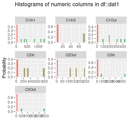
That 76.9% NA in CN1In2 is screaming out for a discussion. Without actually plotting it, I'd say they were definitely right about the barchart but then I have never been much of a fan.

Oh, here is something else from {inspectdf}. I have no idea what it might mean but it is interesting.
Brant_hist

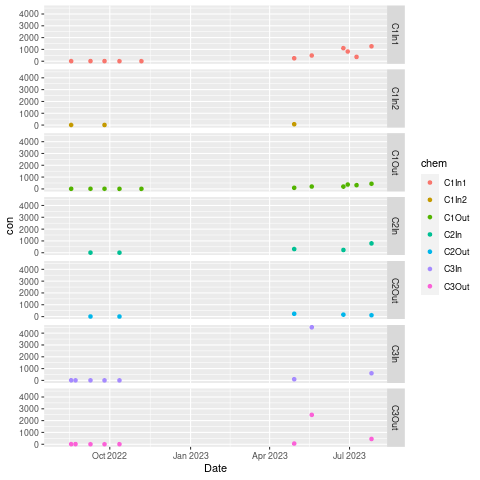
At the moment, I think that faceted point plot looks like a good alternative.

Thanks @jrkrideau. I think that this dot plot you have produced is the best way for me to represent my data. I have tried using your code to reproduce this table myself, but am not having much luck. Could you please provide me with the code that you used to produce this plot?

A few other things that I am wondering about:

  1. Is there a way to remove the months of December through March from the plot? There was no data collected through the winter and it just creates a large area with no data in my graph.
  2. Is there a way to show the data on a logarithmic scale?
  3. Is there a way to change the colours of the points on the plot, so that C1In 1, C1In2, and C1Out are blue, C2In and C2Out are red, and C3In and C3Out are green?
  4. Is there a way to change the font to Times New Roman?
  5. Is there a way to change "chem" in the legend to "Site"?

Thanks

brent_facet

I forgot the library call to {data.table}
With your existing data.frame, this should work.

library(data.table)
library(ggplot2)

dat1  <- TSSdata.dat
DT  <- as.data.table(dat1)

DT2  <- melt(DT, id.vars = "Date",
             measure.vars = c("C1In1", "C1In2", 
                              "C1Out", "C2In",  "C2Out", "C3In", "C3Out"),
             variable.name = "chem",
             value.name    = "con")

setDF(DT2)  # data.table does not seem to play well with faceting.

p  <- ggplot(DT2, aes(Date, con, colour = chem)) + geom_point() +
  facet_grid(chem ~ .)

p

** 1. Change the font to Times New Roman**
I am always crappy at this but I think this will do it

p  <- ggplot(DT2, aes(Date, con, colour = chem)) + geom_point() +
  facet_grid(chem ~ .) + 
  theme(text=element_text(family="Times New Roman", size=12))

** 1. Is there a way to remove the months of December through March from the plot? There was no data collected through the winter and it just creates a large area with no data in my graph.**

Possibly but I am not sure how. I'd advise against it. There is clearly some kind of temporal effect in your data and scrunching up the data is going to distort what you are really doing.

** 1. Is there a way to change the colours of the points on the plot, so that C1In 1, C1In2, and C1Out are blue, C2In and C2Out are red, and C3In and C3Out are green?**

Yes, and you'll have fun doing it. I believe you will have to construct a custom colour palette. Have a look at Custom colour palettes for {ggplot2} for a start

** 1. Is there a way to show the data on a logarithmic scale?**

Maybe but why? I don't see anythng that suggests a need for a log scale but I am no expert.

1. Is there a way to change "chem" in the legend to "Site"?

Just change

 variable.name = "chem",

to

 variable.name = "Site",

Also change "colour = chem" to "site in the ggplot command.

My original guess was you were doing something with some chemical solutions so I said "chem"

Edit:

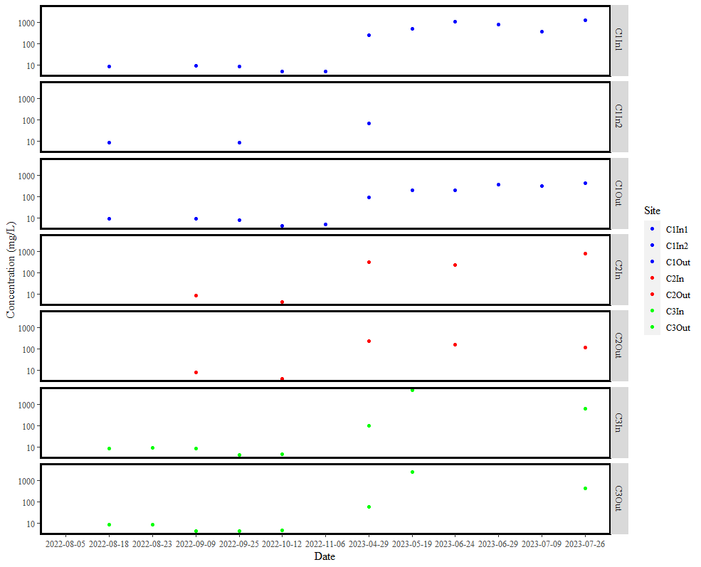
My plot is now complete. Thanks everyone for your help. Here is my final code and plot if anyone has similar issues in the future:

library(tidyverse)
library(data.table)
library(ggplot2)


TSSdata.dat = structure(list(Date = c("2022-08-05", "2022-08-18", "2022-08-23", 
                                  "2022-09-09", "2022-09-25", "2022-10-12", "2022-11-06", "2023-04-29", 
                                  "2023-05-19", "2023-06-24", "2023-06-29", "2023-07-09", "2023-07-26"), 
                         C1In1 = c(NA, 8.794, NA, 9.38, 8.86, 4.866, 5.124, 250, 484.63, 
                                   1107.53, 821.92, 367.5, 1265.6), 
                         C1In2 = c(NA, 8.794, NA, NA, 8.66, NA, NA, 70.59, 
                                   NA, NA, NA, NA, NA), 
                         C1Out = c(NA, 8.898, NA, 8.9, 7.98, 4.28, 4.88, 
                                   91.95, 197.91, 196.26, 367.92, 317.3, 433.3), 
                         C2In = c(NA, NA, NA, 8.64, NA, 4.38, NA, 313.87, NA, 
                                  233.01, NA, NA, 788.6), 
                         C2Out = c(NA, NA, NA, 8.5, NA, 4.21, NA, 237.7, NA, 
                                   162.16, NA, NA, 117.2), 
                         C3In = c(NA, 8.52, 9.1, 8.5, 4.21, 4.46, NA, 98.16, 
                                  4494.04, NA, NA, NA, 606.6), 
                         C3Out = c(NA, 8.96, 8.85, 4.23, 4.48, 4.54, NA, 
                                   57.43, 2487.91, NA, NA, NA, 447.6)), 
                    row.names = c(NA, 13L), 
                    class = "data.frame")

DT <-as.data.table(TSSdata.dat)

DT2  <- melt(DT, id.vars = "Date",
             measure.vars = c("C1In1", "C1In2", 
                              "C1Out", "C2In",  "C2Out", "C3In", "C3Out"),
             variable.name = "Site",
             value.name    = "con")

setDF(DT2) 

p  <- ggplot(DT2, aes(Date, con, colour = Site)) + geom_point() +
  facet_grid(Site ~ .) + scale_y_log10() +
  theme(text=element_text(family="Times New Roman", size=12)) + ylab("Concentration (mg/L)") + 
  scale_colour_manual(values = c("C1In1" = "blue", "C1In2" = "blue", "C1Out" = "blue",
                                 "C2In" = "red", "C2Out" = "red", "C3In" = "green", "C3Out" = "green")) +
  theme(panel.grid.minor = element_blank(),
        panel.background = element_blank(),
        panel.border = element_rect(colour = "black", fill = NA, size = 2))
  
p  
1 Like

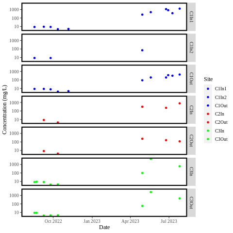
I think you have missed something here. You are plotting Date as a character variable and you are losing that temporal effect.

See this where I have changed Date to a date. DT[, Date := as.Date(Date)]

DT <-as.data.table(TSSdata.dat)
DT[, Date := as.Date(Date)]
DT2  <- melt(DT, id.vars = "Date",
             measure.vars = c("C1In1", "C1In2", 
                              "C1Out", "C2In",  "C2Out", "C3In", "C3Out"),
             variable.name = "Site",
             value.name    = "con")

setDF(DT2) 

p  <- ggplot(DT2, aes(Date, con, colour = Site)) + geom_point() +
  facet_grid(Site ~ .) + scale_y_log10() +
  theme(text=element_text(family="Times New Roman", size=12)) + ylab("Concentration (mg/L)") + 
  scale_colour_manual(values = c("C1In1" = "blue", "C1In2" = "blue", "C1Out" = "blue",
                                 "C2In" = "red", "C2Out" = "red", "C3In" = "green", "C3Out" = "green")) +
  theme(panel.grid.minor = element_blank(),
        panel.background = element_blank(),
        panel.border = element_rect(colour = "black", fill = NA, size = 2))

p  
brant_temp

Thanks for the feedback John, however, for the purpose of my analysis, the temporal effect is irrelevant. Instead of listing dates as the x-axis labels, I could have the labels "Replicate 1", "Replicate 2", "Replicate 3", etc. I deliberately plotted date as a character variable, to avoid the sizable area of empty white space in my graph (as I have no data collected through the winter), and spread the data out more evenly. Thanks for the suggestion though.

Oh, okay, thanks for the feedback.

This topic was automatically closed 42 days after the last reply. New replies are no longer allowed.

If you have a query related to it or one of the replies, start a new topic and refer back with a link.