PlotStereoMap function to make polar maps R

I've spent a lot of time trying to make a radial (polar) map to plot the 500 hPa Geopotential data for Antarctica (previous post: Is it possible to make a polar (radial) filled.contour map? Geopotential in Antarctica data).

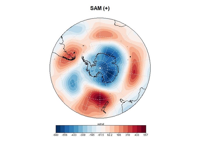
I finally discovered that I can accomplish this with the wonderful function I didn't know about, PlotStereoMap, from the s2dverification package. Here my code and map:

PlotStereoMap(verano2008_med, lon, lat, latlims = c(-30,-90), toptitle = "SAM (+)", 
              title_scale = 0.7, bar_limits = range(verano2008_med),
              triangle_ends = c(T,T), units = "m2/s2", units_scale = 0.7,
              bar_label_scale = 0.7, bar_tick_scale = 0.4)

However, I am now struggling with changing the plot parameters. I've read them all and tried everything, but I can't get the color scale to be smaller (it's almost the size of the map!) and I'd also like it to be horizontal at the bottom of the map.
Any ideas?
Thanks!
1 Like

After posting, I noticed the deprecation warning for the package in favor of {spdv}, which you might take a look at in hope of better facilities and documentation.

I also failed to find much insight from the documentation and related search results. ColorBar() function is supposed to allow fine-grained control of the legend, but there is nothing I saw to show out to save the PlotStereoMap() output as anything but an exported output file and ColorBar() doesn't even have that option. I couldn't get this to work with {grid} and {gridExtra}.

I'd suggest printing the map with

drawleg = FALSE,
fileout = "the_map.tiff"

and reproduce the legend in ggplot2, then save in like format and use a photoeditor to stictch them together and adjust relative size to preference.

library(grid)
library(gridExtra)
library(s2dverification)
#> Loading required package: maps
#> Warning: This package has been deprecated. Please consider using the package 's2dv' instead.
#> 
#> Attaching package: 's2dverification'
#> The following object is masked from 'package:base':
#> 
#>     Filter

Data <- matrix(rnorm(100 * 50), 100, 50)
x <- seq(from = 0, to = 360, length.out = 100)
y <- seq(from = -90, to = 90, length.out = 50)

cols <- c("dodgerblue4", "forestgreen", "yellowgreen",
          "white", "yellow", "orange", "red", "saddlebrown")

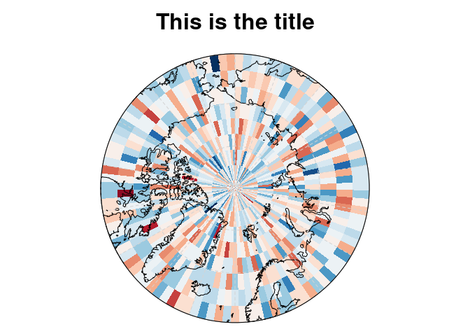
the_map <- PlotStereoMap(Data, x, y, latlims = c(60, 90),
              toptitle = "This is the title",
              drawleg = FALSE)#,

#               fileout = "the_map.tiff")

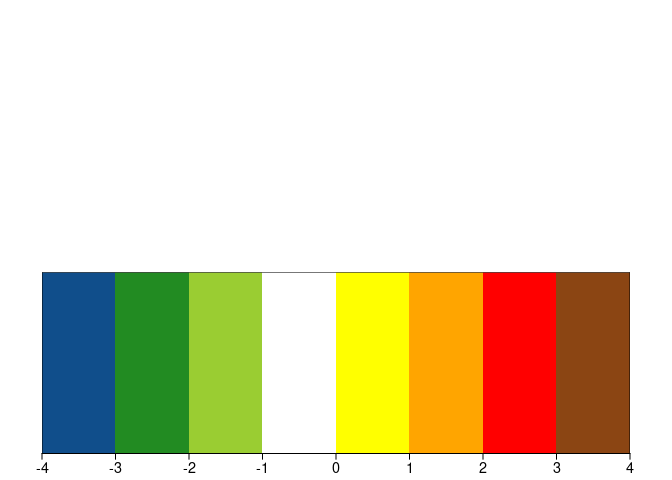
the_legend <- ColorBar(brks = seq(-4,4,1), 
              cols,
              vertical = FALSE, 
              plot = TRUE)

It is a good solution! But I'm not managing to tell the map what I want my color scale to be, so that it corresponds to the legend.
Also, I forgot to mention in my initial question, but I would also like to indicate the meridian values in degrees, but only the lines appear. Any ideas?
Thank you!

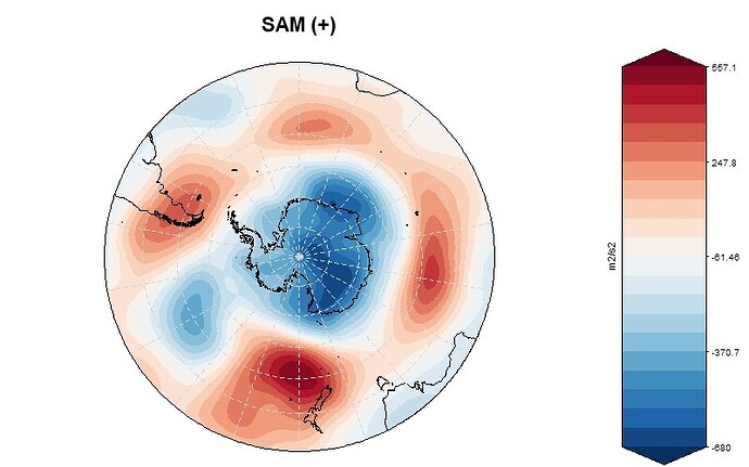
I managed to create the color scale with the same color palette! By modifying your code I managed to make it smaller, and after exporting them separately I joined them in Canvas.
Here is the code I used:

ColorBar(vertical = F, subsampleg = 2,
         bar_limits = range(verano2008_med),
         color_fun = clim.palette(palette = "bluered"),
         plot = T, draw_ticks = T, draw_separators = F,
         title = "m2/s2", title_scale = 0.6,
         label_scale = 0.8, label_digits = 3, tick_scale = 0.4,
         extra_margin = c(6,1,6,1))

However, I still cannot plot the longitude values around the map with the PlotStereoMap() function.

1 Like

This topic was automatically closed 21 days after the last reply. New replies are no longer allowed.

If you have a query related to it or one of the replies, start a new topic and refer back with a link.