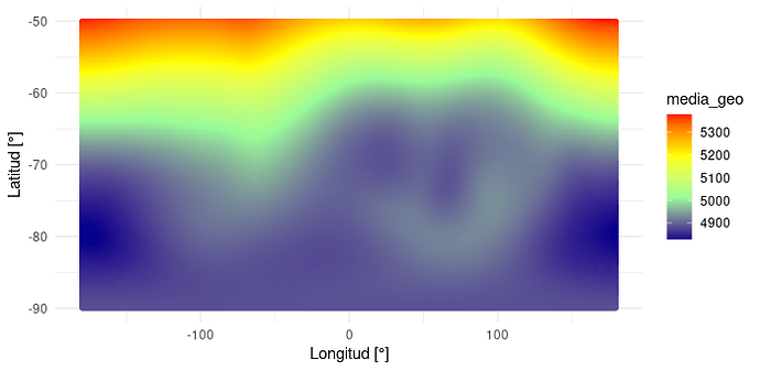
Is it possible to make a polar (radial) filled.contour map? Geopotential in Antarctica data

I am working with reanalysis data (ERA 5) of 500 hPa Geopotential to analyze Southern Annular Mode patterns in the Antarctic region for the period 1998-2016, specifically the dimensions LON [0, 360°] and LAT [-50, -90°] with a resolution of 0.25°x0.25°. I have a monthly mean data series, so the total dimensions of my original array is: 1440 (LON), 161 (LAT), 228 (time).

Here is the link to my data: nc data - Google Drive

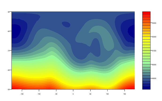
I have managed to plot the data with filled.contour (my target map), but with straight axes, as I show below.

#charge the data
datos_geo <- nc_open("geopotential_antartida.nc")
geo <- ncvar_get(datos_geo, "z")
lon <- ncvar_get(datos_geo, "longitude")
lat <- ncvar_get(datos_geo, "latitude")
py <- c(length(lat):1)
lat <- lat[py]

#make the map
media_geo <- apply(geo, c(1,2), mean)
paleta2 <- colorRampPalette(c("darkblue", "palegreen", "yellow", "red"),interpolate='linear')
par(mar=c(3,3,3,3), mfrow=c(2,1), cex.axis=0.5, cex.lab=0.5, cex.main=0.9, mgp=c(1.5,0.5,0))
filled.contour(lon, lat, media_geo, color.palette=paleta2,
               plot.title=title(main="", xlab="Longitud [°]", ylab="Latitud [°]"),
               plot.axes={axis(1); axis(2); map("antarctica", wrap=c(-180,180), 
                                                add=T, fill=TRUE,border=F, col = "white")})

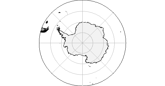
My goal is to make a filled.contour map (or similar) but radial, and with the Antarctic continent underneath. I have managed to make a radial map, but only with the continent, without plotting my data on top.

Is it possible to plot both together? Thanks in advance.

install.packages(c("ggOceanMapsData", "ggOceanMaps"), 
                 repos = c("https://cloud.r-project.org",
                           "https://mikkovihtakari.github.io/drat"))
library(ggOceanMapsData)
library(ggOceanMaps)
basemap(limits = -50, glaciers = TRUE, bathymetry = F)
image

For GIS data such as this, organized as data frames with variables lat, long and observation values as variables, my preferred approach is to join with an {sf::sf} polygon geometry object to do the plotting. {ggplot2} has plot methods for such data frames and provides all the thematic variation needed.

The {rnaturalearth} package should have the shapefiles needed.

1 Like

Could you please show me what the code would look like, even a part of it? I have tried everything and I can't get it. I was hoping to use filled.contour because it is the function I know that makes color maps allowing me to work with arrays or matrices. To work with ggplot2 I need to convert my data to data.frame, and after that I can't visualize the data as I want. Thanks in advance.

Hard to do without representative data. See the FAQ: How to do a minimal reproducible example reprex for beginners.

I'll come back if I can find a suitable polar dataset.

Thank you. I edited the post and shared my data in a drive folder

Thanks. There is a problem in the last line, but I am going to focus on whether it's feasible to convert to a data frame.

# in reprex don't use install.packages, because users may not want to
# install packages without checking them out, also may need ncdf4
# install.packages(c("ggOceanMapsData", "ggOceanMaps", "ncdf4), 
#                  repos = c("https://cloud.r-project.org",
#                            "https://mikkovihtakari.github.io/drat"))
library(ggOceanMapsData)
library(ggOceanMaps)
#> Loading required package: ggplot2
#> Loading required package: ggspatial
#> Warning in fun(libname, pkgname): rgeos: versions of GEOS runtime 3.9.0-CAPI-1.16.2
#> and GEOS at installation 3.8.0-CAPI-1.13.1differ
#> Registered S3 methods overwritten by 'stars':
#>   method             from
#>   st_bbox.SpatRaster sf  
#>   st_crs.SpatRaster  sf
library(ncdf4)
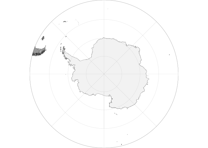
basemap(limits = -50, glaciers = TRUE, bathymetry = F)
#> Warning in sp::proj4string(shapefiles$land): CRS object has comment, which is
#> lost in output

# -- WARNING: 100MB
datos_geo <- nc_open("/home/roc/projects/demo/geopotential_antartida.nc") # https://drive.google.com/drive/folders/100VkPCH3RthSumqyHKc-w_6-2fPg8XNV 
geo <- ncvar_get(datos_geo, "z")
lon <- ncvar_get(datos_geo, "longitude")
lat <- ncvar_get(datos_geo, "latitude")
py <- c(length(lat):1)

media_geo <- apply(geo, c(1,2), mean)

# this returns a function, which was surprising at first; not a problem
paleta2 <- colorRampPalette(c("darkblue", "palegreen", "yellow", "red"),interpolate='linear')

par(mar=c(3,3,3,3), mfrow=c(2,1), cex.axis=0.5, cex.lab=0.5, cex.main=0.9, mgp=c(1.5,0.5,0))

# filled.contour expects increasing x,y (lon/lat) values
# x, y  locations of grid lines at which the values in z are measured. 
# These must be in ascending order.
filled.contour(lon, lat, media_geo, color.palette=paleta2,
               plot.title=title(main="", xlab="Longitud [°]", ylab="Latitud [°]"),
               plot.axes={axis(1); axis(2); map("antarctica", wrap=c(-180,180), 
                                                add=T, fill=TRUE,border=F, col = "white")})
#> Error in filled.contour(lon, lat, media_geo, color.palette = paleta2, : increasing 'x' and 'y' values expected

Thanks Technocrat, but I can't see the difference between the two codes. I arrive at the same thing I had arrived at: a circular basemap of Antarctica, and a colorful, straight map on top, I can't get the filled.contour to be circular and consistent with the basemap.
The problem in the last line of code is because the latitude conversion was missing: lat <- lat[py]

Ok, I'm up-to-speed on your code, now.

update: my plot is flipped, relative to yours. Shouldn't the higher temperatures be in higher latitudes?

Yes, you are correct. I didn't even get to analyze the data I plotted because I wanted to get the radial map done first. But indeed, mine was inverted.

Still struggling with this. Haven't forgotten.

1 Like

This topic was automatically closed 21 days after the last reply. New replies are no longer allowed.

If you have a query related to it or one of the replies, start a new topic and refer back with a link.