Ordering facets by size instead of alphabetical (time series data)

Hello,

This is part 2 of an earlier question that I had posted (part 1: Facet chart in a Shiny web app with lots of plots)

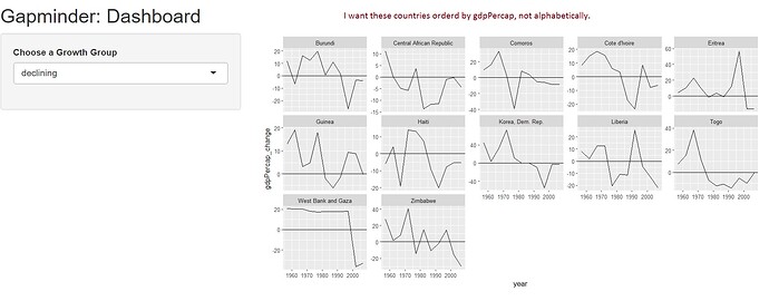
I have a shiny app that creates plots based on some grouping criteria. I want the individual facets/plots to be sorted by size. In the case of the gapminder example, by gpdPercap. I know that there are several posts about this (example: Ordering categories within ggplot2 facets | R-bloggers), but I am having a really hard time applying it to my time series example.

The current code and facet chart is shown below. Any help would be much appreciated!!

library(shiny)
library(tidyverse)
library(gapminder)

### Pre-process Data

## functions
pct_change <- function(x) {
  ((x - lag(x,1)) / lag (x,1)) * 100
}


## data frame to be used in shiny app
df <- gapminder %>% 
  select(country, year, gdpPercap) %>% 
  group_by(country) %>% 
  mutate(gdpPercap_change = pct_change(gdpPercap)) %>% 
  mutate(gdpPercap_change = round(gdpPercap_change, 2)) %>%  
  mutate(growth_group = case_when(year == 2007 & gdpPercap_change > 20                        ~ "high growth",
                                  year == 2007 & gdpPercap_change < 20 & gdpPercap_change > 0 ~ "moderate growth",
                                  year == 2007 & gdpPercap_change < 0                         ~ "declining",
                                  TRUE                                                        ~ as.character(NA)
  )) %>% 
  fill(growth_group, .direction = "up") %>% 
  na.omit()
head(df)


### UI portion
ui <- fluidPage(
  titlePanel("Gapminder: Dashboard"),
  
  sidebarLayout(
    sidebarPanel(
      selectInput(inputId="group", label="Choose a Growth Group", 
                  choices=unique(df$growth_group), selected="declining")
    ),
    mainPanel(
      plotOutput("chart_1")
    )
  )
)


### Server portion
server <- function(input, output) {
  
  output$chart_1 <- renderPlot({
    chart <- df %>% 
      filter(growth_group == input$group) %>% 
      ungroup() %>% 
      ggplot(aes(x=year, y=gdpPercap_change)) +
      geom_line() +
      geom_hline(yintercept = 0) +
      facet_wrap(~ country, scales = "free_y", ncol = 5)
    chart
  })
}

### run shiny app
shinyApp(ui = ui, server = server)
You just need to define country as a factor ordered by your desired criteria, e.g. using

Time series data or not does not affect this as long as you can define the ordering properly (e.g. last or mean gdpPercap).

As mentioned by @martin.R, reordering the country by some other measure should do the trick:

library(forcats)
server <- function(input, output) {
  
  output$chart_1 <- renderPlot({
    chart <- df %>% 
      filter(growth_group == input$group) %>% 
      ungroup() %>% 
      mutate(country = fct_reorder(country, gdpPercap)) %>% 
      ggplot(aes(x=year, y=gdpPercap_change)) +
      geom_line() +
      geom_hline(yintercept = 0) +
      facet_wrap(~ country, scales = "free_y", ncol = 5)
    chart
  })
}

NOTE: By default, fct_reorder() orders by median() of the x variable (gdpPercap), you can specify mean, max, etc. by specifying a .fun. For example:

server <- function(input, output) {
  
  output$chart_1 <- renderPlot({
    chart <- df %>% 
      filter(growth_group == input$group) %>% 
      ungroup() %>% 
      mutate(country = fct_reorder(country, gdpPercap, .fun = mean)) %>% 
      ggplot(aes(x=year, y=gdpPercap_change)) +
      geom_line() +
      geom_hline(yintercept = 0) +
      facet_wrap(~ country, scales = "free_y", ncol = 5)
    chart
  })
}
1 Like

Ah, many thanks! This solved my question perfectly!

Need to read up more details on forcats. Not sure why I didn't look into that until now.

This topic was automatically closed 7 days after the last reply. New replies are no longer allowed.