Hello,
I am trying to create a shiny app so that my colleagues can quickly visualize the trends in a very large database. The database that I am using is very similar in structure to the gapminder database, so I will use that as a toy example.
Here is what I have:
library(shiny)
library(tidyverse)
library(gapminder)

### Pre-process data

## functions
pct_change <- function(x) {
  ((x - lag(x,1)) / lag (x,1)) * 100
}

## data frame to be used in shiny app
df <- gapminder %>%
  select(country, year, gdpPercap) %>%
  group_by(country) %>%
  mutate(gdpPercap_change = pct_change(gdpPercap)) %>%
  mutate(gdpPercap_change = round(gdpPercap_change, 2)) %>%
  mutate(growth_group = case_when(year == 2007 & gdpPercap_change > 20                        ~ "high growth",
                                  year == 2007 & gdpPercap_change < 20 & gdpPercap_change > 0 ~ "moderate growth",
                                  year == 2007 & gdpPercap_change < 0                         ~ "declining",
                                  TRUE                                                        ~ as.character(NA)
  )) %>%
  fill(growth_group, .direction = "up") %>%
  na.omit()


### UI portion
ui <- fluidPage(
  titlePanel("Gapminder: Dashboard"),

  sidebarLayout(
    sidebarPanel(
      selectInput(inputId="group", label="Choose a Growth Group",
                  choices=unique(df$growth_group), selected="declining")
    ),
    mainPanel(
      plotOutput("chart_1")
    )
  )
)


### Server portion
server <- function(input, output) {

  output$chart_1 <- renderPlot({
    chart <- df %>%
      filter(growth_group == input$group) %>%
      ggplot(aes(x=year, y=gdpPercap_change)) +
      geom_line() +
      geom_hline(yintercept = 0) +
      facet_wrap(~ country, scales = "free_y")
    chart
  })
}

### run shiny app
shinyApp(ui = ui, server = server)
My data frame looks like this:
  country      year gdpPercap gdpPercap_change growth_group
  <fct>       <int>     <dbl>            <dbl> <chr>
1 Afghanistan  1957      821.             5.31 high growth
2 Afghanistan  1962      853.             3.93 high growth
3 Afghanistan  1967      836.            -1.98 high growth
4 Afghanistan  1972      740.           -11.5  high growth
5 Afghanistan  1977      786.             6.23 high growth
6 Afghanistan  1982      978.            24.4  high growth
>
The countries are broken out into 3 "growth_groups" or buckets:
  growth_group        n
  <chr>           <int>
1 declining          12
2 high growth        61
3 moderate growth    69
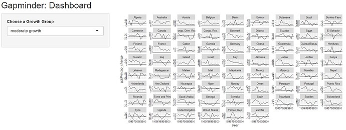
I want my colleagues to quickly see a chart with all of the individual countries placed within their respective growth_group. I chose to use facet_wrap for this purpose. However, with so many countries in each group, the chart quickly becomes unreadable.
Example: with 69 countries in the "moderate" growth group. This is very hard to read.
Two questions:
-
Is there a way to make a facet grid "scroll-able"? Since we are rendering on a web page, scrolling down a long list of charts should be quite intuitive to users. The users are expecting to see lots of charts, but not expecting them to be crammed into a small printable area. I cannot seem to find a way to do this.
-
Alternatively, if facet_wrap is not the right solution here, what other techniques would should I look into? I tried facet_grid, but that seems to make things worse!
Any help would be greatly appreciated!
Thanks in advance
