How to enlarge the size of each sub-panel with common scale bar

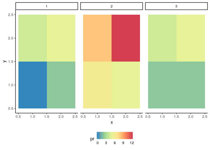
There are 12 monthly data for precipitation values in an area, so each month's dataset has the same coordinates. In df1, the values vary from 0 to 5, while in df2, the values vary from 5 to 12, ..., in df12, the values from 2 to 5 again.

library(ggplot2)
library(ggpubr)

df1 = data.frame(x = c(1,2,1,2), y = c(1,1,2,2), COL = c(0, 2, 4, 5))
df2 = data.frame(x = c(1,2,1,2), y = c(1,1,2,2), COL = c(6, 5, 8, 12))
...
df12= data.frame(x = c(1,2,1,2), y = c(1,1,2,2), COL = c(2, 2, 4, 5))

I want to put the 12 monthly data in one figure, so I use the same scale_fill_distiller and ggarrange functions. The sample code is shown below.

fill_com = scale_fill_distiller('pr',palette='Spectral')
figure1= ggplot(df1, aes(x, y, fill = COL)) + geom_tile() + theme_classic() + fill_com

figure2= ggplot(df2, aes(x, y, fill = COL)) + geom_tile() + theme_classic() + fill_com
...
figure12= ggplot(df12, aes(x,y, fill=COL))+ geom_title()+ theme_classic()+ fill_com

ggarrange(figure1, figure2, figure3, figure4, figure5, figure6, figure7, figure8, figure9, figure10, figure11, figure12, ncol=4, nrow=3, common.legend = TRUE, legend="bottom")

In the resulting figure, each sub-panel (or each month) is very small and the font is indiscernible. How to make it visible and put into a paper? Thanks for your help.

Do you have any particular reason for not using faceting instead of ggarrange?

library(tidyverse)

df1 = data.frame(x = c(1,2,1,2), y = c(1,1,2,2), COL = c(0, 2, 4, 5))
df2 = data.frame(x = c(1,2,1,2), y = c(1,1,2,2), COL = c(6, 5, 8, 12))
df3 = data.frame(x = c(1,2,1,2), y = c(1,1,2,2), COL = c(2, 2, 4, 5))

bind_rows(df1, df2, df3, .id = "Month") %>% 
    ggplot(aes(x, y, fill = COL)) + 
    geom_tile() +
    theme_classic() +
    scale_fill_distiller('pr',palette='Spectral') +
    facet_wrap(vars(Month), ncol = 4, nrow = 3) +
    theme(legend.position = "bottom")

Created on 2019-04-30 by the reprex package (v0.2.1)

Thanks. I just knew ggarrange before I posted this. First, if the 3rd column name in each monthly dataframe is different, how to do this then?

df1 = data.frame(x = c(1,2,1,2), y = c(1,1,2,2), COL.m1 = c(0, 2, 4, 5))
df2 = data.frame(x = c(1,2,1,2), y = c(1,1,2,2), COL.m2 = c(6, 5, 8, 12))
df3 = data.frame(x = c(1,2,1,2), y = c(1,1,2,2), COL.m3 = c(2, 2, 4, 5))

Second, this does not work if I want to draw the area boundary on each sub-panel. I changed the code to the below, but it shows the wrong figures. Each monthly dataset has the same boundary, so I use df1 for drawing the border. Also, the month IDs are not row-wise.

bind_rows(df1, df2, df3,df4,df5,df6,
df7,df8,df9,df10,df11,df12,.id = "Month") %>%
ggplot(aes(lon, lat, fill = COL)) +
geom_tile() +
theme_classic() +
scale_fill_distiller('pr',palette='Spectral')
coord_quickmap(xlim=range(df1$x), ylim=range(df1$y))+
borders('world', xlim=range(df1$x), ylim=range(df1$y), colour='black')+
facet_wrap(vars(Month), nrow=3) +
theme(legend.position = "bottom")

Thanks again for your help.

These functions work with latitudinal and longitudinal ranges, obviously this doesn't work with your sample data because the coordinates are not in that format, could you provide a minimal REPRoducible EXample (reprex)? A reprex makes it much easier for others to understand your issue and figure out how to help.

If you've never heard of a reprex before, you might want to start by reading this FAQ:

Here is a small sample. Thanks.

df1 = data.frame(x = c(-105.3125,-105.4375,-105.3125,-105.4375), y = c(39.9375,39.9375,40.0625,40.0625), COL = c(0, 2, 4, 5))

df2 = data.frame(x = c(-105.3125,-105.4375,-105.3125,-105.4375), y = c(39.9375,39.9375,40.0625,40.0625), COL = c(6, 5, 8, 12))

df3 = data.frame(x = c(-105.3125,-105.4375,-105.3125,-105.4375), y = c(39.9375,39.9375,40.0625,40.0625), COL = c(2, 2, 4, 5))

...
df12

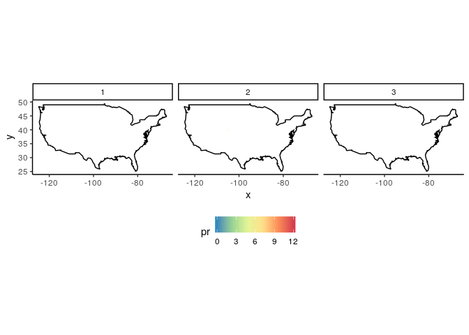
What is your expected output? your sample data doesn't show geographical borders because the limits are too narrow, if you remove the limits the borders are shown (along with extremely small tiles).

df1 = data.frame(x = c(-105.3125,-105.4375,-105.3125,-105.4375), y = c(39.9375,39.9375,40.0625,40.0625), COL = c(0, 2, 4, 5))
df2 = data.frame(x = c(-105.3125,-105.4375,-105.3125,-105.4375), y = c(39.9375,39.9375,40.0625,40.0625), COL = c(6, 5, 8, 12))
df3 = data.frame(x = c(-105.3125,-105.4375,-105.3125,-105.4375), y = c(39.9375,39.9375,40.0625,40.0625), COL = c(2, 2, 4, 5))
library(tidyverse)
p <- bind_rows(df1, df2, df3, .id = "Month") %>% 
    ggplot(aes(x, y, fill = COL)) + 
    geom_tile() +
    theme_classic() +
    scale_fill_distiller('pr',palette='Spectral') +
    borders('world', xlim=range(df1$x), ylim=range(df1$y), colour='black')+
    facet_wrap(vars(Month)) +
    theme(legend.position = "bottom")

p + coord_quickmap(xlim=range(df1$x), ylim=range(df1$y))

p + coord_quickmap()

1 Like

A post was split to a new topic: Problem loading tidyverse: Incompatible library version: readxl.so requires version 3.5.0 or later, but libR.dylib provides version 3.4.0

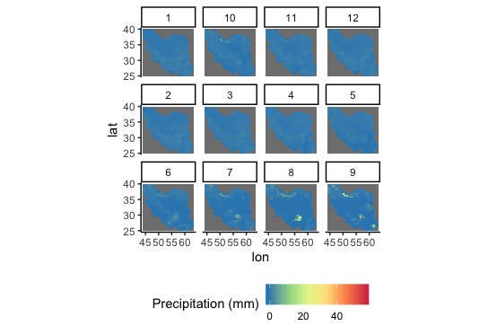
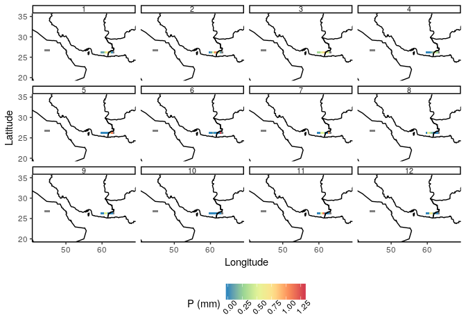
Thanks, it works. But the row numbers are not consecutive. For example, if there are 12 sub-panels for 12 months of data, the first row shows: 1, 10, 11, 12; the second row shows: 2, 3, 4, 5; and the third row shows: 6, 7, 8, 9.

Second, the "bind_rows" function uses "dplyr" package rather than "tidyverse" package.

Third, there are large spaces on the left and right side of the final figure, how to remove the spaces or enlarge the sub-panel size?

Forth, is it possible to control the maximum values of the color bar?

I put the figure here. Thanks.
Rplot

This is happening because you are faceting by a factor variable try to convert it to numerical or specify the order for the levels.

dplyr is part of the tidyverse

If you need specific help with your code, please provide a proper reproducible example.

I put a small sample here. There are NAs in the 3rd column of each dataframe, would that influence the resulting figure?

df1
lon lat P
1 44.25 25.25 NA
2 44.75 25.25 NA
3 45.25 25.25 NA
4 45.75 25.25 NA
5 46.25 25.25 NA
6 46.75 25.25 NA
7 47.25 25.25 NA
8 47.75 25.25 NA
9 48.25 25.25 NA
10 48.75 25.25 NA
11 49.25 25.25 0.11
12 49.75 25.25 NA
...

df2
lon lat P
1 44.25 25.25 NA
2 44.75 25.25 NA
3 45.25 25.25 NA
4 45.75 25.25 NA
5 46.25 25.25 NA
6 46.75 25.25 NA
7 47.25 25.25 NA
8 47.75 25.25 NA
9 48.25 25.25 NA
10 48.75 25.25 NA
11 49.25 25.25 0
12 49.75 25.25 0.22
...

After I have updated the packages, it can find the 'bind_rows' function. But the problems below still exist.
First, the IDs for each sub-panel are not row-wise, as in the figure that I showed before. What do you mean that I am faceting by a factor variable try to convert it to numerical or specify the order for the levels? How should I correct it? I don't know where is the factor variable actually.

Second, there are large spaces on the left and right sides of the figure, so that the actual feature of the sub-panels are hard to recognize. How to improve it? Thanks for your help.

I put the code below:

p <- bind_rows(df1,df2,df3,df4,df5,df6,df7,df8,df9,df10,df11,df12,.id = "Month") %>%
ggplot(aes(lon, lat, fill = P)) +
geom_tile() +
theme_classic() +
scale_fill_distiller('P (mm)',palette='Spectral')+
borders('world', xlim=range(df1$lon), ylim=range(df1$lat), colour='black')+
facet_wrap(vars(Month)) + xlab('Longitude')+ ylab('Latitude')+
theme(legend.position = "bottom")

p + coord_quickmap(xlim=range(df1$lon), ylim=range(df1$lat))

Could you turn this into a copy/paste friendly reprex? Please follow this guide and try to make something similar.

Would this format be proper? Thanks. Look forward to your help.

df1 = data.frame(lon = c(59.75, 60.25, 60.75, 61.25, 61.75, 62.25, 62.75, 63.25, 44.25, 44.75, 45.25),
                 lat = c(26.25, 26.25, 26.25, 26.25, 26.25, 26.25, 26.25, 26.25, 26.75, 26.75, 26.75),
                 P = c(0.1, 0.1,0.3, 0.7, 0.6, 0.4, 0.02, NA, NA, NA, NA))

df2= data.frame(lon = c(59.75, 60.25, 60.75, 61.25, 61.75, 62.25, 62.75, 63.25, 44.25, 44.75, 45.25),
                lat = c(26.25, 26.25, 26.25, 26.25, 26.25, 26.25, 26.25, 26.25, 26.75, 26.75, 26.75),
                P = c(0,0.1, 0.5,  1.1,  0.9, 0.5,  0.1,NA, NA, NA, NA))

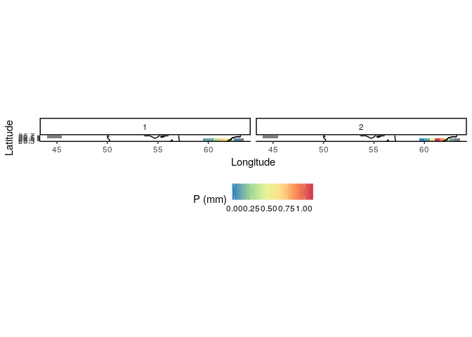
That is proper format for sharing sample data but, it is not a proper reproducible example, this is what I get if I try to make a reprex with your sample data, I think you are not including enough data points to reproduce your issues.

df1 = data.frame(lon = c(59.75, 60.25, 60.75, 61.25, 61.75, 62.25, 62.75, 63.25, 44.25, 44.75, 45.25),
                 lat = c(26.25, 26.25, 26.25, 26.25, 26.25, 26.25, 26.25, 26.25, 26.75, 26.75, 26.75),
                 P = c(0.1, 0.1,0.3, 0.7, 0.6, 0.4, 0.02, NA, NA, NA, NA))

df2= data.frame(lon = c(59.75, 60.25, 60.75, 61.25, 61.75, 62.25, 62.75, 63.25, 44.25, 44.75, 45.25),
                lat = c(26.25, 26.25, 26.25, 26.25, 26.25, 26.25, 26.25, 26.25, 26.75, 26.75, 26.75),
                P = c(0,0.1, 0.5,  1.1,  0.9, 0.5,  0.1,NA, NA, NA, NA))
library(tidyverse)

bind_rows(df1,df2,.id = "Month") %>%
    ggplot(aes(lon, lat, fill = P)) +
    geom_tile() +
    theme_classic() +
    scale_fill_distiller('P (mm)',palette='Spectral') +
    borders('world', xlim=range(df1$lon), ylim=range(df1$lat), colour='black') +
    coord_quickmap(xlim=range(df1$lon), ylim=range(df1$lat)) +
    facet_wrap(vars(Month)) + xlab('Longitude')+ ylab('Latitude') +
    theme(legend.position = "bottom")

In the figure that you got, the 1, 2, etc., the ID rectangles are very large but the figures are very small. Is it possible to shrink the rectangular boxes including '1', '2', etc.

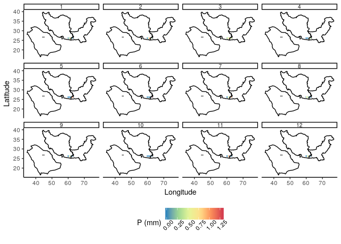
I have twelve such dataframes, each one dataframe is for one month. The 'Month' IDs are not row-wise consecutive, as in the figure below. How to make it consecutive? Where is the factor variable that I tried to convert it to numerical? Thanks.
Rplot

As I say before I can't reproduce your issue because you are not providing reproducible code, so I don't know how else to help you.
I hope some body else could understand your issue with the information you are providing.

Here are the datasets for the 12 months.

df1 = data.frame( lon= c(59.75, 60.25, 60.75, 61.25, 61.75, 62.25 ,62.75, 63.25, 44.25, 44.75, 45.25),
lat = c(26.25, 26.25, 26.25, 26.25, 26.25, 26.25, 26.25, 26.25, 26.75, 26.75, 26.75),
P = c(0.1, 0.1, 0.3, 0.7, 0.6, 0.4, 0.02, NA, NA, NA, NA) )

df2 = data.frame( lon= c(59.75, 60.25, 60.75, 61.25, 61.75, 62.25 ,62.75, 63.25, 44.25, 44.75, 45.25),
lat = c(26.25, 26.25, 26.25, 26.25, 26.25, 26.25, 26.25, 26.25, 26.75, 26.75, 26.75),
P= c(0, 0.1, 0.5, 1.1, 0.9, 0.5, 0.1, NA, NA, NA, NA) )

df3= data.frame( lon= c(59.75, 60.25, 60.75, 61.25, 61.75, 62.25 ,62.75, 63.25, 44.25, 44.75, 45.25),
lat = c(26.25, 26.25, 26.25, 26.25, 26.25, 26.25, 26.25, 26.25, 26.75, 26.75, 26.75),
P= c(0.3, 0.3, 0.5, 0.8, 0.9, 0.6, 0.4, NA, NA, NA, NA))

df4= data.frame( lon =c(59.75, 60.25, 60.75, 61.25, 61.75, 62.25 ,62.75, 63.25, 44.25, 44.75, 45.25),
lat= c(26.25, 26.25, 26.25, 26.25, 26.25, 26.25, 26.25, 26.25, 26.75, 26.75, 26.75),
P= c(0, 0, 0, 0.1, 0.4, 0.6, 0.3, NA, NA, NA, NA))

df5= data.frame( lon =c(59.75, 60.25, 60.75, 61.25, 61.75, 62.25 ,62.75, 63.25, 44.25, 44.75, 45.25),
lat= c(26.25, 26.25, 26.25, 26.25, 26.25, 26.25, 26.25, 26.25, 26.75, 26.75, 26.75),
P= c(0, 0, 0, 0, 0, 0.7, 1.1, NA, NA, NA, NA))

df6 = data.frame( lon =c(59.75, 60.25, 60.75, 61.25, 61.75, 62.25 ,62.75, 63.25, 44.25, 44.75, 45.25),
lat= c(26.25, 26.25, 26.25, 26.25, 26.25, 26.25, 26.25, 26.25, 26.75, 26.75, 26.75),
P= c(0, 0, 0.1, 0, 0, 0, 1.3, NA, NA, NA, NA))

df7= data.frame( lon =c(59.75, 60.25, 60.75, 61.25, 61.75, 62.25 ,62.75, 63.25, 44.25, 44.75, 45.25),
lat= c(26.25, 26.25, 26.25, 26.25, 26.25, 26.25, 26.25, 26.25, 26.75, 26.75, 26.75),
P= c(0, 0, 0.5, 0.5, 0, 0, 1, NA, NA, NA, NA))

df8 = data.frame( lon =c(59.75, 60.25, 60.75, 61.25, 61.75, 62.25 ,62.75, 63.25, 44.25, 44.75, 45.25),
lat= c(26.25, 26.25, 26.25, 26.25, 26.25, 26.25, 26.25, 26.25, 26.75, 26.75, 26.75),
P= c(0, 0.6, 0.4, 0.2, 0, 0, 0, NA, NA, NA, NA))

df9= data.frame( lon =c(59.75, 60.25, 60.75, 61.25, 61.75, 62.25 ,62.75, 63.25, 44.25, 44.75, 45.25),
lat= c(26.25, 26.25, 26.25, 26.25, 26.25, 26.25, 26.25, 26.25, 26.75, 26.75, 26.75),
P= c(0, 0, 0.5, 0.5, 0, 0, 0, NA, NA, NA, NA))

df10 = data.frame( lon =c(59.75, 60.25, 60.75, 61.25, 61.75, 62.25 ,62.75, 63.25, 44.25, 44.75, 45.25),
lat= c(26.25, 26.25, 26.25, 26.25, 26.25, 26.25, 26.25, 26.25, 26.75, 26.75, 26.75),
P= c(0, 0, 0, 0, 0, 0, 0, NA, NA, NA, NA))

df11 = data.frame( lon =c(59.75, 60.25, 60.75, 61.25, 61.75, 62.25 ,62.75, 63.25, 44.25, 44.75, 45.25),
lat= c(26.25, 26.25, 26.25, 26.25, 26.25, 26.25, 26.25, 26.25, 26.75, 26.75, 26.75),
P= c(0, 0, 0.5, 1.1, 0, 0, 0, NA, NA, NA, NA))

df12= data.frame( lon =c(59.75, 60.25, 60.75, 61.25, 61.75, 62.25 ,62.75, 63.25, 44.25, 44.75, 45.25),
lat= c(26.25, 26.25, 26.25, 26.25, 26.25, 26.25, 26.25, 26.25, 26.75, 26.75, 26.75),
P= c(0, 0, 0.5, 0.7, 0.1, 0.1, 0, NA, NA, NA, NA))

In the resulting figure that I pasted above, the 'Month' ID appears in the order:
row 1: 1, 10, 11, 12
row 2: 2, 3, 4, 5
row 3: 6, 7, 8, 9

How to let it to appear as:
row 1: 1, 2, 3, 4
row 2: 5, 6, 7, 8
row 3: 9, 10, 11, 12?

The second question is how to decrease the size of the boxes that have the number: 1, 10, 11, 12, 2, 3, 4, 5, etc? and then enlarge the ggplot size? Thanks to anyone who can help.
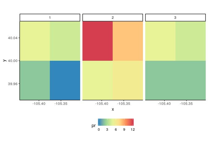
  • You can convert the Month variable to numeric to avoid the ordering issue
  • You can modify the appearance of the facet labels with the theme() function, but the proportions of the facets are afected by the limits you set in coord_quickmap()

See the example bellow.

library(tidyverse)

bind_rows(df1,df2,df3,df4,df5,df6,df7,df8,df9,df10,df11,df12,.id = "Month") %>%
    mutate(Month = as.numeric(Month)) %>% # Convert the categorical variable to numeric
    ggplot(aes(lon, lat, fill = P)) +
    geom_tile() +
    theme_classic() +
    scale_fill_distiller('P (mm)',palette='Spectral') +
    borders('world', xlim=range(df1$lon), ylim=range(df1$lat), colour='black') +
    #coord_quickmap(xlim=range(df1$lon), ylim=range(df1$lat)) + # The proportions of the facets are afected by this limits
    facet_wrap(vars(Month)) + xlab('Longitude') + ylab('Latitude') +
        theme(legend.position = "bottom",
          legend.text = element_text(angle = 45),
          strip.text.x = element_text(size = 8, margin = margin(0, 0, 0, 0, "cm"))) # Modify facet labels appearance

Thanks, this is much better. But if I do not add this line in the script, there will be many unnecessary areas around which decreases the size of the main area. Thus my data cannot explain the central point. Would there be some solutions? Thanks.

coord_quickmap(xlim=range(d1.mon$lon), ylim=range(d1.mon$lat)) +

You could manually define (fine tune) more suitable limits for the plot e.g.

coord_quickmap(xlim=c(42, 68), ylim = c(20, 35)) +

This topic was automatically closed 7 days after the last reply. New replies are no longer allowed.

If you have a query related to it or one of the replies, start a new topic and refer back with a link.