How to add secondary Y axis to ggplot with proper values (scale) ?

Hi, I am a bit struggle with the following code and want to add secondary Y axis (which I did) with proper counts as addition to first Y axis with percentages. Please help.
Additionally my next question is, how to adjust position of counts or percentages on bars with vjust or hjust for individual values not all of them simultaneously ?
And next if I would like to round percentages on bars to two digits, how do I do it here ?
Maybe is there a cleaner way of writing this code as well ?

Thank you for any help regarding this matter.

What I tried so far:

library(tidyverse)
#

recoded <- structure(list(Sex_recod = structure(c(1L, 1L, 1L, 2L, 2L, 2L
), .Label = c("Women", "Men"), class = "factor"), Education_recod = structure(c(1L, 
2L, 3L, 1L, 2L, 3L), .Label = c("basic", "secondary", "high"), class = "factor"), 
    Sex_length = c(10L, 50L, 22L, 18L, 11L, 11L), Sex_prop = c(12.2, 
    61, 26.8, 45, 27.5, 27.5)), row.names = c(NA, -6L), groups = structure(list(
    Sex_recod = structure(1:2, .Label = c("Women", "Men"), class = "factor"), 
    .rows = structure(list(1:3, 4:6), ptype = integer(0), class = c("vctrs_list_of", 
    "vctrs_vctr", "list"))), class = c("tbl_df", "tbl", "data.frame"
), row.names = c(NA, -2L), .drop = TRUE), class = c("grouped_df", 
"tbl_df", "tbl", "data.frame"))


recoded$Education_recod <- factor(recoded$Education_recod)

recoded$Sex_recod <- factor(recoded$Sex_recod)

levels(recoded$Education_recod) <- c("basic", "secondary", "high")

levels(recoded$Sex_recod) <- c("Women", "Men")


colnames(recoded) <- c("Sex_recod", "Education_recod", "Sex_length", "Sex_prop")


ggplot(recoded, aes(x = "", 
                         y = Sex_prop, 
                         fill = Education_recod, 
                         group = Education_recod)) +  
  geom_bar(stat = "identity", position = position_dodge(width = 0.9)) +
  geom_text(aes(label = paste(Sex_prop, "%", sep = ""), 
                group = Education_recod), 
            position = position_dodge(width = 0.9),
            vjust = -0.8)+
  facet_wrap(~ Sex_recod) + 
  scale_y_continuous("Percentage (%)", sec.axis = sec_axis(~., name = "Counts")) +
  scale_x_discrete("") + 
  theme(plot.title = element_text(hjust = 0.5), panel.grid.major.x = element_blank())+
scale_x_discrete("Divided into groups: Women and Men")+
 geom_text(position=position_dodge(width = 0.9), aes(label=(Sex_length), vjust = 3.5))
#> Scale for 'x' is already present. Adding another scale for 'x', which will
#> replace the existing scale.
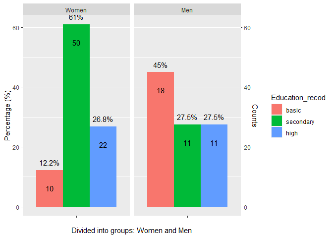
Created on 2021-11-13 by the reprex package (v2.0.1)
Hi ,
I tried with scales::rescale, but it throws an error:
"Error: transformation for secondary axes must be monotonic"

library(tidyverse)
#>

recoded <- structure(list(Sex_recod = structure(c(1L, 1L, 1L, 2L, 2L, 2L
), .Label = c("Women", "Men"), class = "factor"), Education_recod = structure(c(1L, 
2L, 3L, 1L, 2L, 3L), .Label = c("basic", "secondary", "high"), class = "factor"), 
    Sex_length = c(10L, 50L, 22L, 18L, 11L, 11L), Sex_prop = c(12.2, 
    61, 26.8, 45, 27.5, 27.5)), row.names = c(NA, -6L), groups = structure(list(
    Sex_recod = structure(1:2, .Label = c("Women", "Men"), class = "factor"), 
    .rows = structure(list(1:3, 4:6), ptype = integer(0), class = c("vctrs_list_of", 
    "vctrs_vctr", "list"))), class = c("tbl_df", "tbl", "data.frame"
), row.names = c(NA, -2L), .drop = TRUE), class = c("grouped_df", 
"tbl_df", "tbl", "data.frame"))

recoded$Education_recod <- factor(recoded$Education_recod)

recoded$Sex_recod <- factor(recoded$Sex_recod)

levels(recoded$Education_recod) <- c("basic", "secondary", "high")

levels(recoded$Sex_recod) <- c("Women", "Men")


colnames(recoded) <- c("Sex_recod", "Education_recod", "Sex_length", "Sex_prop")

ggplot(recoded, aes(
  x = "",
  y = Sex_prop,
  fill = Education_recod,
  group = Education_recod
)) +
  geom_bar(stat = "identity", position = position_dodge(width = 0.9)) +
  geom_text(aes(
    label = paste(Sex_prop, "%", sep = ""),
    group = Education_recod
  ),
  position = position_dodge(width = 0.9),
  vjust = -0.8
  ) +
  facet_wrap(~Sex_recod) +
  scale_y_continuous("Percentage (%)", sec.axis = sec_axis(~ scales::rescale(recoded$Sex_length, to = range(0:60)), name = "Counts")) +
  scale_x_discrete("") +
  theme(plot.title = element_text(hjust = 0.5), panel.grid.major.x = element_blank()) +
  scale_x_discrete("Divided into groups: Women and Men") +
  geom_text(position = position_dodge(width = 0.9), aes(label = (Sex_length), vjust = 3.5))
#> Scale for 'x' is already present. Adding another scale for 'x', which will
#> replace the existing scale.
> Error: transformation for secondary axes must be monotonic

Created on 2021-11-13 by the reprex package (v2.0.1)

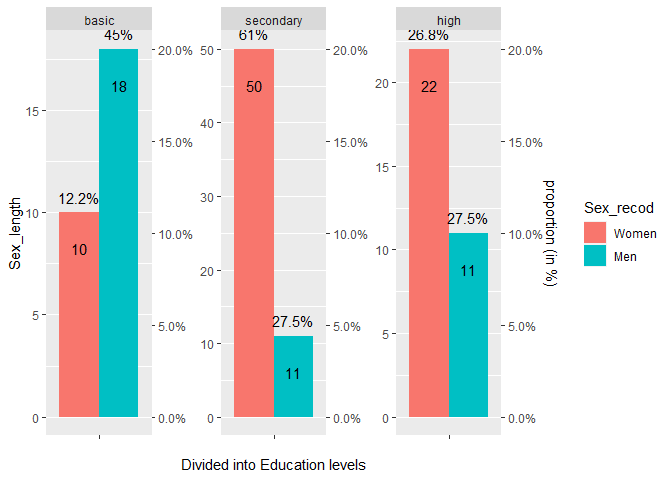
Constantly trying I have come up with this, which is closer to my desire.
I would like to correct % scale as it is a bit off and apply individual %scales and ranges to each facets from facet_wrap().
Any help would be greatly appreciated.

library(tidyverse)
#>
recoded <- structure(list(
  Sex_recod = structure(c(1L, 1L, 1L, 2L, 2L, 2L), .Label = c("Women", "Men"), class = "factor"), Education_recod = structure(c(
    1L,
    2L, 3L, 1L, 2L, 3L
  ), .Label = c("basic", "secondary", "high"), class = "factor"),
  Sex_length = c(10L, 50L, 22L, 18L, 11L, 11L), Sex_prop = c(
    12.2,
    61, 26.8, 45, 27.5, 27.5
  )
), row.names = c(NA, -6L), groups = structure(list(
  Sex_recod = structure(1:2, .Label = c("Women", "Men"), class = "factor"),
  .rows = structure(list(1:3, 4:6), ptype = integer(0), class = c(
    "vctrs_list_of",
    "vctrs_vctr", "list"
  ))
), class = c("tbl_df", "tbl", "data.frame"), row.names = c(NA, -2L), .drop = TRUE), class = c(
  "grouped_df",
  "tbl_df", "tbl", "data.frame"
))


recoded$Education_recod <- factor(recoded$Education_recod)

recoded$Sex_recod <- factor(recoded$Sex_recod)

levels(recoded$Education_recod) <- c("basic", "secondary", "high")

levels(recoded$Sex_recod) <- c("Women", "Men")


colnames(recoded) <- c("Sex_recod", "Education_recod", "Sex_length", "Sex_prop")


ggplot(recoded, aes(
  x = "",
  y = Sex_length,
  fill = Sex_recod,
  group = Sex_recod
)) +
  geom_bar(stat = "identity", position = position_dodge(width = 0.9)) +
  geom_text(aes(
    label = paste(Sex_prop, "%", sep = ""),
    group = Sex_recod
  ),
  position = position_dodge(width = 0.9),
  vjust = -0.8
  ) +
  facet_wrap(~Education_recod, scales = "free") +
  scale_y_continuous("Counts", sec.axis = sec_axis(trans = ~., name = "Counts")) +
  scale_x_discrete("") +
  theme(plot.title = element_text(hjust = 0.5), panel.grid.major.x = element_blank()) +
  scale_x_discrete("Divided into Education levels") +
  geom_text(position = position_dodge(width = 0.9), aes(label = (Sex_length), vjust = 3.5)) +
  ggplot2::scale_y_continuous(
    sec.axis = ggplot2::sec_axis(
      trans = ~ ((.) / sum(.) * 100),
      labels = scales::percent,
      name = "proportion (in %)"
    )
  )
#> Scale for 'x' is already present. Adding another scale for 'x', which will
#> replace the existing scale.
#> Scale for 'y' is already present. Adding another scale for 'y', which will
#> replace the existing scale.

Created on 2021-11-13 by the reprex package (v2.0.1)

Hi @Andrzej ––I'm not super familiar with scales, and your plot code is already more complicated than what I've tried to do in the past with that package. But I do know that applying different formatting to different facets is notoriously difficult in ggplot. For example, in this post, the OP is asking how to add different secondary axes to different facets, and it seems that the answer is that you... can't really do that.

One workaround, as shown in that post, would be to add a geom_text() layer for the other axes, but that seems like it could get really complicated in your case. A better way, I think, would be to plot each of the plots individually and then combine them side by side using something like cowplot::plot_grid() or the newer patchwork package.

But it's worth noting, in all of this, that ggplot2 deliberately makes it difficult to do the kind of thing you're attempting here. There's a lot of controversy in data visualization about whether or not it's a good idea to include two axes on the same plot, and in the interest of providing a coherent grammar of graphics, ggplot doesn't facilitate doing this because you "shouldn't". See more discussion here about its limitations. You might have more luck trying base R.

Thank you very much @kaijabean,
that was really helpful. I will try to do it with patchwork and place two plots side-by side.
best,
Andrzej

This topic was automatically closed 21 days after the last reply. New replies are no longer allowed.

If you have a query related to it or one of the replies, start a new topic and refer back with a link.