Hello,
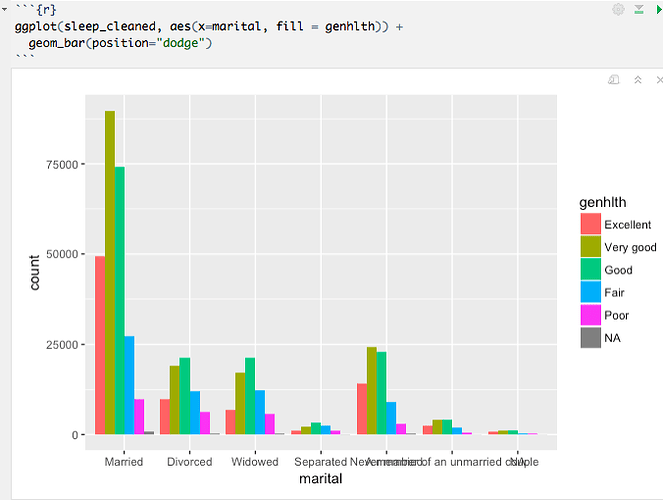
I have two categorical variables and I would like to compare the two of them in a graph.Logically I need the ratio. I have no idea how to do that, could anyone please kindly hint me towards the right direction? They are considered as factors in my database.
'data.frame': 484351 obs. of 2 variables: marital: Factor w/ 6 levels "Married","Divorced",..: 1 1 1 1 2 1 3 1 1 1 ...
genhlth: Factor w/ 5 levels "Excellent","Very good",..: 3 3 2 3 2 4 3 1 3 3 ..
My X value is general health and my Y value is marital status. The graph below gives an idea of what I am looking for.
Thanks in advance,
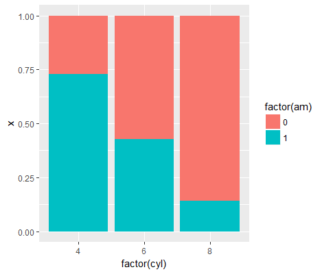
Hi, I was able to get the ratio with some data manipulation prior to plotting, hopefully this is what you need:
library(dplyr)
library(ggplot2)

mtcars %>%
  group_by(cyl, am) %>%
  tally() %>%
  group_by(cyl) %>%
  mutate(x = n / sum(n)) %>%
  ggplot() +
    geom_col(aes(
      x = factor(cyl),
      y = x,
      fill = factor(am)
      ), position = "stack")
1 Like
edgararuiz:
mtcars %>%
THANK YOU EDGAR!!!! I am very happy, it is exactly what I needed!
1 Like
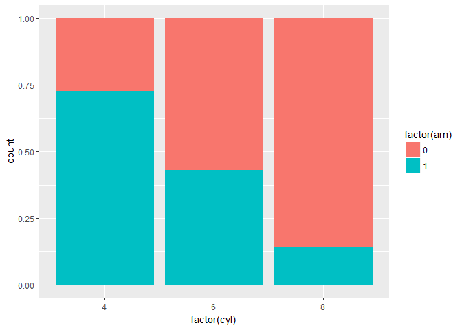
or let ggplot2 do all the work:
library(ggplot2)

ggplot(data = mtcars) +
  geom_bar(aes(x = factor(cyl), fill = factor(am)), position = "fill")


