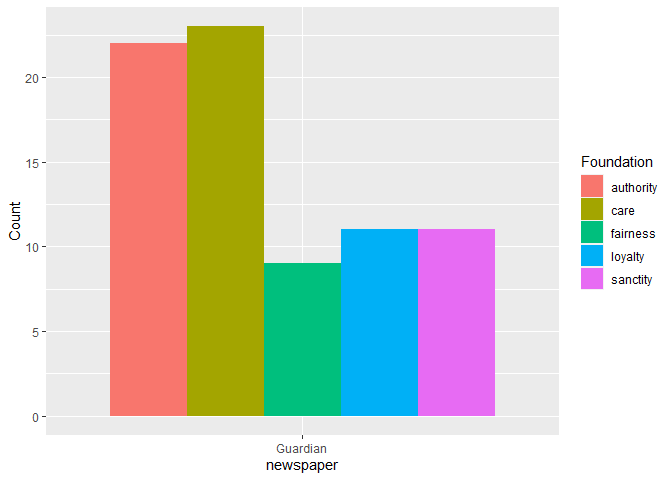
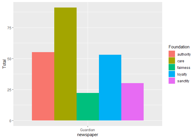
Hey guys! My dissertation is due very very soon and I am s t r u g g l i n g with R Studio. I would like to create a bar chart of some categorical variables that I have gotten through quanteda. I am a total beginner and have been trying all day to make this and don't really have the time to spare to keep looking at youtube tutorials.
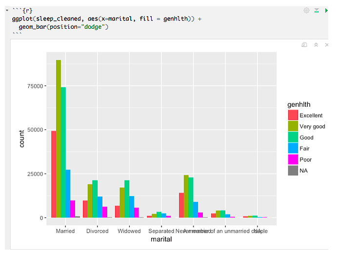
I need to make exactly this (but with my data - also I hope Christine doesn't mind my using this as a demonstration, I took it from her R query here) :
My question is, how did she create the fill variables, "genhlth" ???
I have tried merging columns from the data set that I am using with the "cbind()" function, but I assume the issue is that they need to be assigned to each variable. I know it's hard to explain but my code is terrible, so I don't think it will help. Can someone just explain to me the basics of getting that kind of bar chart from a categorical dataset? Unfortunately the tutorials only explain how to create it, not how to create the identifying variables. I am very embarassed as I am sure this is very simple, but will be forever grateful for any sort of help possible!!!
Sincerely,
Desperate


