I am trying to change the title of the legend for the confidence intervals produced by the fable autoplot or autolayer functions to say "Confidence Interval" instead of "level".
I tried adding level = "Confidence Interval" to the labs function based on the answer to this question: Change legend title of forecast plot - #3 by budugulo but that was using the fpp3 library and it doesn't seem to work with fable or fabletools. I have tried reading google search results and asking ChatGPT back and forth for hours and I can't figure out how to change that title.
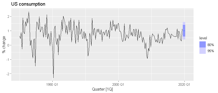
These are not confidence intervals. They are prediction intervals. There is a difference.
The fpp3 package loads the fable and fabletools packages (and a few others). Any code that loads fpp3 will also be using the fable package and its friends.
Now, to answer the question. The autoplot() function is returning a ggplot object, so you can use ggplot functions to modify it. In this case, you need to replace the title of the fill_ramp guide.
THANK YOU! I seriously can't thank you enough. I spent hours trying to figure this out yesterday and even though I knew it could be edited with ggplot, I couldn't seem to figure out the right combination of ggplot functions and variable names... Maybe I need to do a deep study of ggplot.
Here's my actual code. I couldn't easily share the data so I just made a simple reprex to explain what I was trying to do. The last line was added based on your answer and fixed my problem.
cuny_ts |>
  autoplot(enrl, color = "#0033A1", linewidth = 1) +
  geom_line(data = fitted(fit_ensemble),
            aes(y = .fitted), alpha = 1,  color = "#FFB71B", linewidth = 1) +
  autolayer(fc_ensemble, alpha = 0.35, level = 80,  color = "#FFB71B", linewidth = 1) + # makes the prediction interval transparent
  autolayer(fc_ensemble, alpha = 1, level = NULL,color = "#FFB71B", linewidth = 1) +  # makes the forecast line the correct solid CUNY branded color not a transparent version of it
  labs(x = "Year",
       y = "Number of Students",
       title = "CUNY Total Undergraduate Enrollment from 1990-2023 With 10-Year Forecast") +
  scale_y_continuous(labels = scales::comma_format()) +
  theme_bw(base_size = 10)  +
  guides(fill_ramp = guide_legend(title = "Prediction Interval"))
Unfortunately I am not allowed to share the plot that it produces publicly.
And THANK YOU again for correcting my understanding of the prediction interval vs confidence interval. I really appreciate that and will be correcting my report. I read Forecasting: Principles and Practice (3rd ed) almost cover to cover while working on this project to try to make sure I did everything correctly but I still feel a little shaky on some things and know I have a lot more to learn...