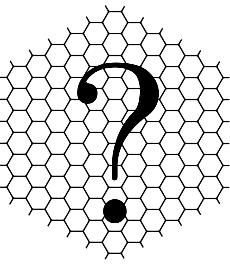
For parallelism, perhaps we need a fake hex logo for "uncategorized"? Maybe just a hex sticker with a big question mark in the middle.
4 Likes
I definitely agree with this! The Uncategorized & RStudio::conf categories just look like something is missing. There is a lot of white space around the categories that looks awkward.
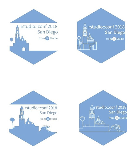
I think that a stylized question mark would look great in a hex, but I'm not sure what to use for the RStudio::conf hex. Do you have any thoughts on that @jennybryan?
The size and whitespace issue has been raised here and is a good point: Category hexes are too large
I don't have an idea for the rstudio::conf hex, but agree that it would be better to have one.
2 Likes
That's the exact post that got me thinking about the design of the website earlier today.
There is a new post today talking about a hex for rstudio::conf. I think that they look pretty good, and thought you might want to check them out.
1 Like
We got you covered, @jennybryan! @dlsweet posted a link to a parallel discussion
Let's now address the rstudio::conf hex logo? ![]()