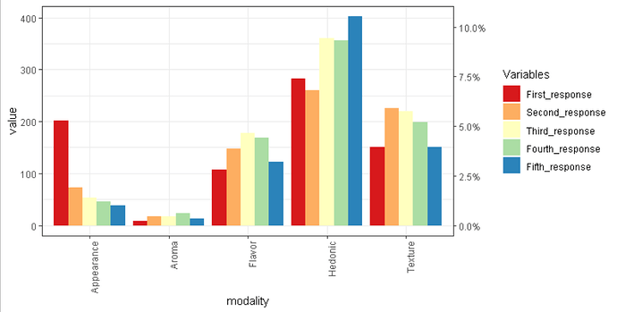
Can you show a drawing like you did before regarding what do you want to get ?
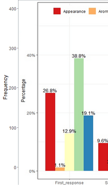
The main thing was to have 2 axis, percent and frequency on primary and secondary axis. But because it seems not possible I am just playing with my graph. But here is a drawing where I had everything in percentage.
The x and y refer to the legend position on the graph. Just play around with the numbers.
For example:
ggplot(dat, aes(variable, value, fill=interaction(modality))) +
  geom_bar(stat='identity', position='dodge') +
  theme_bw() +
  scale_fill_brewer('Variables', palette='Spectral') + geom_text(aes(label=value), position=position_dodge(width=0.9), vjust=-0.25) +
  theme(legend.title=element_blank()) +
  labs(x = NULL, y = "Frequency") +
  theme(legend.position = c(.3, .95),legend.direction = "horizontal")
Hi @andresrcs, I have read your solution in this post:
https://forum.posit.co/t/adding-percentages-to-a-bargraph-in-ggplot/35860
but I am still confsed how to convert counts to percentages in this plot.
Can you advise, please ?
Thanks for the extended effort. I shall go through it later today.
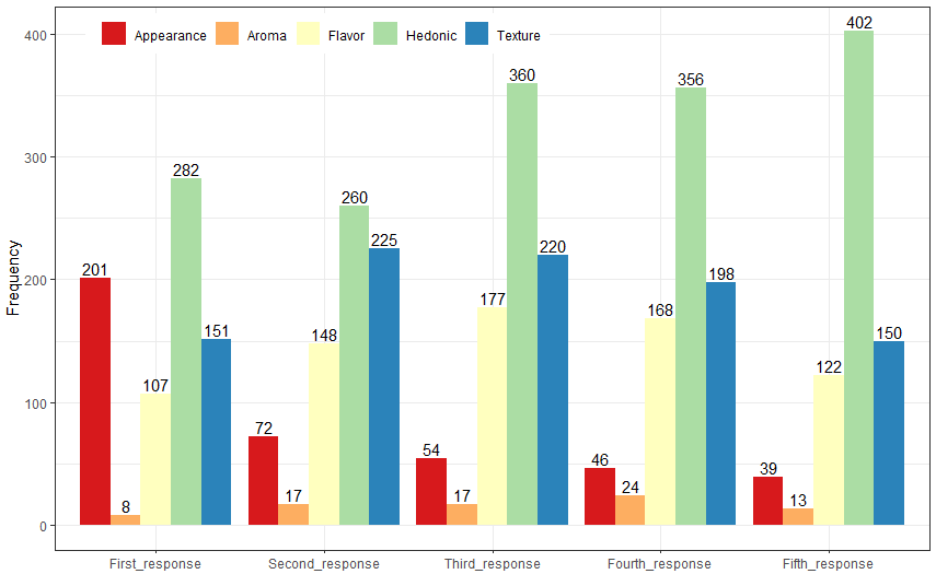
Otherwise, If you divide column response by frequency column, you should be able to get %. Like, first response has 201 count for appearance and if you divide it by frequency column 749, its percent (27%). Similar to other columns.
Thanks a lot!
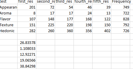
Making the conversion on the data is trivial, the challenge would be to get a primary y-axis with frequency and a secondary y-axis with percentages, I don't know how to do it or if it's possible with ggplot2, I think you can do it with base R and lattice but I don't remember how.
library(tidyverse)

df <- data.frame(
   First_response = c(201L, 8L, 107L, 151L, 282L),
  Second_response = c(72L, 17L, 148L, 225L, 260L),
   Third_response = c(54L, 17L, 177L, 220L, 360L),
  Fourth_response = c(46L, 24L, 168L, 198L, 356L),
   Fifth_response = c(39L, 13L, 122L, 150L, 402L),
        Frequency = c(749L, 722L, 828L, 792L, 726L),
         modality = as.factor(c("Appearance",
                                "Aroma","Flavor","Texture","Hedonic"))
)

df %>%
    mutate_at(vars(-modality, - Frequency), ~ . / Frequency) %>%
    gather(Response, Percentage, First_response:Fifth_response) %>%
    mutate(Response = factor(Response,
                      levels = c("First_response", "Second_response",
                                 "Third_response", "Fourth_response",
                                 "Fifth_response"))) %>%
    ggplot(aes(x = Response, y = Percentage, fill = modality)) +
    geom_col(position = "dodge") +
    geom_text(aes(label = scales::percent(Percentage,
                                          accuracy = 0.1)),
              position = position_dodge(width=0.9),
              vjust = -0.25) +
    labs(x = NULL, y = "Percentage") +
    scale_y_continuous(labels = scales::label_percent()) +
    scale_fill_brewer('Variables', palette='Spectral') +
    theme_bw() +
    theme(legend.title = element_blank(),
          legend.position = c(.3, .95),
          legend.direction = "horizontal")
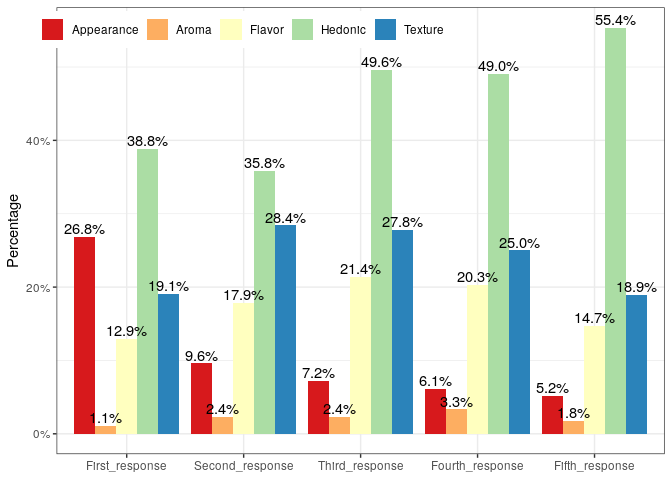
Thank you very much indeed @andresrcs for your kind reply and help.
I learned a lot and now I will try to figure something out to have both y-axises.
With data.table
library(data.table)
library(ggplot2)
dt<- structure(list(modality = structure(c(1L, 2L, 3L, 5L, 4L), .Label = c("Appearance",
                              "Aroma", "Flavor", "Hedonic", "Texture"), class = "factor"),
                     First_response = c(201L, 8L, 107L, 151L, 282L),
                     Second_response = c(72L,  17L, 148L, 225L, 260L),
                     Third_response = c(54L, 17L, 177L,  220L, 360L),
                     Fourth_response = c(46L, 24L, 168L, 198L, 356L ),
                     Fifth_response = c(39L, 13L, 122L, 150L, 402L),
                     Frequency = c(749L, 722L, 828L, 792L, 726L)), class = "data.frame",
                row.names = c(NA,-5L))
dt1<-data.table(dt)[,.SD/Frequency,by=c("Frequency","modality"),.SDcols=2:6]
dat <- melt(dt1,id.vars = c("Frequency","modality"),variable.name = "Response", value.name = "Percentage",variable.factor=TRUE)
dat[,ggplot(.SD,aes(x = Response, y = Percentage, fill = modality)) +
  geom_col(position = "dodge") +
  geom_text(aes(label = scales::percent(Percentage, accuracy = 0.1)),
            position = position_dodge(width=0.9), vjust = -0.25) +
  labs(x = NULL, y = "Percentage") +
  scale_y_continuous(labels = scales::label_percent()) +
  scale_fill_brewer('Variables', palette='Spectral') +
  theme_bw() +
  theme(legend.title = element_blank(),
        legend.position = c(.3, .95),
        legend.direction = "horizontal"),]
Thanks @Hermes I tried to run the code you pasted above, but its showing an error "Error: 'label_percent' is not an exported object from 'namespace:scales'.
dt<- structure(list(modality = structure(c(1L, 2L, 3L, 5L, 4L), .Label = c("Appearance",
                                                                           "Aroma", "Flavor", "Hedonic", "Texture"), class = "factor"),
                    First_response = c(201L, 8L, 107L, 151L, 282L),
                    Second_response = c(72L,  17L, 148L, 225L, 260L),
                    Third_response = c(54L, 17L, 177L,  220L, 360L),
                    Fourth_response = c(46L, 24L, 168L, 198L, 356L ),
                    Fifth_response = c(39L, 13L, 122L, 150L, 402L),
                    Frequency = c(749L, 722L, 828L, 792L, 726L)), class = "data.frame",
               row.names = c(NA,-5L))
dt1<-data.table(dt)[,.SD/Frequency,by=c("Frequency","modality"),.SDcols=2:6]
#> Error in data.table(dt): could not find function "data.table"
dat <- melt(dt1,id.vars = c("Frequency","modality"),variable.name = "Response", value.name = "Percentage",variable.factor=TRUE)
#> Error in melt(dt1, id.vars = c("Frequency", "modality"), variable.name = "Response", : could not find function "melt"
dat[,ggplot(.SD,aes(x = Response, y = Percentage, fill = modality)) +
      geom_col(position = "dodge") +
      geom_text(aes(label = scales::percent(Percentage, accuracy = 0.1)),
                position = position_dodge(width=0.9), vjust = -0.25) +
      labs(x = NULL, y = "Percentage") +
      scale_y_continuous(labels = scales::label_percent()) +
      scale_fill_brewer('Variables', palette='Spectral') +
      theme_bw() +
      theme(legend.title = element_blank(),
            legend.position = c(.3, .95),
            legend.direction = "horizontal"),]
#> Error in eval(expr, envir, enclos): object 'dat' not found
Created on 2020-04-11 by the reprex package (v0.3.0)
library(data.table)
It's something else. I already have function "data.table". Here you go,
library(ggplot2)
#> Warning: package 'ggplot2' was built under R version 3.5.3
library(reprex)
#> Warning: package 'reprex' was built under R version 3.5.3
library(tidyverse)
#> Warning: package 'tidyverse' was built under R version 3.5.3
#> Warning: package 'tibble' was built under R version 3.5.3
#> Warning: package 'tidyr' was built under R version 3.5.3
#> Warning: package 'purrr' was built under R version 3.5.3
#> Warning: package 'dplyr' was built under R version 3.5.3
#> Warning: package 'stringr' was built under R version 3.5.3
library(reshape2)
#> Warning: package 'reshape2' was built under R version 3.5.3
#>
#> Attaching package: 'reshape2'
#> The following object is masked from 'package:tidyr':
#>
#>     smiths
library(data.table)
#>
#> Attaching package: 'data.table'
#> The following objects are masked from 'package:reshape2':
#>
#>     dcast, melt
#> The following objects are masked from 'package:dplyr':
#>
#>     between, first, last
#> The following object is masked from 'package:purrr':
#>
#>     transpose
#Help from R-community

dt<- structure(list(modality = structure(c(1L, 2L, 3L, 5L, 4L), .Label = c("Appearance",
                                                                           "Aroma", "Flavor", "Hedonic", "Texture"), class = "factor"),
                    First_response = c(201L, 8L, 107L, 151L, 282L),
                    Second_response = c(72L,  17L, 148L, 225L, 260L),
                    Third_response = c(54L, 17L, 177L,  220L, 360L),
                    Fourth_response = c(46L, 24L, 168L, 198L, 356L ),
                    Fifth_response = c(39L, 13L, 122L, 150L, 402L),
                    Frequency = c(749L, 722L, 828L, 792L, 726L)), class = "data.frame",
               row.names = c(NA,-5L))
dt1<-data.table(dt)[,.SD/Frequency,by=c("Frequency","modality"),.SDcols=2:6]
dat <- melt(dt1,id.vars = c("Frequency","modality"),variable.name = "Response", value.name = "Percentage",variable.factor=TRUE)
dat[,ggplot(.SD,aes(x = Response, y = Percentage, fill = modality)) +
      geom_col(position = "dodge") +
      geom_text(aes(label = scales::percent(Percentage, accuracy = 0.1)),
                position = position_dodge(width=0.9), vjust = -0.25) +
      labs(x = NULL, y = "Percentage") +
      scale_y_continuous(labels = scales::label_percent()) +
      scale_fill_brewer('Variables', palette='Spectral') +
      theme_bw() +
      theme(legend.title = element_blank(),
            legend.position = c(.3, .95),
            legend.direction = "horizontal"),]
#> Error: 'label_percent' is not an exported object from 'namespace:scales'
Created on 2020-04-11 by the reprex package (v0.3.0)
Update scales package, that function is rather new
Thanks, I got it. But it still missing both y-axis.
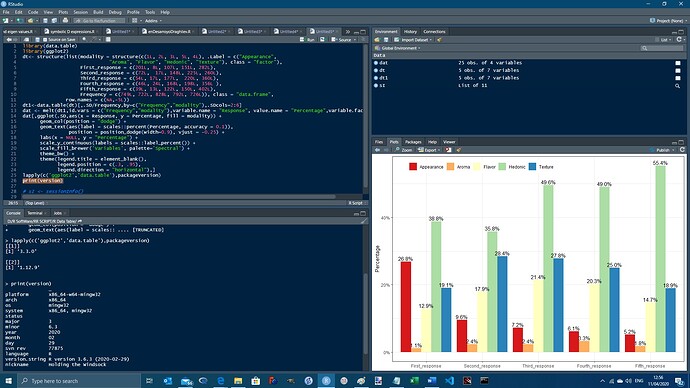
With these versions of data.table and ggplot2, it runs correctly:
>lapply(c('ggplot2','data.table'),packageVersion)
[[1]]
[1] ‘3.3.0’

[[2]]
[1] ‘1.12.9’
print(version)
               _
platform       x86_64-w64-mingw32
arch           x86_64
os             mingw32
system         x86_64, mingw32
status
major          3
minor          6.3
year           2020
month          02
day            29
svn rev        77875
language       R
version.string R version 3.6.3 (2020-02-29)
nickname       Holding the Windsock
Yes, it is. I want both percentage and frequency. The plot you attached looks good, I think.
But unfortunately, I think that, this is virtually impossible to do.
Maybe with some rearrangement of data layout somehow ?
Okay, but how you produced the above graph, it had both frequency and %.
It was done in Windows Paint because I just wanted to make sure that I understood you correctly.
I used Andrzej post as a starting point.
Here is second axis with percentage values, this only would make sense if the percentage is of the total frequency of the entire data (i.e. ignores groupings), so this is what is shown
df <- structure(list(
  modality = structure(c(1L, 2L, 3L, 5L, 4L), .Label = c(
    "Appearance",
    "Aroma", "Flavor", "Hedonic", "Texture"
  ), class = "factor"),
  First_response = c(201L, 8L, 107L, 151L, 282L), Second_response = c(
    72L,
    17L, 148L, 225L, 260L
  ), Third_response = c(
    54L, 17L, 177L,
    220L, 360L
  ), Fourth_response = c(46L, 24L, 168L, 198L, 356L), Fifth_response = c(39L, 13L, 122L, 150L, 402L), Frequency = c(
    749L,
    722L, 828L, 792L, 726L
  )
), class = "data.frame", row.names = c(
  NA,
  -5L
))

library(reshape2)
library(ggplot2)
library(tidyverse)
library(scales)

df2 <- select(df, -Frequency)

dat <- melt(df2)

# to linear scale frequency values into % of global total
data_total <- sum(dat$value)

# > Using modality as id variables
ggplot(dat, aes(modality, value, fill = interaction(variable))) +
  geom_bar(stat = "identity", position = "dodge") +
  theme_bw() +
  theme(axis.text.x = element_text(angle = 90, hjust = 1)) +
  scale_fill_brewer("Variables", palette = "Spectral") +
  scale_y_continuous(sec.axis = sec_axis(~ . / data_total, labels = percent))
