Help with bar graph in ggplot

Hello, I am new to R and trying to generate bar plot by using ggplot?

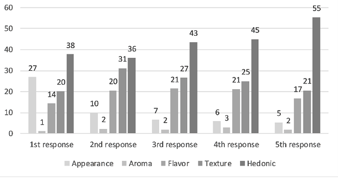
I tried to wrote code for it, but I am not getting what I want. I want first response, second response at x while each modality, say appearance-bar followed by aroma-bar, flavor-bar, and so on for 1st and all other responses. Also I want frequency column as secondary axis in plot?
df <- read.csv("F:/_Figures/open_end_frequency_response.csv")
colnames(df)[1] = "modality"
colnames(df)[2] = "First_response"
colnames(df)[3] = "Second_response"
colnames(df)[4] = "Third_response"
colnames(df)[5] = "Fourth_response"
colnames(df)[6] = "Fifth_response"
library(ggplot2)
ggplot(data.frame(df), aes(x=modality)) +
geom_bar()

Annotation 2020-04-07 174542

Hi, and welcome!

Please see the FAQ: What's a reproducible example (`reprex`) and how do I do one? Using a reprex, complete with representative data will attract quicker and more answers.

Although it's not in the preferred reprex format which is best for cut and past, the code is fine except for one major shortcoming -- the data object, df.

Because this is a relatively short and simple data set, rather than a screenshot, which is seldom useful, what would be helpful is to

dput(df)

and copy/paste after entering

df <- [paste here]

A shortcut direct to clipboard is

require(clipr)
#> Loading required package: clipr
#> Welcome to clipr. See ?write_clip for advisories on writing to the clipboard in R.
require(magrittr)
#> Loading required package: magrittr
require(stringr)
#> Loading required package: stringr

specimen <- function(x)
  deparse(x) %>%
  str_c(collapse = '') %>%
  str_replace_all('\\s+', ' ') %>%
  str_replace_all('\\s*([^,\\()]+ =) (c\\()', '\n  \\1\n    \\2')  %>%
  str_replace_all('(,) (class =)', '\\1\n  \\2') %>%
  write_clip(allow_non_interactive = TRUE)

specimen(dat)

A few suggestions for redoing this

library(ggplot2) # should go first
df <- [paste]
colnames(df) <- c("modality","First_response","Second_response","Third_response","Fourth_response,"Sixth_response")
ggplot(df, aes(x = modality) # df is already a data frame

Thanks, for the suggestion. I used reprex here:

library(ggplot2)
install.packages("reprex")
library(reprex)
df <- read.csv("F:/open_end_frequency_response.csv")
colnames(df)[1] = "modality"
colnames(df)[2] = "First_response"
colnames(df)[3] = "Second_response"
colnames(df)[4] = "Third_response"
colnames(df)[5] = "Fourth_response"
colnames(df)[6] = "Fifth_response"
dput(df)
colnames(df) <- c("modality","First_response","Second_response","Third_response",
"Fourth_response", "Fifth_response", "Frequency")
ggplot(df, aes(x = modality)) +
geom_bar()

Sorry I was unclear!

After dput(df) there will be some output on the screen that looks like this

structure(list(mpg = c(21, 21, 22.8), cyl = c(6, 6, 4), disp = c(160, 
160, 108), hp = c(110, 110, 93), drat = c(3.9, 3.9, 3.85), wt = c(2.62, 
2.875, 2.32), qsec = c(16.46, 17.02, 18.61), vs = c(0, 0, 1), 
    am = c(1, 1, 1), gear = c(4, 4, 4), carb = c(4, 4, 1)), row.names = c("Mazda RX4", 
"Mazda RX4 Wag", "Datsun 710"), class = "data.frame")

and it would be cut and pasted in to reprex (easiest with the addin option from RStudio--just search for rep

my_data <-
  structure(
    list(
      mpg = c(21, 21, 22.8),
      cyl = c(6, 6, 4),
      disp = c(160,
               160, 108),
      hp = c(110, 110, 93),
      drat = c(3.9, 3.9, 3.85),
      wt = c(2.62,
             2.875, 2.32),
      qsec = c(16.46, 17.02, 18.61),
      vs = c(0, 0, 1),
      am = c(1, 1, 1),
      gear = c(4, 4, 4),
      carb = c(4, 4, 1)
    ),
    row.names = c("Mazda RX4",
                  "Mazda RX4 Wag", "Datsun 710"),
    class = "data.frame"
  )
length(my_data)
#> [1] 11

Created on 2020-04-06 by the reprex package (v0.3.0)

Off to bed. Will check back tomorrow

library(ggplot2)
#> Warning: package 'ggplot2' was built under R version 3.5.3
library(reprex)
#> Warning: package 'reprex' was built under R version 3.5.3
df <- read.csv("F:/SensoryPhD_Files/Chapter2_Figures/open_end_frequency_response.csv")
colnames(df)[1] = "modality"
colnames(df)[2] = "First_response"
colnames(df)[3] = "Second_response"
colnames(df)[4] = "Third_response"
colnames(df)[5] = "Fourth_response"
colnames(df)[6] = "Fifth_response"
dput(df)
#> structure(list(modality = structure(c(1L, 2L, 3L, 5L, 4L), .Label = c("Appearance", 
#> "Aroma", "Flavor", "Hedonic", "Texture"), class = "factor"), 
#>     First_response = c(201L, 8L, 107L, 151L, 282L), Second_response = c(72L, 
#>     17L, 148L, 225L, 260L), Third_response = c(54L, 17L, 177L, 
#>     220L, 360L), Fourth_response = c(46L, 24L, 168L, 198L, 356L
#>     ), Fifth_response = c(39L, 13L, 122L, 150L, 402L), Frequency = c(749L, 
#>     722L, 828L, 792L, 726L)), class = "data.frame", row.names = c(NA, 
#> -5L))
df <- dput(df)
#> structure(list(modality = structure(c(1L, 2L, 3L, 5L, 4L), .Label = c("Appearance", 
#> "Aroma", "Flavor", "Hedonic", "Texture"), class = "factor"), 
#>     First_response = c(201L, 8L, 107L, 151L, 282L), Second_response = c(72L, 
#>     17L, 148L, 225L, 260L), Third_response = c(54L, 17L, 177L, 
#>     220L, 360L), Fourth_response = c(46L, 24L, 168L, 198L, 356L
#>     ), Fifth_response = c(39L, 13L, 122L, 150L, 402L), Frequency = c(749L, 
#>     722L, 828L, 792L, 726L)), class = "data.frame", row.names = c(NA, 
#> -5L))
colnames(df) <- c("modality","First_response","Second_response","Third_response",
"Fourth_response", "Fifth_response", "Frequency")
ggplot(df, aes(x = modality))+
         geom_bar()
Created on 2020-04-07 by the reprex package (v0.3.0)

1 Like

Hi @sharmachetan,

What do you think about this ?

df <- structure(list(modality = structure(c(1L, 2L, 3L, 5L, 4L), .Label = c("Appearance", 
 "Aroma", "Flavor", "Hedonic", "Texture"), class = "factor"), 
     First_response = c(201L, 8L, 107L, 151L, 282L), Second_response = c(72L, 
     17L, 148L, 225L, 260L), Third_response = c(54L, 17L, 177L, 
     220L, 360L), Fourth_response = c(46L, 24L, 168L, 198L, 356L
     ), Fifth_response = c(39L, 13L, 122L, 150L, 402L), Frequency = c(749L, 
     722L, 828L, 792L, 726L)), class = "data.frame", row.names = c(NA, 
 -5L))

library(reshape2)

library(ggplot2)

library(tidyverse)
#> Warning: package 'tidyr' was built under R version 4.0.0


df2 <- select(df, -Frequency)

dat <- melt(df2)
#> Using modality as id variables

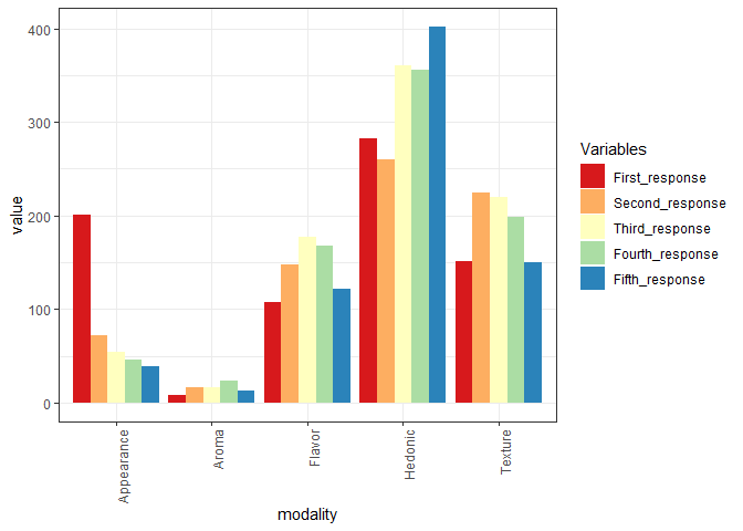
ggplot(dat, aes(modality, value, fill=interaction(variable))) +
  geom_bar(stat='identity', position='dodge') +
  theme_bw() + theme(axis.text.x = element_text(angle=90, hjust=1)) +
  scale_fill_brewer('Variables', palette='Spectral')

Created on 2020-04-07 by the reprex package (v0.3.0)

1 Like

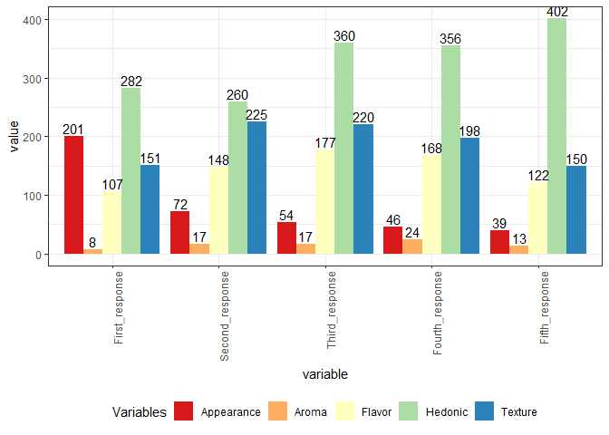
Wow, it looks good. Thanks a lot.

Can I have frequency on secondary axis and percentage on primary axis. Also, I was expecting graph like attached here. Attached graph has percentage on y axis but I also wish having frequency on secondary axis.

I am glad it helped, I wiil try
to do what you would like to achieve:

but I am humble R learner and beginner as well, so maybe we will see if @technocrat can help when he wakes up ? :slight_smile:

regards,
Andrzej

1 Like

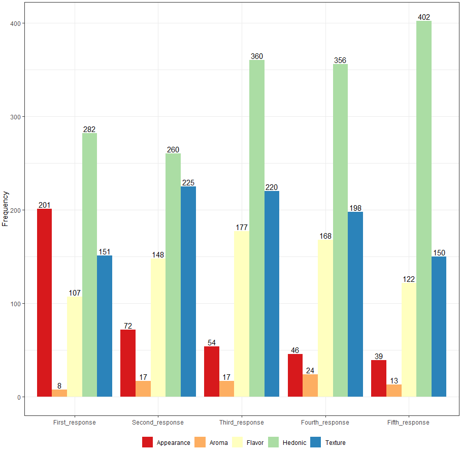
Please have a look at this:

df <- structure(list(modality = structure(c(1L, 2L, 3L, 5L, 4L), .Label = c("Appearance", 
 "Aroma", "Flavor", "Hedonic", "Texture"), class = "factor"), 
     First_response = c(201L, 8L, 107L, 151L, 282L), Second_response = c(72L, 
     17L, 148L, 225L, 260L), Third_response = c(54L, 17L, 177L, 
     220L, 360L), Fourth_response = c(46L, 24L, 168L, 198L, 356L
     ), Fifth_response = c(39L, 13L, 122L, 150L, 402L), Frequency = c(749L, 
     722L, 828L, 792L, 726L)), class = "data.frame", row.names = c(NA, 
 -5L))

library(reshape2)

library(ggplot2)

library(tidyverse)
#> Warning: package 'tidyr' was built under R version 4.0.0


df2 <- select(df, -Frequency)

dat <- melt(df2)
#> Using modality as id variables

ggplot(dat, aes(variable, value, fill=interaction(modality))) +
  geom_bar(stat='identity', position='dodge') +
  theme_bw() + theme(axis.text.x = element_text(angle=90, hjust=1)) +
  scale_fill_brewer('Variables', palette='Spectral') + geom_text(aes(label=value), position=position_dodge(width=0.9), vjust=-0.25) +
  theme(legend.position="bottom")

Created on 2020-04-07 by the reprex package (v0.3.0)
I am still working on how to add percentages on Y axis.

regards,
Andrzej

1 Like

Thanks for the help and I appreciate your effort.
I do not need data points as such on top of each bar when y axis is frequency. Can we change axis title "value" to "Frequency". Also, please delete word variable.

In mean time I was trying to learn font size change, legend position change, color change etc.

Thanks a lot!

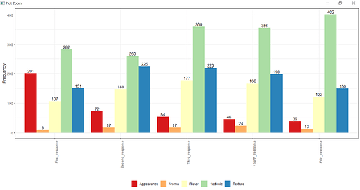
Here you are:

ggplot(dat, aes(variable, value, fill=interaction(modality))) +
  geom_bar(stat='identity', position='dodge') +
  theme_bw() + theme(axis.text.x = element_text(angle=90, hjust=1)) +
  scale_fill_brewer('Variables', palette='Spectral') + geom_text(aes(label=value), position=position_dodge(width=0.9), vjust=-0.25) +
  theme(legend.position="bottom")+
  theme(legend.title=element_blank()) +
xlab("") + ylab("Frequency")

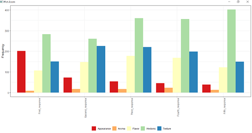
and without bars' labels:

ggplot(dat, aes(variable, value, fill=interaction(modality))) +
  geom_bar(stat='identity', position='dodge') +
  theme_bw() + theme(axis.text.x = element_text(angle=90, hjust=1)) +
  scale_fill_brewer('Variables', palette='Spectral') + 
  theme(legend.position="bottom")+
  theme(legend.title=element_blank()) +
xlab("") + ylab("Frequency")

kind regards,
Andrzej

2 Likes

Wow! Thanks for the great regexp Only very mild tweaks to be 100% cut-and-paste. 2020 to date award winner for qualifying heats!

1 Like

Here's an example of how to build up the color, font, position changes step by step. I'm not recommending how the OP choose a presentation style, just for the process of building up.

1 Like

Thanks for the example and regxp, but I am still wondering how I can have percentage on secondary axis. Its kind of "one data but I want 2 axis". One side it should have % axis and Frequency on secondary axis. @Andrzej helped me to have one primary axis, but secondary axis is still far from reality.

Thanks

1 Like

Yes, it is possible to have two axes, such as kg and pounds but those are simply different scales for the same aspect of the same quantity. Count and frequency can't work the same way. Using frequency (count/total) for y reflects a different aspect than just count.

In tabulations by category this is often addressed as a weighted average emphasizing the cumulative contribution.

Okay, but percentage was calculated from frequency, so technically it should be related.

1 Like

Well, yes it's related, true. I'm having trouble dredging this out of school maths 60 years ago, but consider whether both are on the same measurement scale type

Got it. Yes, they are not on same scale.
Actually, I first tried this in excel and came to know that I cant do this in excel. But when I contacted excel help they said that they do this for me but they were charging for this. So I thought that R would be better place for me to look for and actually this way I shall start learning it. So, definitely there should be a way to change the table into %age (based on frequency) and put axis as secondary axis (associate %age with frequency), if excel people can do this. Anyway, I learned a lot.

Thanks

I may have missed a bit here and am just going off the last bit of code. Is there a reason why the x axis labels need to be vertical?

ggplot(dat, aes(variable, value, fill=interaction(modality))) +
  geom_bar(stat='identity', position='dodge') +
  theme_bw() + 
  scale_fill_brewer('Variables', palette='Spectral') + geom_text(aes(label=value), position=position_dodge(width=0.9), vjust=-0.25) +
  theme(legend.position="bottom")+
  theme(legend.title=element_blank()) +
  labs(x = NULL, y = "Frequency")

1 Like

How I can move legend into the graph. I know this function:
theme(legend.position = c(x,.y)
but how it would work when we have just y axis