Adding percentages to a bargraph in ggplot

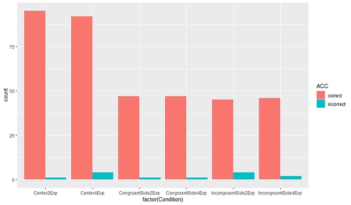
I apologize if this question has been asked before, but I looked through some answers, and wasn't able to find a solution that matched my issue. I am trying to add percentage inside the bar graph. The values that I am plotting are categorical (example: I am plotting Accuracy, and it is defined by "incorrect" and "correct" responses. I am trying to have a percentage of those responses per 1 condition).

I have played around with stat_bin with geom="text" but failed.

So far my code is

ggplot(SinglePatient,aes(factor(Condition))+geom_bar(aes(fill = ACC), position = "dodge")

SinglePatient is a small sample from a larger data.frame. Here is an example from that data.

Patient  Session   Stimulus     Trial  Running[Trial]   Block   ACC     Side   Condition  Group  new.RT
7212      post      blue_color.jpg  14  Center2ExpTrialList 2   incorrect   L   Center2Exp  BrainHQ  251    
7212      post      brown_color.jpg 6   Center2ExpTrialList 2   correct     R   Center2Exp  BrainHQ  253
7212      post      blue_color.jpg  19  Center2ExpTrialList 2   correct     L   Center2Exp  BrainHQ  256
7212      post      brown_color.jpg 23  Center2ExpTrialList 12  correct     R   Center2Exp  BrainHQ  261    
7212      post      blue_color.jpg  18  Center2ExpTrialList 2   correct     L   Center2Exp  BrainHQ  267

Any help appreciated.
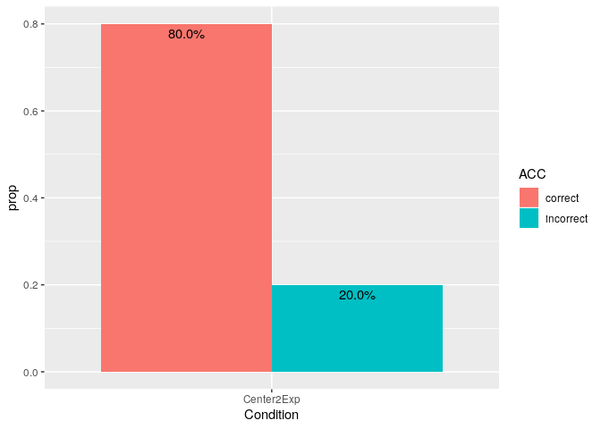
This reproducible example shows one way to do it.
Note: For future posts please make your questions providing a reproducible example like this one

SinglePatient <- data.frame(stringsAsFactors=FALSE,
          Patient = c(7212, 7212, 7212, 7212, 7212),
          Session = c("post", "post", "post", "post", "post"),
         Stimulus = c("blue_color.jpg", "brown_color.jpg", "blue_color.jpg",
                      "brown_color.jpg", "blue_color.jpg"),
            Trial = c(14, 6, 19, 23, 18),
   Running.Trial. = c("Center2ExpTrialList", "Center2ExpTrialList",
                      "Center2ExpTrialList", "Center2ExpTrialList",
                      "Center2ExpTrialList"),
            Block = c(2, 2, 2, 12, 2),
              ACC = c("incorrect", "correct", "correct", "correct", "correct"),
             Side = c("L", "R", "L", "R", "L"),
        Condition = c("Center2Exp", "Center2Exp", "Center2Exp", "Center2Exp",
                      "Center2Exp"),
            Group = c("BrainHQ", "BrainHQ", "BrainHQ", "BrainHQ", "BrainHQ"),
           new.RT = c(251, 253, 256, 261, 267)
)

library(tidyverse)

SinglePatient %>% 
    group_by(Condition) %>% 
    count(ACC) %>% 
    mutate(prop = n/sum(n)) %>% 
    ggplot(aes(x = Condition, y = prop)) +
    geom_col(aes(fill = ACC), position = "dodge") +
    geom_text(aes(label = scales::percent(prop), 
                  y = prop, 
                  group = ACC),
              position = position_dodge(width = 0.9),
              vjust = 1.5)

Created on 2019-07-22 by the reprex package (v0.3.0.9000)

4 Likes

Thanks a lot! I will keep in mind the format for future posts.

This topic was automatically closed 21 days after the last reply. New replies are no longer allowed.