fitting spline through local maxima

Hi,

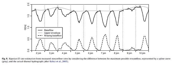
My name is Waqas and I am a Ph.D. scholar @ Waikato University. I am currently trying to reproduce a graph from one of my literature to use in my P.h.D defense. I have the time series data of my variable Q that is water discharge I streams and I want to find the local maxima in the series and then fit a spline through them that can show what our variable would look like in the absence of fluctuation. (the light grey line) . Also after finding the spline, how can I find the difference between actual and splined data(dashed line) .

I will be grateful if anyone could help me how can achieve it using ggplot2 in R

The required Result is

and my code is

> library(gglopt2)
>  
> data.frame(stringsAsFactors=FALSE,
>    Date_Time = c("1/01/2014 1:00", "1/01/2014 2:00", "1/01/2014 3:00",
>                  "1/01/2014 4:00", "1/01/2014 5:00", "1/01/2014 6:00",
>                  "1/01/2014 7:00", "1/01/2014 8:00", "1/01/2014 9:00", "1/01/2014 10:00",
>                  "1/01/2014 11:00", "1/01/2014 12:00", "1/01/2014 13:00",
>                  "1/01/2014 14:00", "1/01/2014 15:00", "1/01/2014 16:00",
>                  "1/01/2014 17:00", "1/01/2014 18:00", "1/01/2014 19:00", "1/01/2014 20:00",
>                  "1/01/2014 21:00", "1/01/2014 22:00", "1/01/2014 23:00",
>                  "2/01/2014 0:00", "2/01/2014 1:00", "2/01/2014 2:00", "2/01/2014 3:00",
>                  "2/01/2014 4:00", "2/01/2014 5:00", "2/01/2014 6:00",
>                  "2/01/2014 7:00", "2/01/2014 8:00", "2/01/2014 9:00", "2/01/2014 10:00",
>                  "2/01/2014 11:00", "2/01/2014 12:00", "2/01/2014 13:00",
>                  "2/01/2014 14:00", "2/01/2014 15:00", "2/01/2014 16:00",
>                  "2/01/2014 17:00", "2/01/2014 18:00", "2/01/2014 19:00", "2/01/2014 20:00",
>                  "2/01/2014 21:00", "2/01/2014 22:00", "2/01/2014 23:00",
>                  "3/01/2014 0:00", "3/01/2014 1:00", "3/01/2014 2:00", "3/01/2014 3:00",
>                  "3/01/2014 4:00", "3/01/2014 5:00", "3/01/2014 6:00",
>                  "3/01/2014 7:00", "3/01/2014 8:00", "3/01/2014 9:00", "3/01/2014 10:00",
>                  "3/01/2014 11:00", "3/01/2014 12:00", "3/01/2014 13:00",
>                  "3/01/2014 14:00", "3/01/2014 15:00", "3/01/2014 16:00",
>                  "3/01/2014 17:00", "3/01/2014 18:00", "3/01/2014 19:00", "3/01/2014 20:00",
>                  "3/01/2014 21:00", "3/01/2014 22:00", "3/01/2014 23:00",
>                  "4/01/2014 0:00", "4/01/2014 1:00", "4/01/2014 2:00", "4/01/2014 3:00",
>                  "4/01/2014 4:00", "4/01/2014 5:00", "4/01/2014 6:00",
>                  "4/01/2014 7:00", "4/01/2014 8:00", "4/01/2014 9:00", "4/01/2014 10:00",
>                  "4/01/2014 11:00", "4/01/2014 12:00", "4/01/2014 13:00",
>                  "4/01/2014 14:00", "4/01/2014 15:00", "4/01/2014 16:00", "4/01/2014 17:00",
>                  "4/01/2014 18:00", "4/01/2014 19:00", "4/01/2014 20:00",
>                  "4/01/2014 21:00", "4/01/2014 22:00", "4/01/2014 23:00",
>                  "5/01/2014 0:00", "5/01/2014 1:00", "5/01/2014 2:00", "5/01/2014 3:00",
>                  "5/01/2014 4:00"),
>            Q = c(0.75, 0.75, 0.75, 0.75, 0.75, 0.75, 0.75, 0.71, 0.71, 0.71,
>                  0.71, 0.71, 0.71, 0.45, 0.45, 0.42, 0.42, 0.42, 0.32, 0.32,
>                  0.4, 0.4, 0.4, 0.4, 0.42, 0.42, 0.48, 0.51, 0.48, 0.51, 0.48,
>                  0.48, 0.48, 0.48, 0.45, 0.45, 0.42, 0.4, 0.37, 0.37, 0.37, 0.37,
>                  0.35, 0.35, 0.35, 0.37, 0.37, 0.4, 0.4, 0.42, 0.42, 0.42, 0.42,
>                  0.42, 0.42, 0.42, 0.42, 0.42, 0.4, 0.4, 0.37, 0.37, 0.37, 0.35,
>                  0.35, 0.35, 0.35, 0.35, 0.35, 0.37, 0.37, 0.37, 0.37, 0.42, 0.48,
>                  0.54, 0.54, 0.54, 0.54, 0.54, 0.54, 0.51, 0.51, 0.51, 0.48, 0.45,
>                  0.45, 0.42, 0.4, 0.4, 0.4, 0.4, 0.4, 0.42, 0.45, 0.48, 0.48,
>                  0.42, 0.48, 0.48)
> )
> p = ggplot(PET, aes(x = Date_Time, group = 1)) + geom_line(aes(y = Q), colour = "blue")+ 
>   stat_peaks(aes(y=Q),colour = "red") +
> geom_line(aes(y = Eto, alpha = 0.5), colour = "orange") + theme_bw() 
> p
Hi Waqas, welcome!

To help us help you, could you please prepare a reproducible example (reprex) illustrating your issue and a sample of your desired output? Please have a look at this guide, to see how to create a reprex:

1 Like

Hi, I have updated my question with the required result and my code

The code below identifies the locations of the peaks returned by stat_peaks and then interpolates a spline function between each peak. For linear interpolation, you can use the approx function in the same way we've used spline() below. spline() has a few different fitting options, so you can try tweaking it to adjust the fit.

library(tidyverse)
library(ggpmisc)
theme_set(theme_classic())

p = ggplot(PET, aes(x = Date_Time, group = 1)) + 
  geom_line(aes(y=Q), colour = "blue") +
  stat_peaks(aes(y=Q),colour = "red")
p

# Get locations of peaks found by stat_peaks
pb = ggplot_build(p)
peaks = pb$data[[2]] %>% 
  arrange(x)

# Fit a spline function to the peaks and get a data frame of points so that 
#  we can add the spline fit to the plot
peaks.spline = as.data.frame(spline(peaks$x, peaks$y, n=6*nrow(peaks)))

# Add spline to plot
p + geom_line(data=peaks.spline, aes(x, y), colour="red")

To get the difference between the spline fit and the dashed line in your example, calculate the values of the spline function at the same x-values at which you have values for the dashed line. For example, if you have data for the dashed line at x = 1:10, then the values of spline function at those same points is:

spline.compare = as.data.frame(spline(peaks$x, peaks$y, xout=1:10))

Thank you very much for the code . :smiling_face_with_three_hearts:

I just remembered that the pracma package has the findpeaks function for identifying local maxima. I wrote an answer using it a few months ago. And here's another example as well.

1 Like

Hi,
Thanks to you I successfully draw a spline through the local peaks of my data but , I do not have the x values for the "Q " instead the values are a time series (as shown in my data) .
How to can I get the "Q" values at the same x steps as the splined line ?

I didn't notice that the dates in your data were strings, rather than an R date-time format. As a result, ggplot internally just created generic integer x-values for the date strings, ordered alphabetically.

In the code below, I've converted your dates to an R date-time format, which means that the underlying values are numeric (seconds elapsed since January 1, 1970 at midnight). Those underlying numeric values set the scale on which you would determine the x-values for your spline function. However, because the measurements fall into groups with large distances in time between each group, you may want to fit your spline function separately to each cluster of observations.

# Convert date-time strings to date-time format
PET = PET %>% 
  mutate(Date_Time = mdy_hm(Date_Time))

p = ggplot(PET, aes(x = Date_Time, y=Q)) + 
  geom_line(colour = "blue") +
  stat_peaks(colour = "red") 

# Get locations of peaks found by stat_peaks
pb = ggplot_build(p)
peaks = pb$data[[2]] %>% 
  arrange(x)

# Fit a spline function to the peaks and get a data frame of points so that 
#  we can add the spline fit to the plot
peaks.spline = as.data.frame(spline(peaks$x, peaks$y, n=6*nrow(peaks)))

# Convert x-values to date-time class
peaks.spline$x = as.POSIXct(peaks.spline$x, origin="1970-01-01", tz="UTC")

# Add spline to plot
p + geom_line(data=peaks.spline, aes(x, y), colour="red")

1 Like

This topic was automatically closed 21 days after the last reply. New replies are no longer allowed.

If you have a query related to it or one of the replies, start a new topic and refer back with a link.