Hello fellow Coders,
I am in need of your help!!!!
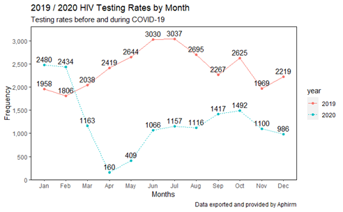
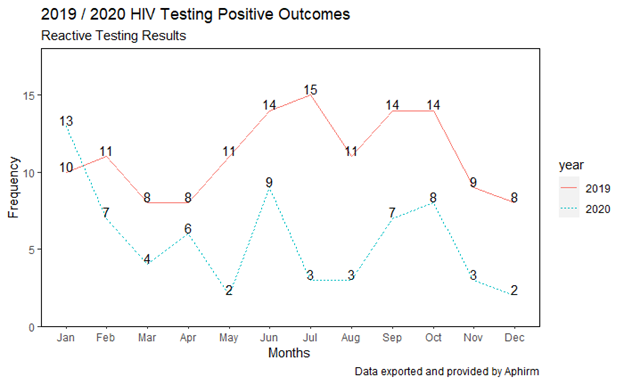
below you will find two sets of coding, one shows testing trends between 2019 and 2020 and one shows testing rates in 2019 by negative or positive results (because I am a new user, I am only allowed to display one image)
Now learning how to code and develop these types of visuals, I want to go a step further and look at only positive rates in 2019 / 2020.
I have by trying to figure out a way I can mesh the two codes together to do just that, but I have gotten no where.
I was wondering if anyone can assist me with this, I hope providing the coding structures you might be able to see how to wrangle something together and assist me with this.
I appreciate all of your help!
Thank you!
DF%>%
mutate(session_date = as.Date(session_date, format = "%m/%d/%Y"),
session_date_ym = as.yearmon(session_date)) %>%
count(session_date_ym) %>%
mutate(year = as.factor(year(session_date_ym))) %>%
ggplot(aes(month(session_date_ym, label = TRUE), n, color = year, group = year, linetype = year)) +
geom_line()+
geom_point()+
geom_text(aes(label = n), vjust = -0.5, color = "Black")+
scale_y_continuous(labels = scales::comma, limits = c(0,3300), expand = c(0,0), breaks = seq(0,3500,500))+
labs(x = "Months", y = "Frequency", title = "2019 / 2020 HIV Testing Rates by Month", subtitle = "Testing rates before and during COVID-19", caption = expression(paste("Data exported and provided by Aphirm")))+
theme(panel.grid = element_blank(),
panel.background = element_rect(fill = "white"),
panel.border = element_rect(color = "black", fill = NA))

DF %>%
mutate(Session.Date = as.Date(Session.Date, format = "%m/%d/%Y"),
session_date_yearmon = as.yearmon(Session.Date)) %>%
select(session_date_yearmon, Final.Test.Result) %>%
mutate(final_test_result_coded = case_when(
str_detect(str_to_lower(Final.Test.Result), ".pos.") ~ "Positive",
T ~ "Negative"
)) %>%
count(session_date_yearmon, final_test_result_coded) %>%
ggplot(aes(month(session_date_yearmon, label = TRUE), n, color = final_test_result_coded, group = final_test_result_coded))+
geom_line()+
geom_point()+
geom_text(aes(label = n), vjust = -0.4, color = "black")+
labs(x = "Months", y = "Frequency", title = "2019 HIV Testing Outcomes", subtitle = "HIV Testing Results",color = "Test Results", caption = expression(paste("Data exported and provided by Aphirm")))+
theme(panel.grid = element_blank(),
panel.background = element_rect(fill = "white"),
panel.border = element_rect(color = "black", fill = NA))
