Hello All,
In some cases I use Tableau to show some visual work, but I would like to learn how to do that in R.
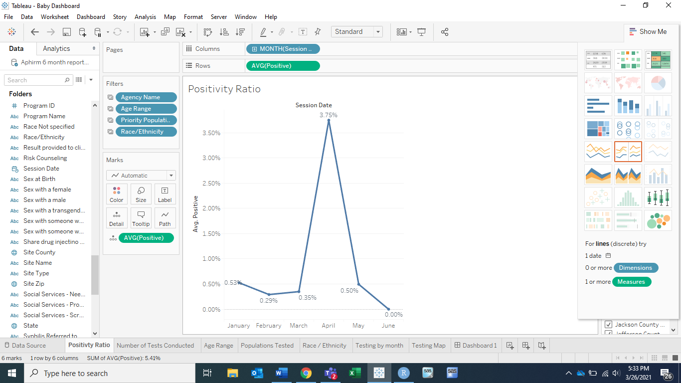
What I would like to do is get a calculated average / ration of a positivity ratio seen like in the picture attached to this thread.
below I have began a code and it will depict a visual showing total positive cases each month in the year of 2019 and 2020.
Example: In January of 2019 there were 10 new cases.
However, as mentioned, I would like that to be converted into a ratio shown over the year.
Example: In the graph shared, there was a 0.53% Positivity ratio.
I think I am just stuck on the calculation part and would appreciate all the help.
Thank you so much!
Aphirm_2019_2020_HIV_Testing_Data %>%
mutate(Session.Date = as.Date(Session.Date, format = "%m/%d/%Y"),
session_date_ym = as.yearmon(Session.Date)) %>%
count(session_date_ym, final_test_result_coded) %>%
filter(final_test_result_coded == "Positive")%>%
mutate(year = as.factor(year(session_date_ym)))%>%
ggplot(aes(month(session_date_ym, label = TRUE), n, color = year, group = year, linetype = year)) +
geom_line()+
geom_text(aes(label = n), vjust = -0.1, color = "black")+
scale_y_continuous(limits = c(0,18), expand = c(0,0), breaks = seq(0,15,5))+
labs(x = "Months", y = "Frequency", title = "2019 / 2020 HIV Testing Positive Outcomes", subtitle = "Reactive Testing Results", caption = expression(paste("Data exported and provided by Aphirm")))+
theme(panel.grid = element_blank(),
panel.background = element_rect(fill = "white"),
panel.border = element_rect(color = "black", fill = NA))