I would like to know if somehow has any idea how to produce a graph like this using ggplot2:
Thank you in advance for any possible help.
I would like to know if somehow has any idea how to produce a graph like this using ggplot2:
Thank you in advance for any possible help.
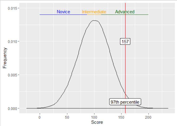
This should get you started (E&OE):
library(ggplot2)

all_mean <- 100
all_sd <- 30
my_score <- 157

dd <- rnorm(n=100000, mean=all_mean, sd=all_sd)
z <- (my_score - all_mean)/all_sd
pc <- round(100*(pnorm(z)), digits=0)
t1 <- paste0(as.character(pc),"th percentile")

p33 <- all_mean + (qnorm(0.3333) * all_sd)
p67 <- all_mean + (qnorm(0.6667) * all_sd)

ggplot() +
  geom_density(aes(dd)) +
  geom_vline(aes(xintercept=my_score), colour="red") +
  geom_label(aes(x=my_score, y=0.001, label=t1)) +
  geom_label(aes(x=my_score, y=0.01, label=as.character(my_score))) +

  geom_segment(aes(x=0,   y=0.014, xend=p33, yend=0.014), colour="blue") +
  geom_segment(aes(x=p33, y=0.014, xend=p67, yend=0.014), colour="orange") +
  geom_segment(aes(x=p67, y=0.014, xend=200, yend=0.014), colour="darkgreen") +

  geom_text(aes(x=p33/2, y=0.0145, label="Novice"), colour="blue") +
  geom_text(aes(x=all_mean, y=0.0145, label="Intermediate"), colour="orange") +
  geom_text(aes(x=200-(200-p67)/2, y=0.0145, label="Advanced"), colour="darkgreen") +
  ylim(0, 0.015) +
  labs(x="Score", y="Frequency") +
  theme(legend.position='none')

Created on 2019-09-06 by the reprex package (v0.3.0)
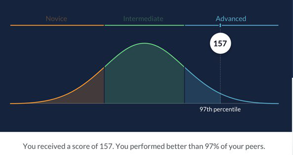
Excellent! It is an good starting point!
Thank you!
I believe that this can be improved upon by not making dd the result of a simulation. So something like (untested).
Define dd as the dnorm function with the paramaters you want:
dd <- function(x) { dnorm(x, sd=all_sd, mean=all_mean)
And then within the plot, replace geom_density(aes(dd)) with stat_function(fun = dd).
And here it is with a reprex. I changed three things from @DavoWW's excellent answer.
dd as a function based on dnormstat_function(dd) instead of geom_densityggplot2 really wants data even if all of the plotting comes from other things.library(ggplot2)
all_mean <- 100
all_sd <- 30
my_score <- 157
dd <- function(x) { dnorm(x, mean=all_mean, sd=all_sd) }
z <- (my_score - all_mean)/all_sd
pc <- round(100*(pnorm(z)), digits=0)
t1 <- paste0(as.character(pc),"th percentile")
p33 <- all_mean + (qnorm(0.3333) * all_sd)
p67 <- all_mean + (qnorm(0.6667) * all_sd)
ggplot(data.frame(x=c(0, 180)), aes(x=x)) +
stat_function(fun=dd) +
geom_vline(aes(xintercept=my_score), colour="red") +
geom_label(aes(x=my_score, y=0.001, label=t1)) +
geom_label(aes(x=my_score, y=0.01, label=as.character(my_score))) +
geom_segment(aes(x=0, y=0.014, xend=p33, yend=0.014), colour="blue") +
geom_segment(aes(x=p33, y=0.014, xend=p67, yend=0.014), colour="orange") +
geom_segment(aes(x=p67, y=0.014, xend=200, yend=0.014), colour="darkgreen") +
geom_text(aes(x=p33/2, y=0.0145, label="Novice"), colour="blue") +
geom_text(aes(x=all_mean, y=0.0145, label="Intermediate"), colour="orange") +
geom_text(aes(x=200-(200-p67)/2, y=0.0145, label="Advanced"), colour="darkgreen") +
ylim(0, 0.015) +
labs(x="Score", y="Frequency") +
theme(legend.position='none')
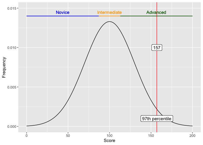
Created on 2019-09-08 by the reprex package (v0.3.0)
Excellent, @jpgoldberg!!!
This topic was automatically closed 21 days after the last reply. New replies are no longer allowed.