Hello,
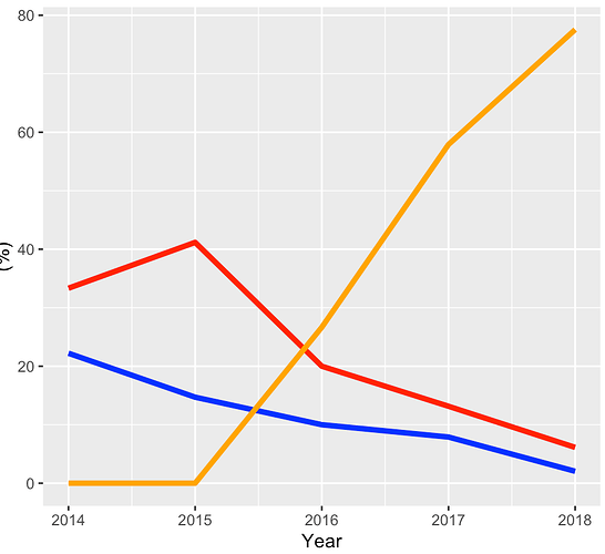
I am trying to figure out how to add a manual legend to a ggplot2 figure. From my reading, you have to add color to aes. However, from all of the examples that I have seen, the color is used for a factor variable. I have a line plot with three continuous variables. I need to add a simple legend for the colors.
ggplot(by_year_percentage, aes(x=arrivaldate)) +
  geom_line(aes(y=deathpercentage), color = "blue", size = 1.5) +
  geom_line(aes(y=tamponadepercentage), color = "red", size = 1.5) +
  geom_line(aes(y=protaminepercentage), color = "orange", size = 1.5) +
  labs(x="Year", y="(%)")
