Hello, I'm trying to build a shiny app to plot different models of temporal discounting, with each line corresponding to a different model. I have it mostly working, but I can't keep the different lines consistent colors when the user adds or subtracts models to the plots.
Briefly, I have 4 different model, each of which has an inputCheckbox for whether or not to include it, along with inputs for the model parameters (for simplicity I've removed the parameter input boxes from the below example). So the ui looks like this:
ui <- fluidPage(
    checkboxInput('include_exponential', 'Exponential', value = TRUE),
    checkboxInput('include_hyperbolic', "Hyperbolic", value = TRUE),
    checkboxInput('include_quasi', 'Quasi-Hyperbolic', value = TRUE),
    checkboxInput('include_constant', 'Constant-Sensitivity', value = TRUE),

    plotOutput("model_plot")
)
Each of these four models corresponds to a function (that takes parameters and outputs values) and a stat_function, which is added to a ggplot object if the corresponding checkbox is checked, so the server looks like this:
server <- function(input, output) {
# model functions
calc_exponential <- function(V, D, r) {
V / exp(r*D)
}
calc_hyperbolic <- function(V, D, k) {
V / (1 + k*D)
}
calc_quasi_hyperbolic <- function(V, D, beta, delta) {
V * (beta * delta^D)
}
constant_sensitivity <- function(V, D, a, b) {
V * exp(-(a*D)^b)
}
# functions to add to ggplot (placed within `reactive` since they usually also vary as a function of user input)
stat_exponential <- reactive(stat_function(mapping = aes(color = 'Exponential'), fun = calc_exponential, args = list(V = 100, r = .02)))
stat_hyperbolic <- reactive(stat_function(mapping = aes(color = 'Hyperbolic'), fun = calc_hyperbolic,args = list(V = 100, k = .02)))
stat_quasihyp <- reactive(stat_function(mapping = aes(color = 'Quasi-Hyperbolic'), fun = calc_quasi_hyperbolic, args = list(V = 100, beta = .99, delta = .99)))
stat_cs <- reactive(stat_function(mapping = aes(color = 'Constant Sensitivity'), fun = constant_sensitivity, args = list(V = 100, a = .5, b = 1)))
output$model_plot <- renderPlot({
p_base <- ggplot(data.frame(x=c(0, 360)), aes(x = x)) +
theme_bw() +
theme(text = element_text(size = 16, face = 'bold'))+
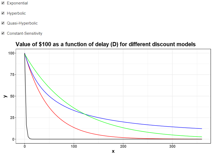
labs(title = 'Value of $100 as a function of delay (D) for different discount models')
if(input$include_exponential) p_base <- p_base + stat_exponential()
if(input$include_hyperbolic) p_base <- p_base + stat_hyperbolic()
if(input$include_quasi) p_base <- p_base + stat_quasihyp()
if(input$include_constant) p_base <- p_base + stat_cs()
p_base
})
}
This works decently well (and I borrowed some from this question), but the problem is that when you remove one of the models, all of the colors change. Using something like scale_fill_manual(values = rainbow(4)) works a bit better -- it doesn't change the colors being used every time, but it does still shift which color refers to which model. So for instance, unchecking the 'Exponential' box changes the colors of the hyperbolic and quasi-hyperbolic lines (I'm a new user so I can't post multiple images, but if you run the above code it should hopefully be fairly clear what I'm talking about).
One alternative that works okay, but not amazing, is to change stat_function so that colors are manually set outside of the aes call, like this:
    stat_exponential <- reactive(stat_function(color = 'red', fun = calc_exponential, args = list(V = 100, r = .02)))
    stat_hyperbolic <- reactive(stat_function(color = 'blue', fun = calc_hyperbolic,args = list(V = 100, k = .02)))
    stat_quasihyp <- reactive(stat_function(color = 'green', fun = calc_quasi_hyperbolic, args = list(V = 100, beta = .99, delta = .99)))
    stat_cs <- reactive(stat_function(color = 'black', fun = constant_sensitivity, args = list(V = 100, a = .5, b = 1)))
This works how I'd like it to (the colors don't change when I uncheck the boxes), but it also means I lose the legend, which I would like to maintain:
Apologies if this is an obvious question, but is there a way to either add a legend to the above plot, or to keep the colors of lines from changing in the first approach?
(Additionally, this is my first question in the RStudio Community, so welcome feedback on my reprex, and this is also my first time working extensively with shiny, so if anyone has tips for better practices with reactive programming I would love to hear them).