Reordering of legend in ggplot2

Dear All,

I have a follow-up question on the topic discussed below:

After manually adding a legend to my plot, as described by @andresrcs, I want to reorder the legend entries. However, I have not yet found a practicable solution.

Any advice on my issue would be highly appreciated.

1 Like

This post includes code for reordering the items in a legend:
http://www.cookbook-r.com/Graphs/Legends_(ggplot2)/

1 Like

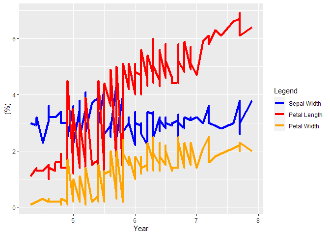
Here's an amended version of Andres's example:

library(ggplot2)

colors <- c("Petal Length" = "red", "Petal Width" = "orange", "Sepal Width" = "blue")

ggplot(datasets::iris, aes(x = Sepal.Length)) +
  geom_line(aes(y = Sepal.Width, color = "Sepal Width"), size = 1.5) +
  geom_line(aes(y = Petal.Length, color = "Petal Length"), size = 1.5) +
  geom_line(aes(y = Petal.Width, color = "Petal Width"), size = 1.5) +
  labs(x = "Year",
       y = "(%)",
       color = "Legend") +
  scale_color_manual(values = colors, breaks = names(colors)[c(3,1,2)])

Created on 2020-09-29 by the reprex package (v0.3.0)

The labels default to alphabetical order I think.

1 Like

Hi @francisbarton,

Thank you very much for your help. I just tried to implement your code, unfortunately I received the following error message:
"Removed 183 rows containing missing values (geom_path)."
Without scale_color_manual I have no problems plotting the data.

Do you have any further suggestions?

Best,

If you need more specific help, you would have to provide a REPRoducible EXample (reprex) more specific to your situation.

2 Likes

Dear @andresrcs / Francis

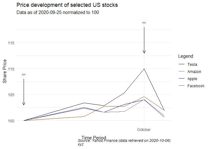
I tried to make a reprex (I'm a RStudio beginner) and added the output below. Although it didn't seem to have worked properly, I hope the code will help solve my problem:

#Load packages
library(tidyverse)
library(quantmod)
library(broom)
library(lubridate)

#Data Import 
start = as.Date("2020-09-25")
end = as.Date("2020-10-05")
getSymbols(c("AAPL", "AMZN", "FB", "TSLA"), src = "yahoo", from = start, to = end)

#Normalisation of data to 100 by 25 September 2020
AAPL <- ((AAPL$AAPL.Adjusted/112.28)*100)
AMZN <- ((AMZN$AMZN.Adjusted/3095.13)*100)
FB <- ((FB$FB.Adjusted/254.82)*100)
TSLA <- ((TSLA$TSLA.Adjusted/407.34)*100)

#Change formats from xts objects to data frames
AAPL <- data.frame(date = index(AAPL), coredata(AAPL))
AMZN <- data.frame(date = index(AMZN), coredata(AMZN))
FB <- data.frame(date = index(FB), coredata(FB))
TSLA <- data.frame(date = index(TSLA), coredata(TSLA))

#Merge all data frames into one dataset
merge1 <- merge(AAPL, AMZN, by = "date")
merge2 <- merge(FB, TSLA, by = "date") 
stocks <- merge(merge1, merge2, by = "date")

#Rename the dataset to avoid misunderstandings
stocks <- rename(stocks, Apple = AAPL.Adjusted, Amazon = AMZN.Adjusted, Facebook = FB.Adjusted, Tesla = TSLA.Adjusted)

#Create a legend for the plot
colors <- c("Apple" = "darkblue", "Amazon" = "gray39", "Facbeook" = "chocolate4", "Tesla" = "black")

#Plot the Data
ggplot(stocks, aes(x=date)) +
  geom_line(aes(y = Apple, color = "Apple")) +
  geom_line(aes(y = Amazon, color = "Amazon")) +
  geom_line(aes(y = Facebook, color = "Facebook")) +
  geom_line(aes(y = Tesla, color = "Tesla")) +
  scale_x_date(date_labels = "%B", date_breaks = "1 month") +
  geom_segment(aes(x = as.Date(c("2020-10-01")), y = 118, xend = as.Date(c("2020-10-01")), yend = 113), arrow = arrow(length = unit(0.25, "cm")), color = "black") +
  annotate("text", x = as.Date(c("2020-10-01")), y = 119, label = "xyz", size = 2, colour = "black") +
  geom_segment(aes(x = as.Date(c("2020-09-25")), y = 108, xend = as.Date(c("2020-09-25")), yend = 103), arrow = arrow(length = unit(0.25, "cm")), color = "black") +
  annotate("text", x = as.Date(c("2020-09-25")), y = 109, label = "xyz", size = 2, colour = "black") +
  ylab("Share Price") +
  xlab("Time Period") +
  labs(title = "Price development of selected US stocks", subtitle = "Data as of 2020-09-25 normalized to 100", caption = expression(italic("Source: Yahoo Finance (data retrieved on 2020-10-06) \nxyz")), color = "Legend") +
  theme(plot.caption = element_text(hjust = 1)) +
  theme_minimal() +
  theme(axis.title.x = element_text(margin = margin(t=10))) +
  scale_color_manual(values = colors, breaks = names(colors)[c(4,2,1,3)])

Thank you very much!
It looks OK to me. Well done. Is there anything you want to do differently?
There was just a Facebook typo in your previous example that needed fixing.

#Load packages
library(tidyverse)
library(quantmod)
library(broom)
library(lubridate)

#Data Import 
start = as.Date("2020-09-25")
end = as.Date("2020-10-05")
getSymbols(c("AAPL", "AMZN", "FB", "TSLA"), src = "yahoo", from = start, to = end)

#Normalisation of data to 100 by 25 September 2020
AAPL <- ((AAPL$AAPL.Adjusted/112.28)*100)
AMZN <- ((AMZN$AMZN.Adjusted/3095.13)*100)
FB <- ((FB$FB.Adjusted/254.82)*100)
TSLA <- ((TSLA$TSLA.Adjusted/407.34)*100)

#Change formats from xts objects to data frames
AAPL <- data.frame(date = index(AAPL), coredata(AAPL))
AMZN <- data.frame(date = index(AMZN), coredata(AMZN))
FB <- data.frame(date = index(FB), coredata(FB))
TSLA <- data.frame(date = index(TSLA), coredata(TSLA))

#Merge all data frames into one dataset
merge1 <- merge(AAPL, AMZN, by = "date")
merge2 <- merge(FB, TSLA, by = "date") 
stocks <- merge(merge1, merge2, by = "date")

#Rename the dataset to avoid misunderstandings
stocks <- rename(stocks, Apple = AAPL.Adjusted, Amazon = AMZN.Adjusted, Facebook = FB.Adjusted, Tesla = TSLA.Adjusted)

#Create a legend for the plot
colors <- c("Apple" = "darkblue", "Amazon" = "gray39", "Facebook" = "chocolate4", "Tesla" = "black")

#Plot the Data
ggplot(stocks, aes(x=date)) +
  geom_line(aes(y = Apple, color = "Apple")) +
  geom_line(aes(y = Amazon, color = "Amazon")) +
  geom_line(aes(y = Facebook, color = "Facebook")) +
  geom_line(aes(y = Tesla, color = "Tesla")) +

  scale_x_date(date_labels = "%B", date_breaks = "1 month") +
  geom_segment(aes(x = as.Date(c("2020-10-01")), y = 118, xend = as.Date(c("2020-10-01")), yend = 113), arrow = arrow(length = unit(0.25, "cm")), color = "black") +
  annotate("text", x = as.Date(c("2020-10-01")), y = 119, label = "xyz", size = 2, colour = "black") +
  geom_segment(aes(x = as.Date(c("2020-09-25")), y = 108, xend = as.Date(c("2020-09-25")), yend = 103), arrow = arrow(length = unit(0.25, "cm")), color = "black") +
  annotate("text", x = as.Date(c("2020-09-25")), y = 109, label = "xyz", size = 2, colour = "black") +
  ylab("Share Price") +
  xlab("Time Period") +
  labs(title = "Price development of selected US stocks", subtitle = "Data as of 2020-09-25 normalized to 100", caption = expression(italic("Source: Yahoo Finance (data retrieved on 2020-10-06) \nxyz")), color = "Legend") +
  theme(plot.caption = element_text(hjust = 1)) +
  theme_minimal() +
  theme(axis.title.x = element_text(margin = margin(t=10))) +
  scale_color_manual(values = colors, breaks = names(colors)[c(4,2,1,3)])

Created on 2020-10-06 by the reprex package (v0.3.0)

1 Like

@francisbarton I made a mistake in my original code where I changed something in the color values and didn't properly apply it to the whole code. Thank you very much for your help, really appreciated.

If your question's been answered (even if by you), would you mind choosing a solution? (See FAQ below for how).

Having questions checked as resolved makes it a bit easier to navigate the site visually and see which threads still need help.

Thanks

This topic was automatically closed 7 days after the last reply. New replies are no longer allowed.

If you have a query related to it or one of the replies, start a new topic and refer back with a link.