Option 2: Violin Plots: I purposely increased the width to show the crowding in the 8-8 area. Also the scale="count" is important to show the areas with more counts.
ggplot(ESS_bereinigt, aes(x=as.numeric(stfjb),
                          y = as.numeric(happy))) +
  geom_violin(aes(group = as.numeric(stfjb)),
              scale = "count", width = 1.75,
              fill = "grey50", alpha = 0.5) +
  theme_classic() +
  scale_x_continuous(breaks = seq(0,10,1)) +
  scale_y_continuous(breaks = seq(0,10,1)) +
  geom_smooth(method = "lm")
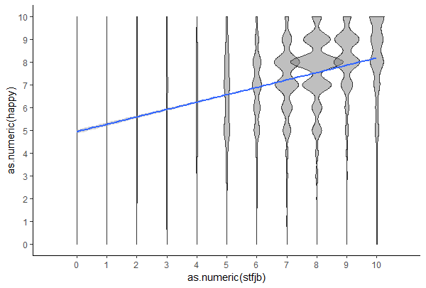
Boxplots actually don't look good, just because the median is then also one of the numbers.
Option 3: Count the number of observations per X-Y-pair, then define the size of the points depending on the counts.
ESS_bereinigt %>%
  group_by(cntry, stfjb, happy) %>%
  mutate(happy_count = n()) %>%
ggplot(aes(x=as.numeric(stfjb),
                          y = as.numeric(happy))) +
  geom_point(aes(size = happy_count)) +
  theme_classic() + scale_size_continuous(range = c(1,11)) +
  scale_x_continuous(breaks = seq(0,10,1)) +
  scale_y_continuous(breaks = seq(0,10,1)) +
  geom_smooth(method = "lm", na.rm=TRUE, size = 1.5)
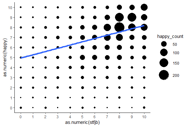
PS: Maybe it's the other way around, people that are more happy in their life can also enjoy their work more!? 