ylim = c(0,100), but need the (100,140) space on my plot.

Hi,

I need to draw a proportion graph with ylim = c(0,100).
Everything is fine and I draw the graph.

But, I also need the space that range in (100,140) in order to add a coma with a p-value. If want my y-axis to stop at 100, therefore if I do with ylim = c(0,140), my y-axis goes too high.
I thought yaxs would solve my problem, but this is not the use he is made for according to documentation.

I put below the entire code of the graph. What is the command to solve the problem ?

#Graphic of Consistency for First Task
prop.tableorder <- c(prop.tablempl1[2],prop.tablecbt1[2])
bb <- barplot(prop.tableorder, names.arg = c("ConsMPL1", "ConscMPL1"), ylab = "Proportion", col = "cornflowerblue", border = 1, ylim = c(0,140), las = 1)
#Add Confidence Intervals to the graph
segments(bb[1,],72.193,bb[1,],85.226, lwd = 1)
arrows(bb[1,],72.193,bb[1,],85.226, lwd = 1,angle = 90, code = 3, length = 0.05)
segments(bb[2,],58.255,bb[2,],73.358, lwd = 1)
arrows(bb[2,],58.255,bb[2,],73.358, lwd = 1,angle = 90, code = 3, length = 0.05)
#Text
text(bb[1], prop.tableorder[1] + 15, labels = prop.tableorder[1], cex=.8)
text(bb[2], prop.tableorder[2] + 15, labels = prop.tableorder[2], cex=.8)
#Test of equality of means (used for verification)
t.test(data_order1$consistent_cbt,data_order1$consistent_mpl, var.equal=TRUE)
text(x = 1.3, y = 112, '{', srt = 270, cex = 10, family = 'Helvetica Neue UltraLight')
text(x = 1.3, y = 127, 'Pr(T > t) = 0.0111')
This is harder than needed to troubleshoot without a reproducible example, called a reprex, including, especially data in the same form as prop.tablepl1 and tablecbt1.

as @technocrat says, is to complicated to figure out how your plot should look.
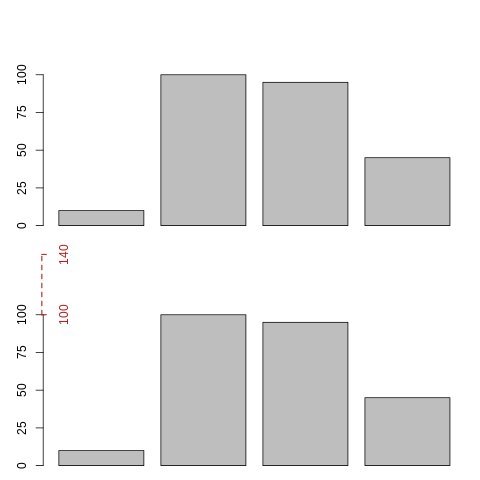
Strictly speaking, what you want to do is easy to accomplish with basic plot argument-functions, i.e.:

## fake data 
a <- c(10,100, 95,45)
## barplot with specific axis params declared explictly
barplot(a, ylim = c(0, 140), yaxt = 'no')
axis(2, at = c(0,25,50,75,100))

You just need to accommodate ylim for your own desired dimensions, yaxt = 'no' for not drawing the axis, and then use function axis(...) to draw the axis as you want. These minimum changes should make what you want, as shown in the figure below. Note that I have plotted it twice, in the lower one I have drawn in red the part of the axis that is missing (actually not drawn) in the first plot, but truly existing (the interval part from 100 to 140) for showing it (I used smaller margins so the actual empty spaces could be misleading)

example

hope it helps

1 Like

Thanks for you reply.

It was my first message and I was ignorant of what is a reprex. Since my code is extremely long, I minimized to the relevant portion and what was my issue. Thanks for explaining me what I should do.

Super Fernando, this is what I was looking for.

1 Like

This topic was automatically closed 21 days after the last reply. New replies are no longer allowed.