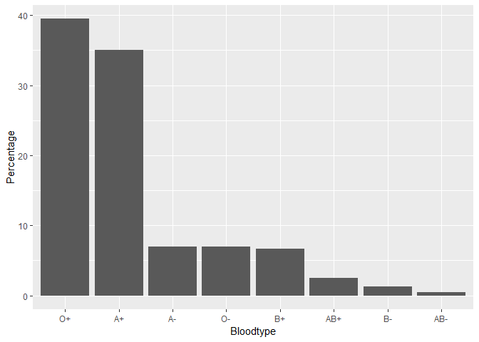
One step further with fct_reorder ![]()
Bloodtypes %>%
  mutate(Percentage = parse_number(Percentage, locale = locale(decimal_mark = ","))) %>%
  ggplot(aes(x = fct_reorder(Bloodtype, Percentage, .desc = TRUE), y = Percentage)) +
  xlab('Bloodtype') +
  geom_col()