Y-axis scale in Rstudio

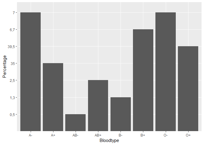
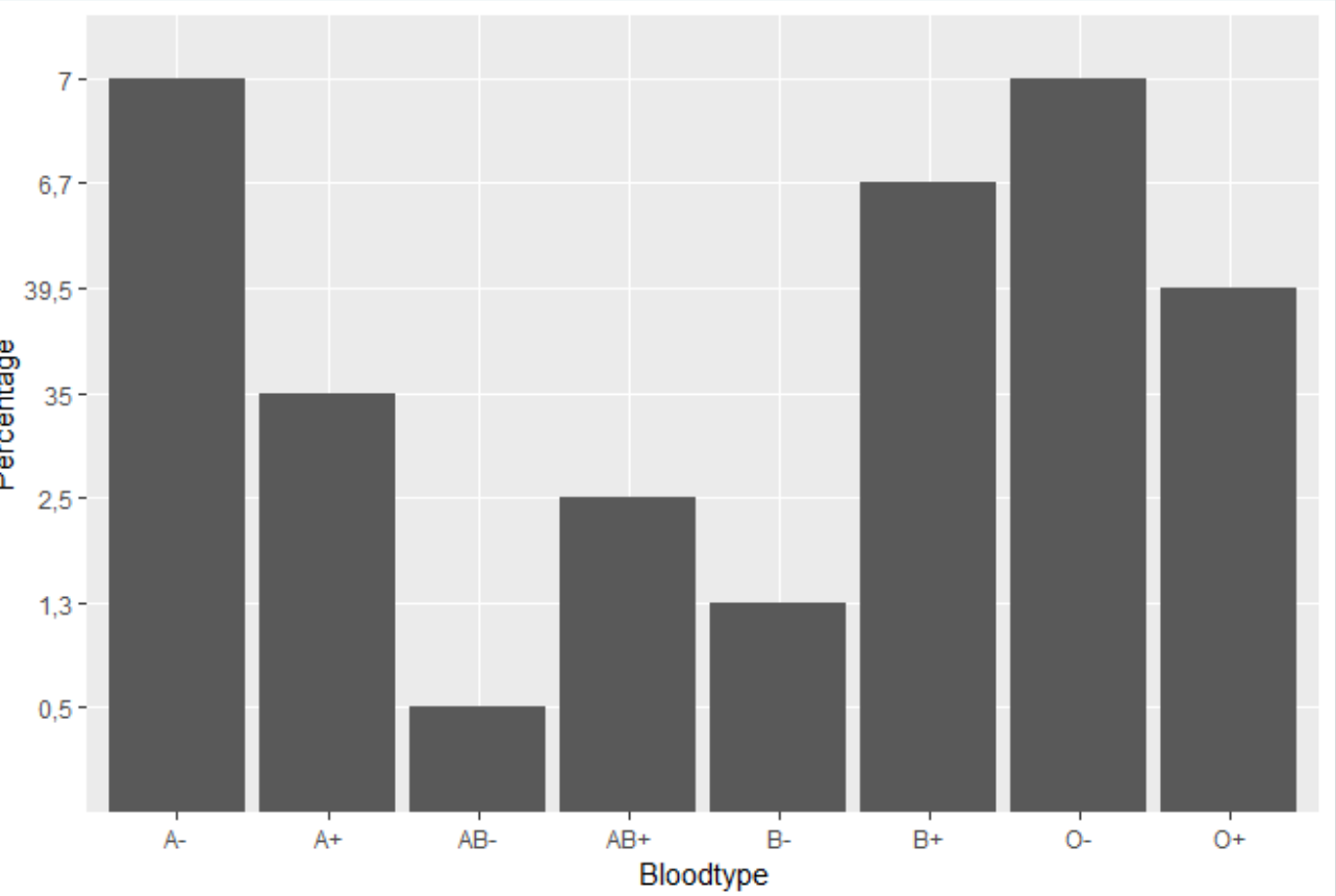
I have a plot of the distribution of blood types in the Netherlands, but my y-axis is a bit messy as the values of A+ and O- are much larger than the rest (see picture). How can I get this right?

This is my code in Rstudio:
ggplot(data = Blood_types_Sanquin, mapping = aes(x=Bloodtype, y=Percentage))+
geom_bar(stat = "Identity")![Bloodtype%20distribution|689x462]

(upload://umNMkgIBjVrJevj1bYUF03lXiiw.png)

Hi, welcome!

To help us help you, could you please prepare a reproducible example (reprex) illustrating your issue? Please have a look at this guide, to see how to create one:

I do not completely understand the explanation about the reprex thing, but these are the values I want a graph of: (I called this dataframe Bloodtypes_3)

Bloodtype Percentage
A- 7
A+ 35
AB- 0,5
AB+ 2,5
B- 1,3
B+ 6,7
O- 7
O+ 39,5

ggplot(data = Bloodtypes_3, mapping = aes(x=Bloodtype, y=percentage))+
geom_bar(stat = "Identity")

With this piece of code I tried to make a bar plot with on the x-axis the bloodgroup (A-, A+ etc) and on the y-axis the percentages. But because the percentages of A+ and O+ are so big, it gives a messed up graph.
I hope this is enough, if not, please let me know. Really thank you for your help in advance :slight_smile:

Have you read the link I gave you? sharing some sample data on a friendly format is as easy as typing datapasta::df_paste(Blood_types_Sanquin) and pasting the result here, also the link to the sample image you posted before is not working, could you fix that?

I indeed read the link, but I did not completely understand what I had to do. (I am just a beginner in Rstudio) But I tried what you said I had to do and this is the result:

Bloodtypes <- data.frame(stringsAsFactors=FALSE,
                         Bloodtype = c("A-", "A+", "AB-", "AB+", "B-", "B+",
                                       "O-", "O+"),
                         ABO = c("A", "A", "AB", "AB", "B", "B", "O", "O"),
                         Rhesus = c("-", "+", "-", "+", "-", "+", "-", "+"),
                         Percentage = c("7", "35", "0,5", "2,5", "1,3", "6,7", "7", "39,5"))
library(ggplot2)
ggplot(Bloodtypes, aes(x = Bloodtype, y = Percentage)) +
    geom_col()

Created on 2019-04-25 by the reprex package (v0.2.1)

I hope the image works now.
Thank you for your help!

Yes, that was better, I have turned your data into a proper reprex to help you with that part, could you please elaborate a little more on what do you mean with "gives a messed up graph"? what would be your desired result?

I see now that the piece of code I used for making the bar is not copied correctly. This is the right code:
ggplot(data = Blood_types_Sanquin, mapping = aes(x=Bloodtype, y=Percentage))+
geom_bar(stat = "identity")


A+ and O+ have the highest values but the other bars with lower values are higher than them. This is because there is 35 and 39,5 between 2,5 and 6,7. I would like to know how to make a graph that looks like the image I shared before. (Idk how but it changed all of the sudden?!?)

Ok, I think I know what is going on here, the previous image changed because I edited your post to make it a proper reprex, the difference is that in the example I made, the decimal mark is a dot and in yours is a comma and R is treating them as a categorical variable (i.e. like text) you just have to use . instead of , as decimal mark.

I copied the code you edited in that post in my script and ran it, and it worked! This is the graph I was trying to make. Thank you so much for your help!

Just for completeness this would be the solution converting Percentage column from text to numeric.

Bloodtypes <- data.frame(stringsAsFactors=FALSE,
                         Bloodtype = c("A-", "A+", "AB-", "AB+", "B-", "B+",
                                       "O-", "O+"),
                         ABO = c("A", "A", "AB", "AB", "B", "B", "O", "O"),
                         Rhesus = c("-", "+", "-", "+", "-", "+", "-", "+"),
                         Percentage = c("7", "35", "0,5", "2,5", "1,3", "6,7", "7", "39,5"))

library(tidyverse)
Bloodtypes %>% 
    mutate(Percentage = parse_number(Percentage, locale = locale(decimal_mark = ","))) %>% 
    ggplot(aes(x = Bloodtype, y = Percentage)) +
    geom_col()

One step further with fct_reorder :slight_smile:

Bloodtypes %>% 
  mutate(Percentage = parse_number(Percentage, locale = locale(decimal_mark = ","))) %>% 
  ggplot(aes(x = fct_reorder(Bloodtype, Percentage, .desc = TRUE), y = Percentage)) +
  xlab('Bloodtype') +
  geom_col()

This topic was automatically closed 21 days after the last reply. New replies are no longer allowed.

If you have a query related to it or one of the replies, start a new topic and refer back with a link.