Hi,
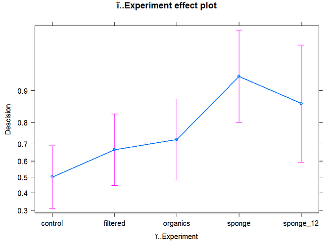
I'm having trouble interpreting the output of an allEffects plot (see below).
I thought the Y axis represented the 'probability of making a decision' but the Y axis is not spaced evenly which is confusing me.
The glm run was between a dependent binary variable 'Decision' (either 1 or 0), independent 'experiment' variable (factors), accounting for individual 'subject'.
glm5 <- glmer(Descision ~ ï..Experiment + (1 | subject), family = binomial, data = no_decision_df)
summary(glm5)
plot(allEffects(glm5))
