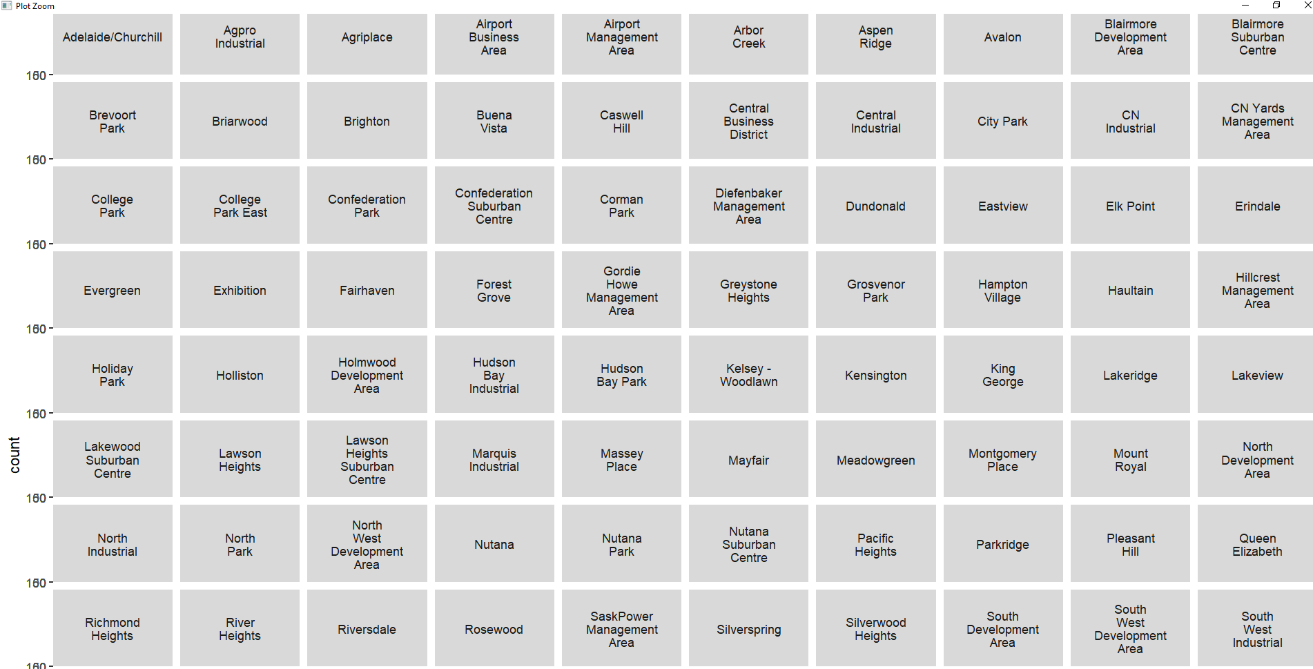
I have a number of neighbourhoods, each of which should have two columns - one for 2023 and then a five year average. Does anyone know how to "expand" each of the y-axises so the chart actually shows up? It's a geom_col with facet_wrap with neighbourhood and ncol of 10.
With no sample data, this is my best guess: facet_wrap(~neighbourhood, scales = "free_y")
# package libraries
library(tidyverse)

# random sample data
set.seed(444)

# create a tibble of sample data
sample_data <- tibble(
  count = rnorm(n = 100, mean = 100, sd = 10),
  neighbourhood = sample(c(
    "Evergreen", "Rosewood", "Parkridge", "Lakeview", "Avalon", "Mayfair"
  ), size = 100,
  replace = TRUE),
  year = sample(seq(2018, 2023, 1), size = 100, replace = TRUE)
)

# plot
sample_data %>%
  group_by(neighbourhood, year) %>%
  summarize(count = mean(count)) %>%
  ggplot() +
  geom_col(
    mapping = aes(
      x = year,
      y = count
    )
  ) +
  # what about scales = "free_y"
  facet_wrap(~neighbourhood, scales = "free_y")
#> `summarise()` has grouped output by 'neighbourhood'. You can override using the
#> `.groups` argument.

Created on 2024-01-04 with reprex v2.0.2
Thank you, unfortunately no this didn't work. I believe I've tried this before. This is also in the Zoom panel if that makes a difference or not.

I think we need to see your code and some sample data. See
FAQ Asking Questions
A handy way to supply some sample data is the dput() function. In the case of a large dataset something like dput(head(mydata, 100)) should supply the data we need. Just do dput(mydata) where mydata is your data. Copy the output and paste it here between
```
```
1 Like
This topic was automatically closed 21 days after the last reply. New replies are no longer allowed.
If you have a query related to it or one of the replies, start a new topic and refer back with a link.