Hey guys,
I created a big series of bubble plots which just lacked the information of the date in the header, so I modified the code by splitting the time stamp that consisted date and time in one column into two with the separate function. So far so good, it works, but for some reason the whole appearance of all plots changed, especially the X-axis even though I changed nothing else in the code. I created a loop because it's 250+ plots:
for (i in unique(bubble_data2$relevant)){
  bubble_data_filter = subset(bubble_data2, relevant==i)
  bubble.plot=ggplot(bubble_data_filter, aes(x=Time, y=cpod, size = clx)) +
  geom_point(alpha=0.3, color = "blue") + ylab("CPOD ID") + scale_size(range = c(2, 12), name="Clicks (n)") +
    scale_x_discrete(guide = guide_axis(check.overlap = TRUE)) +
    labs(title = paste("Clicks per CPOD over time - Event: ", bubble_data_filter$relevant[1], " - Date: ", bubble_data_filter$Date,
                       "\nNet: ",bubble_data_filter$net_type,
                       " - Obs: ",bubble_data_filter$observation,
                       " - Boat: ", bubble_data_filter$boats,
                       " - Wind: ", paste(bubble_data_filter$wind_dir,bubble_data_filter$wind_for, sep = ""),
                       " - Sea state: ", bubble_data_filter$sea_state,
                       sep=""))

ggsave(paste("bubble_plot_",bubble_data_filter$relevant[1],".png",sep=""),
       plot=bubble.plot,
       width = 20, height = 20, dpi = 300, units = "cm",)
print(paste("last event processed: ", bubble_data_filter$relevant[1]))
}
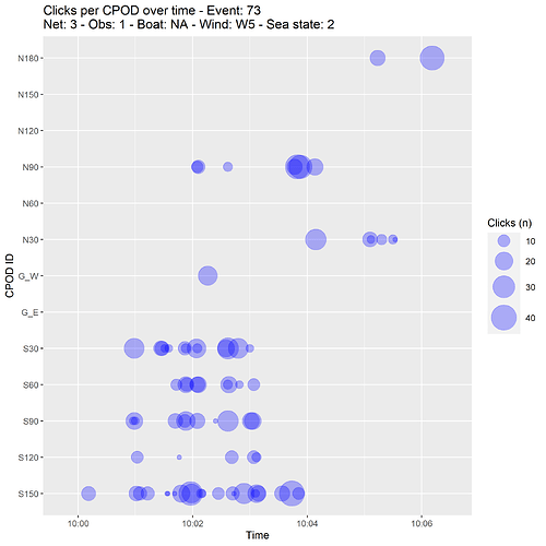
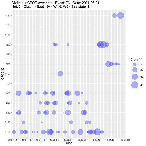
Just an example for one plot who it looked before and after the date was added. I just added the scale_x_discrete as well because there were overlapping labels.
That's how the plot looked before (wihtout the date in the header)
And that's how it looks now. So the information on the X-axis is the same, but the resolution is totalle different.
The only thing I added before the plot code that is new is this:
bubble_data2 = bubble_data %>%
  separate(Time, into = c('Date', 'Time'), sep = " ")
Maybe you guys know the issue. Thanks!

