AC3112
July 19, 2022, 5:47pm
1
Hi All,
I have a dichotomised variable, which I have split into two variables in an endeavour to show the distribution of zeros and ones with this dichotomised variable.
I've been mildly successful. Yet, the graph I've produced has 0.0, 0.5, 1.0 as tick marks on the x-axis, when I simply want 0-1 as tick marks.
Thus far, I've tried establishing 'limits' 'breaks' and all kinds of customisation on the x-axis, yet with very limited success.
I've tried to upload some data and my code for a a reproducible example. Would appreciate if anyone could help me amend the issue.
The data is unequal length, so I've used 'melt' to combine 0-1s.
C1
  [1] 1 1 1 1 1 1 1 1 1 1 1 1 1 1 1 1 1 1 1 1 1 1 1 1 1 1 1 1 1 1 1 1 1 1 1 1 1 1 1 1 1 1 1 1 1 1 1 1 1 1 1 1 1 1 1 1 1 1 1 1 1
 [62] 1 1 1 1 1 1 1 1 1

C11
  [1] 0 0 0 0 0 0 0 0 0 0 0 0 0 0 0 0 0 0 0 0 0 0 0 0 0 0 0 0 0 0 0 0 0 0 0 0 0 0 0 0 0 0 0 0 0 0 0 0 0 0 0 0 0 0 0 0 0 0 0 0 0

maxlength = max(length(C1), length(C11))
CELL1 = c(C1, rep(NA, maxlength - length(C1)))
CELL11 = c(C11, rep(NA, maxlength - length(C11)))
CELL1 <- as.numeric(CELL1)
CELL11 <- as.numeric(CELL11)
CELL111 <- data.frame(CELL1, CELL11)
CELL111 <- melt(CELL111)

CC1 <- ggplot(CELL111, aes(x=value, fill=variable)) +
  geom_histogram(binwidth = 0.5, bins = 2) +
  theme_classic() +
  labs(title = "Cell 3 \n (Cluster 1)") +
  theme(legend.position = "none", plot.title = element_text(hjust = 0.5, size = 11, face = "bold"),
        axis.text = element_text(size = 11)) +
  xlab("mRs") +
  scale_fill_manual(values = c("#80B1D3", "#FB8072"))
Would appreciate any help here
FJCC
July 19, 2022, 6:06pm
2
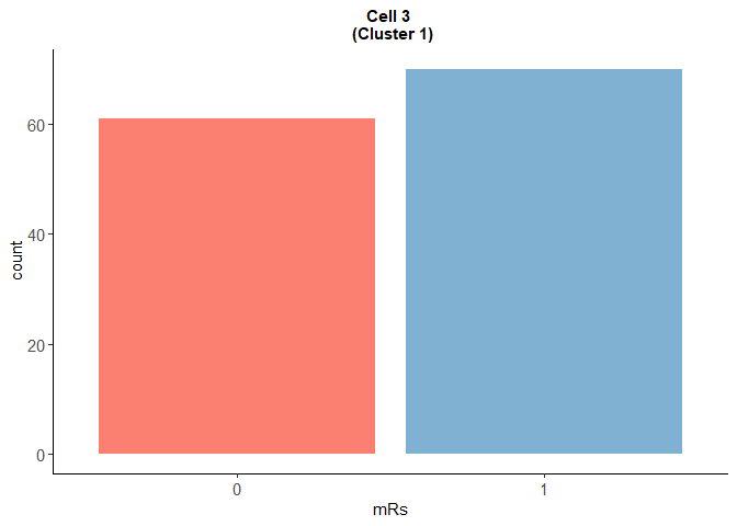
Does this get you the kind of plot you want?
library(tidyverse)
#> Warning: package 'tibble' was built under R version 4.1.2
C1 <- rep(1,70)

C11 <- rep(0,61)

maxlength = max(length(C1), length(C11))
CELL1 = c(C1, rep(NA, maxlength - length(C1)))
CELL11 = c(C11, rep(NA, maxlength - length(C11)))
CELL1 <- as.numeric(CELL1)
CELL11 <- as.numeric(CELL11)
CELL111 <- data.frame(CELL1, CELL11)
CELL111 <- reshape2::melt(CELL111)
#> No id variables; using all as measure variables

# CC1 <- ggplot(CELL111, aes(x=value, fill=variable)) +
#   geom_histogram(binwidth = 0.5, bins = 2) +
#   theme_classic() +
#   labs(title = "Cell 3 \n (Cluster 1)") +
#   theme(legend.position = "none", plot.title = element_text(hjust = 0.5, size = 11, face = "bold"),
#         axis.text = element_text(size = 11)) +
#   xlab("mRs") +
#   scale_fill_manual(values = c("#80B1D3", "#FB8072"))

CELL111 |> mutate(value = as.character(value)) |>
  filter(value != "NA") |>
ggplot(aes(x=value,fill=variable)) + geom_bar() +
  theme_classic() +
  labs(title = "Cell 3 \n (Cluster 1)") +
  theme(legend.position = "none", plot.title = element_text(hjust = 0.5, size = 11, face = "bold"),
        axis.text = element_text(size = 11)) +
  xlab("mRs") +
  scale_fill_manual(values = c("#80B1D3", "#FB8072"))
Created on 2022-07-19 by the reprex package (v2.0.1)
AC3112
July 19, 2022, 8:03pm
3
Thank you @FJCC . Very much appreciated
system
July 26, 2022, 8:04pm
4
This topic was automatically closed 7 days after the last reply. New replies are no longer allowed.