Hello R-Community,
this is my first post and I try to be as precise as possible. Please don´t bother to ask for more information. ![]()
This is the case:
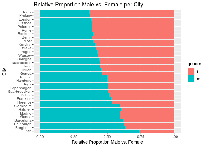
I got some aggregated data, containing city names, people per city, and share of females per city. I´d like to create a barplot, displaying the proportion of males and females per city. Also I´d like to have the share of females per city displayed in descending order.
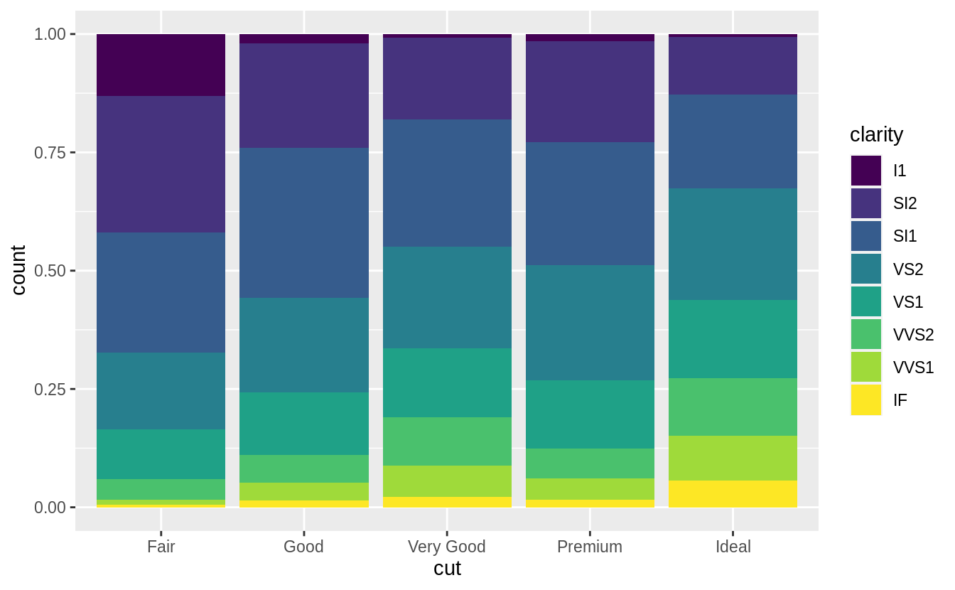
The result should look something like this: (Picture taken form Hadley Wickhams - R for Data Science)
I figured, using the position = "fill" command would be a good idea. This is how far i got:
Creating and mutating the data:
library(tidyverse)

City <- c("Barcelona", "Bari", "Bologna", "Borgholm", "Duesseldorf", "Dublin", "Edinburgh", "Florence", "Frankfurt", "Genoa",
          "Hamburg", "Karvina", "Krakow", "Milan", "Most", "Ostrava", "Palermo", "Prague", "Rome", "Saarbruecken", "Stockholm",
          "Teplice", "Turin", "Warsaw", "Bochum", "London", "Berlin", "Paris", "Lissboa", "Vienna", "Copenhagen", "Helsinki",
          "Riga", "Madrid")

People <- c(472, 60, 657, 90, 389, 49, 120, 269, 763, 131, 60, 120, 78, 70, 202, 128, 184, 93, 120, 250, 79, 105, 101, 412,
            102, 87, 99, 69, 410, 312, 210, 100, 65, 79)

Share_of_Females <- c(0.3827029, 0.2649492, 0.5627421, 0.3717596, 0.5583374, 0.4967123, 0.3787804, 0.4668641, 0.4715904, 0.5424107,
                      0.4986961, 0.5938898, 0.6258508, 0.5458969, 0.6113255, 0.5897642, 0.6166618, 0.5848115, 0.6146192, 0.4975600,
                      0.4061146, 0.5035726, 0.5511435, 0.5651329, 0.6123814, 0.6213054, 0.6113255, 0.6315025, 0.6166618,
                      0.4011456, 0.4975600, 0.4013462, 0.4975600, 0.4011456)


df <- data.frame(City, People, Share_of_Females)

df <- mutate(df,
             Share_of_Males = 1 - Share_of_Females,
             males = round(People * Share_of_Males),
             females = round(People * Share_of_Females))
Since this data is aggregated, I wanted to get a new data.frame, where males and females are displayed in one column by gender.
mcity <- data.frame(City = df$City, gender = "m", n = df$males, People = df$People, share = df$Share_of_Males)
fcity <- data.frame(City = df$City, gender = "f", n = df$females, People = df$People, share = df$Share_of_Females)

df.plot <- rbind(mcity, fcity)

df.plot %>%
  ggplot() +
  geom_bar(mapping = aes(x = City, y = n , fill = gender), stat = "identity", position = "fill") +
  labs(x = "City",
       y = "Relative Proportion Male vs. Female",
       title = "Relative Proportion Male vs. Female per City") +
  coord_flip()
Do you have any ideas on how I can display the share of females per city in descending order?
Thanks a lot in advance!