An isochronous map shows how far people can travel from a specific location within set time intervals, helping us visualize real-world accessibility, not just by distance, but by time. Unlike static maps that follow administrative boundaries, isochronous maps account for roads, terrain, and mode of transport, offering a more honest picture of reachability.
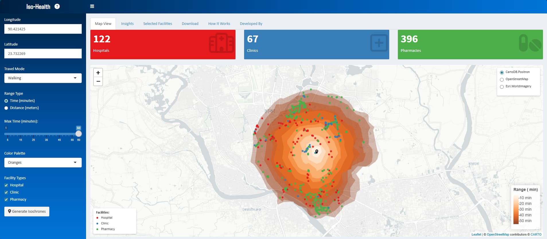
I’ve been working on Iso-Health, a geospatial application built in R Shiny that leverages open data and open-source tools to map access to healthcare facilities across the world. The application dynamically generates travel catchments based on walking, cycling, or driving times from any chosen location. It identifies which hospitals, clinics, and pharmacies fall within those zones, calculates average and nearest travel times, and displays the results on an interactive map.
The idea behind Iso-Health is simple but powerful: to bridge the gap between spatial data and health system decision-making. In many parts of the world, people’s ability to reach healthcare is shaped not just by distance, but by infrastructure, transport availability, and terrain. By visualizing these realities, we can inform better planning, identify underserved areas, and move one step closer to more equitable health access for all.