"William" in the Northeast ggplot Help

Hi,

I'm using the SSA database to analyze the name "William."
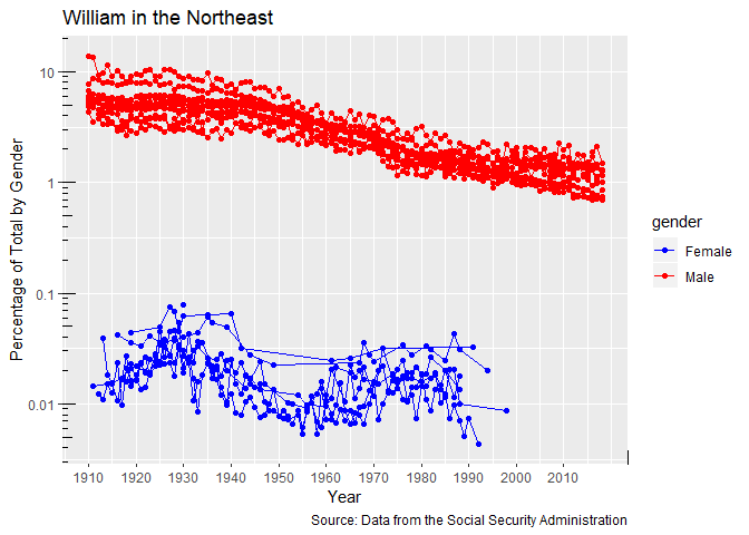
I created a graph for William in the Northeast by gender, but the results are displayed by gender and aggregate. I would like a line for each state within the same graph. For example, one line for New York, one line for Vermont, etc. and not just overall males and females named William in the Northeast.
How should I adjust my code?
I'm new to R so any help is appreciated.

SSA_state.df <- read.delim("https://www.laits.utexas.edu/~mr56267/TLAH_Names_2020/Textbook/SSA_state_level.txt",
                           stringsAsFactors = FALSE)

library(dplyr)
library(scales)
library(ggplot2)

sequence_of_years <- seq(from = 1880, to = 2018, by = 10)

William_state.df <- SSA_state.df[which(SSA_state.df$name=="William"),]

William_NE.df <- William_state.df[which(William_state.df$state=="ME"|
                                          William_state.df$state=="MA"|
                                          William_state.df$state=="RI"|
                                          William_state.df$state=="CT"|
                                          William_state.df$state=="NH"|
                                          William_state.df$state=="VT"|
                                          William_state.df$state=="NY"|
                                          William_state.df$state=="PA"|
                                          William_state.df$state=="NJ"|
                                          William_state.df$state=="DE"|
                                          William_state.df$state=="MD"),]

ggplot(data = William_NE.df, aes(x = year,y = perc, color=gender, group=interaction(state,gender))) + 
  geom_point() +
  labs(title="William in the Northeast", x = "Year", 
       y="Percentage of Total by Gender",
       caption="Source: Data from the Social Security Administration") +
  scale_x_continuous(breaks = sequence_of_years) +
  scale_color_manual(labels= c("Female","Male"), values = c("blue","red"))+
  scale_y_log10(labels=prettyNum) +
  annotation_logticks()
seems like a rather large text file to read in.
You will likely get better support on your charting question, by skipping to your best prepared data William_NE.df and providing us a textual representation of that.
the dput() function is available for this. best of luck :slight_smile:

I think you just need to add + geom_line() to your code which makes the plot. It's not pretty but it adds lines for each state/gender combo. I've also improved your code a bit below to help you learn some tricks - you don't need all those or statements, you can just use %in%

library(readr)
SSA_state.df <- read_delim("https://www.laits.utexas.edu/~mr56267/TLAH_Names_2020/Textbook/SSA_state_level.txt",
                           delim="\t",
                           col_types = cols(
                             state = col_character(),
                             gender = col_character(),
                             year = col_integer(),
                             name = col_character(),
                             count = col_integer(),
                             total = col_integer(),
                             perc = col_double(),
                             state_name = col_character()
                           ))

library(dplyr)
#> 
#> Attaching package: 'dplyr'
#> The following objects are masked from 'package:stats':
#> 
#>     filter, lag
#> The following objects are masked from 'package:base':
#> 
#>     intersect, setdiff, setequal, union
library(scales)
#> 
#> Attaching package: 'scales'
#> The following object is masked from 'package:readr':
#> 
#>     col_factor
library(ggplot2)
library(magrittr)

sequence_of_years <- seq(from = 1880, to = 2018, by = 10)

William_state.df <- SSA_state.df %>%
  filter(name=="William")

William_NE.df <- William_state.df %>%
  filter(state %in% 
           c("ME", "MA", "RI", "CT", "NH", "VT", "NY", "PA", "NJ", "DE", "MD"))
  

ggplot(data = William_NE.df, aes(x = year,y = perc, color=gender, 
                                 group=interaction(state,gender))) + 
  geom_point() +
  geom_line() +
  labs(title="William in the Northeast", x = "Year", 
       y="Percentage of Total by Gender",
       caption="Source: Data from the Social Security Administration") +
  scale_x_continuous(breaks = sequence_of_years) +
  scale_color_manual(labels= c("Female","Male"), values = c("blue","red"))+
  scale_y_log10(labels=prettyNum) +
  annotation_logticks()

Created on 2020-02-26 by the reprex package (v0.3.0)

1 Like

Thank you so much!
Is there anyway to add a legend and different colors for different states to the graph? So a legend for states and corresponding colors like green for Vermont, black for New York, etc.
Thanks for your help again.

You need to change that the argument for color is state. Something like this:

ggplot(data = William_NE.df, aes(x = year,y = perc, color=state, 
                                 group=interaction(state,gender))) + 
  geom_point() +
  geom_line() +
  labs(title="William in the Northeast", x = "Year", 
       y="Percentage of Total by Gender",
       caption="Source: Data from the Social Security Administration") +
  scale_x_continuous(breaks = sequence_of_years) +
  scale_y_log10(labels=prettyNum) +
  annotation_logticks()

Thanks for your help! It works!

If your question's been answered (even if by you), would you mind choosing a solution? (See FAQ below for how).

Having questions checked as resolved makes it a bit easier to navigate the site visually and see which threads still need help.

Thanks

This topic was automatically closed 7 days after the last reply. New replies are no longer allowed.