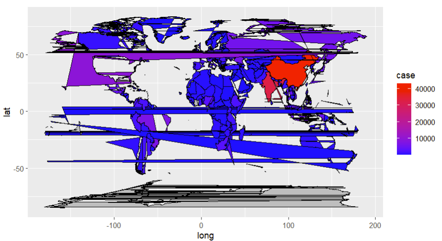
I first downloaded the world map using the maps package. After changing the names of some countries, I combined the longitude and latitude of the map and my data. The following is my code:
p.i<-ggplot(df.map.i,aes(x=long,y=lat,group=location_name))+ geom_polygon(aes(fill=case),color="black")+ coord_fixed(1.3)
Try grouping by the group variable of world_map:
geom_polygon(aes(fill=case, group = group),color="black")+
I got it! THANK YOU!!!
This topic was automatically closed 90 days after the last reply. New replies are no longer allowed. If you have a query related to it or one of the replies, start a new topic and refer back with a link.