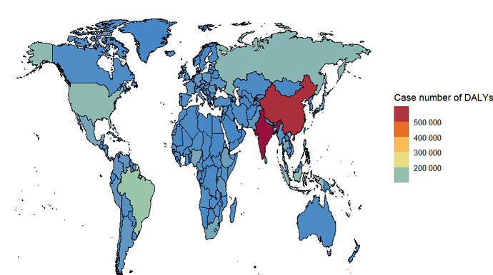
I draw a map and I set the colors and breaks to show rhe size of the value. But I find that the colors in map do not match the color show in the legend. (Please compare the 5 colors on the map, in the code and in the legend.) Why?
p.d<-ggplot(df.map.d,aes(x=long,y=lat,group=group))+
  geom_polygon(aes(fill=case),color="black",linewidth=0.2)+

  labs(fill="Case number of DALYs")+
  coord_cartesian(ylim = c(-50, 90))+

  scale_fill_gradientn(colors = c("#3288BD", "#ABDDA4", "#FEE08B", "#F46D43","#9E0142"),
                       breaks = c(200000,300000,400000,500000),
                       guide = guide_colorsteps(),
                       na.value = NA,
                       labels = scales::label_number())
