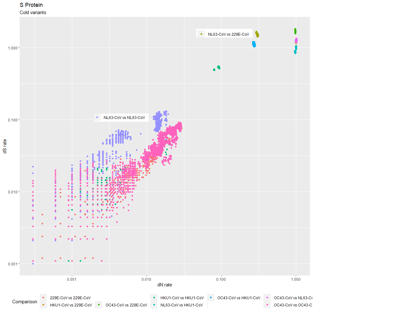
Hi!
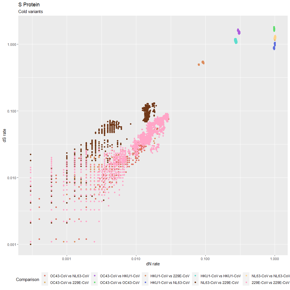
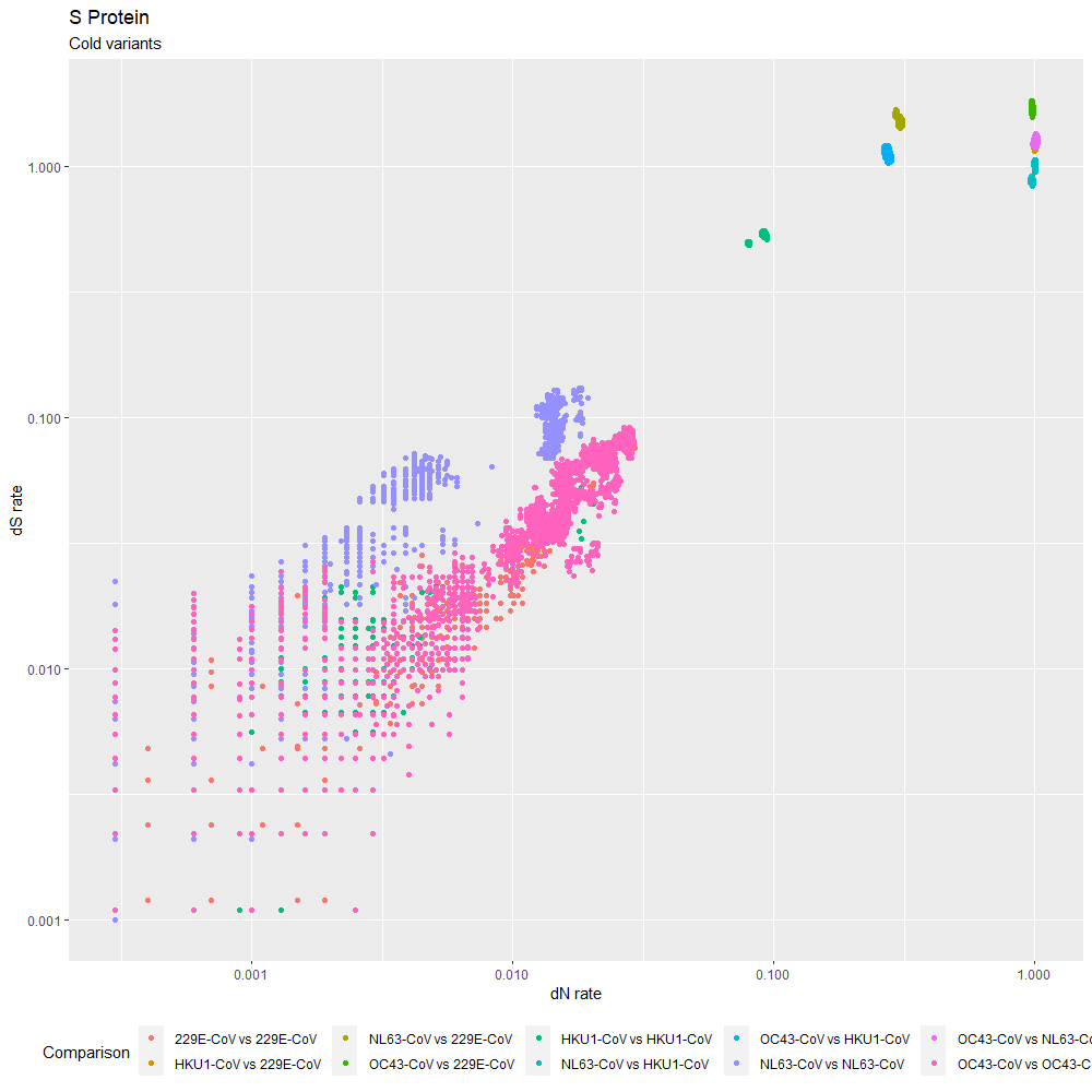
I´m plotting my data frame (9 columns and 264.000 rows ≈):
ID1	         ID2	     dN	         dS	         Omega     Label_ID1    Label_ID2	Group
ABD75601 	 ABD75577 	 0.0003 	 0.0022 	 0.1428 	 HKU1-CoV 	 HKU1-CoV 	 Intra
ABD75601 	 ABD75585 	 0.0003 	 0.0011 	 0.2859 	 HKU1-CoV 	 HKU1-CoV 	 Intra
ABD75601 	 ABD75593 	 0.0006 	 0.0022 	 0.2858 	 HKU1-CoV 	 HKU1-CoV 	 Intra
ABD75609 	 NP_073551 	 1.0011 	 1.2589 	 0.7952 	 HKU1-CoV 	 229E-CoV 	 Inter
ABD75609 	 QJY77946 	 1.0025 	 1.1785 	 0.8507 	 HKU1-CoV 	 229E-CoV 	 Inter
My script for plot this:
df_S_Cold %>%
  ggplot(aes(x = dN, y = dS)) +
  geom_point(aes(color = Label_ID2), size = 2, alpha=0.5) +
  scale_y_continuous(trans='log10') +
  scale_x_continuous(trans='log10') +
  labs(title = "S Protein",
       subtitle = "Cold variants",
       x = "dN rate",
       y = "dS rate",
       color = "Comparison") +
  scale_color_manual(labels=c(
    "OC43-CoV vs NL63-CoV",
    "OC43-CoV vs 229E-CoV",
    "OC43-CoV vs HKU1-CoV",
    "OC43-CoV vs OC43-CoV",
    "HKU1-CoV vs 229E-CoV",
    "HKU1-CoV vs NL63-CoV",
    "HKU1-CoV vs HKU1-CoV",
    "NL63-CoV vs 229E-CoV",
    "NL63-CoV vs NL63-CoV",
    "229E-CoV vs 229E-CoV"),
    values=c(
      "#dd6d5d", # Red
      "#ddad5d", # Yellow
      "#ad5ddd", # Purple
      "#5ddd6d", # Green
      "#dd8d5d", # Orange
      "#5d6ddd", # Blue
      "#5dddcd", # Light blue
      "#703818", # Brown
      "#ffd38b", # Light Yellow and Pink
      "#ffa5c7")) +
  theme_gray() +
  theme(axis.title = element_text()) +
  theme(legend.position = "bottom")
This result in this plot:
My question is: Why only there are 4 comparisons, when must there 10?
Is there an explanation for that?
Any suggestion or comment on the possible problem?
Thank!