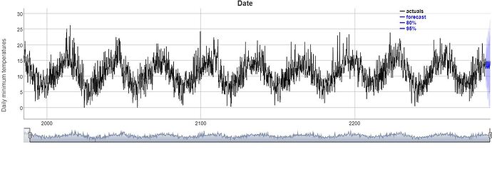
why is it showing wrong date format and I tried to aggregate the data but it did not work.
aggregate(. ~date,data=data,fun=sum)
library(shiny)
library(plotly)
library(dygraphs)
library(forecast)
library(tseries)
library(dplyr)

ui<-fluidPage(
fluidRow(dygraphOutput("forecast")))
dt1<-read.csv("C:/Users/dell/Downloads/archive (3)/daily-minimum-temperatures-in-me.csv")

server<-function(input,output,session){
  output$forecast <- renderDygraph({
  interval_value_formatter <- "function(num, opts, seriesName, g, row, col) {
  value = g.getValue(row, col);
  if(value[0] != value[2]) {
    lower = Dygraph.numberValueFormatter(value[0], opts);
    upper = Dygraph.numberValueFormatter(value[2], opts);
    return '[' + lower + ', ' + upper + ']';
  } else {
    return Dygraph.numberValueFormatter(num, opts);
  }
}"
  timeseies1<-ts(as.numeric(dt1$Daily.minimum.temperatures),start = c(1981,1),frequency = 12)

  timeseies1 %>%
  stlf(timeseies1, h = 36) %>%
  {cbind(actuals=.$x, forecast_mean=.$mean,
        lower_95=.$lower[,"95%"], upper_95=.$upper[,"95%"],
        lower_80=.$lower[,"80%"], upper_80=.$upper[,"80%"])} %>%
  dygraph(main="Date", ylab = "Daily minimum temperatures") %>%
  dyAxis("y", valueFormatter = interval_value_formatter) %>%
  dySeries("actuals", color = "black") %>%
  dySeries("forecast_mean", color = "blue", label = "forecast") %>%
  dySeries(c("lower_80", "forecast_mean", "upper_80"),
           label = "80%", color = "blue") %>%
  dySeries(c("lower_95", "forecast_mean", "upper_95"),
           label = "95%", color = "blue") %>%
  dyLegend(labelsSeparateLines=TRUE) %>%
  dyRangeSelector() %>%
  dyUnzoom() %>%
  dyCrosshair(direction = "vertical") %>%
  dyOptions(digitsAfterDecimal = 1) %>%
  dyCSS(textConnection(".dygraph-legend {background-color: rgba(255, 255, 255, 0.5) !important; }"))

})
}
shinyApp(ui,server)
could any one please tell me why is it happening and how could i rectify this issue.
