Hi. I am a very beginner of Rtools. I imported a csv file into Rstudio and tried to visualize some data. But my code is not working. Please check it for me. Is it the problem of my code or the csv file? Thank you so much!
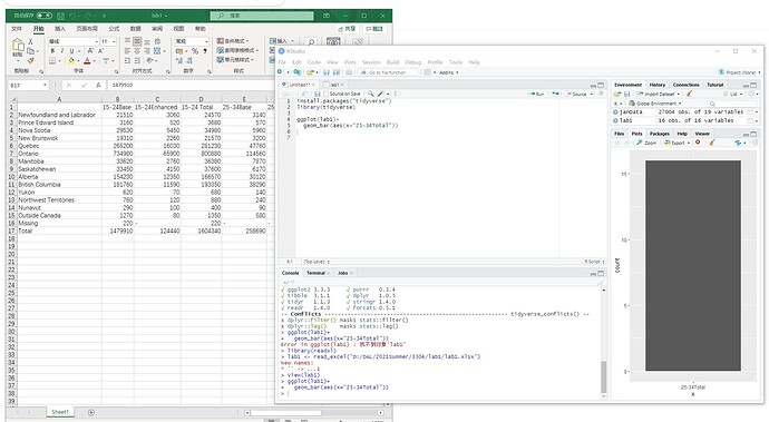
I can see a plot in the bottom right corner, Can you explain why you think your code doesn't work or what would be your desired output?
Also, please be aware that posting screenshots of your code is not very helpful and it is considered a bad practice here so, to help us help you, could you please prepare a reproducible example (reprex) illustrating your issue? Please have a look at this guide, to see how to create one:
Thank you for your response. I expect to plot the data on 25-34Total column. But it shows a dark rectangular without anything can reveal the data. Sorry I am a very beginner of this code. I don't really understand the reproducible example you mentioned.
You are plotting a bar graph for only one categorical variable thus you get one rectangle as tall as the count of rows (left axis), it is exactly the expected result for the code you have written.
Have you clicked on the link and read the guide? It is not that hard, read the guide and give it a try, even an unsuccessful try can be more useful than a screenshot.
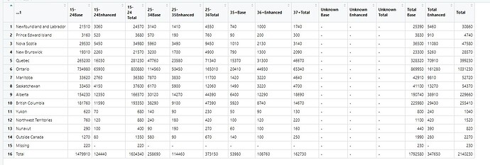
Thank you so much. I am trying to comprehend it. Then, could you tell me how to show the total number of each age group by bar chart. I would like to show the difference of each age group. Here is my entire table.
That is not a table it is a screenshot, I can't copy from that to give you an example. As I said before, please read the guide and try to provide a reproducible example or at least some sample data in a copy/paste friendly format (not a screenshot).
@Crasiky - Try running the command
dput(lab1)
and pasting the output of that into a reply on this forum. Paste the output between lines that consist of only three back ticks, like this
```
Your output here
```
It is not clear what part of the data you want to plot. Do you want all of the values in the row named Total, labeled using the column headers?
Thank you for response. I am looking for a bar chart to show the entire total column so that I can compare the total number of provinces
structure(list(...1 = c("Newfoundland and Labrador", "Prince Edward Island",
"Nova Scotia", "New Brunswick", "Quebec", "Ontario", "Manitoba",
"Saskatchewan", "Alberta", "British Columbia", "Yukon", "Northwest Territories",
"Nunavut", "Outside Canada", "Missing", "Total"), `15-24Base` = c(21510,
3160, 29530, 19310, 265200, 734980, 33620, 33450, 154230, 181760,
620, 760, 290, 1270, 220, 1479910), `15-24Enhanced` = c("3060",
"520", "5450", "2260", "16030", "65900", "2760", "4150", "12350",
"11590", "70", "120", "100", "80", "-", "124440"), `15-24 Total` = c(24570,
3680, 34980, 21570, 281230, 800880, 36380, 37600, 166570, 193350,
680, 880, 400, 1350, 220, 1604340), `25-34Base` = c("3140", "570",
"5960", "3200", "47760", "114560", "7870", "6170", "30120", "38290",
"140", "240", "90", "580", "-", "258690"), `25-35Enhanced` = c("1410",
"190", "3490", "1700", "23580", "50450", "3830", "5900", "14270",
"9100", "90", "180", "190", "90", "-", "114460"), `25-36Total` = c("4550",
"760", "9450", "4900", "71340", "165010", "11700", "12060", "44390",
"47390", "230", "420", "270", "670", "-", "373150"), `35+Base` = c("740",
"90", "1010", "790", "15370", "20410", "1420", "1490", "6400",
"5920", "50", "100", "60", "140", "-", "53980"), `36+Enhanced` = c("1000",
"200", "2130", "1300", "31300", "44930", "3220", "3220", "12290",
"8740", "90", "120", "100", "100", "-", "108760"), `37+Total` = c("1740",
"300", "3140", "2090", "46670", "65340", "4640", "4700", "18690",
"14670", "130", "220", "160", "250", "-", "162730"), `Unknown Base` = c("-",
"-", "-", "-", "-", "-", "-", "-", "-", "-", "-", "-", "-", "-",
"-", "-"), `Unknown Enhanced` = c("-", "-", "-", "-", "-", "-",
"-", "-", "-", "-", "-", "-", "-", "-", "-", "-"), `Unknown Total` = c("-",
"-", "-", "-", "-", "-", "-", "-", "-", "-", "-", "-", "-", "-",
"-", "-"), `Total Base` = c(25390, 3830, 36500, 23300, 328320,
869950, 42910, 41100, 190740, 225980, 800, 1100, 440, 1990, 230,
1792580), `Total Enhanced` = c("5460", "910", "11080", "5260",
"70910", "161280", "9810", "13270", "38910", "29430", "240",
"420", "390", "280", "-", "347650"), Total = c(30860, 4740, 47580,
28570, 399230, 1031230, 52720, 54370, 229660, 255410, 1040, 1520,
820, 2270, 230, 2140230)), row.names = c(NA, -16L), class = c("tbl_df",
"tbl", "data.frame"))
Is this what you mean?
library(tidyverse)
lab1 <- structure(list(...1 = c("Newfoundland and Labrador", "Prince Edward Island",
"Nova Scotia", "New Brunswick", "Quebec", "Ontario", "Manitoba",
"Saskatchewan", "Alberta", "British Columbia", "Yukon", "Northwest Territories",
"Nunavut", "Outside Canada", "Missing", "Total"), `15-24Base` = c(21510,
3160, 29530, 19310, 265200, 734980, 33620, 33450, 154230, 181760,
620, 760, 290, 1270, 220, 1479910), `15-24Enhanced` = c("3060",
"520", "5450", "2260", "16030", "65900", "2760", "4150", "12350",
"11590", "70", "120", "100", "80", "-", "124440"), `15-24 Total` = c(24570,
3680, 34980, 21570, 281230, 800880, 36380, 37600, 166570, 193350,
680, 880, 400, 1350, 220, 1604340), `25-34Base` = c("3140", "570",
"5960", "3200", "47760", "114560", "7870", "6170", "30120", "38290",
"140", "240", "90", "580", "-", "258690"), `25-35Enhanced` = c("1410",
"190", "3490", "1700", "23580", "50450", "3830", "5900", "14270",
"9100", "90", "180", "190", "90", "-", "114460"), `25-36Total` = c("4550",
"760", "9450", "4900", "71340", "165010", "11700", "12060", "44390",
"47390", "230", "420", "270", "670", "-", "373150"), `35+Base` = c("740",
"90", "1010", "790", "15370", "20410", "1420", "1490", "6400",
"5920", "50", "100", "60", "140", "-", "53980"), `36+Enhanced` = c("1000",
"200", "2130", "1300", "31300", "44930", "3220", "3220", "12290",
"8740", "90", "120", "100", "100", "-", "108760"), `37+Total` = c("1740",
"300", "3140", "2090", "46670", "65340", "4640", "4700", "18690",
"14670", "130", "220", "160", "250", "-", "162730"), `Unknown Base` = c("-",
"-", "-", "-", "-", "-", "-", "-", "-", "-", "-", "-", "-", "-",
"-", "-"), `Unknown Enhanced` = c("-", "-", "-", "-", "-", "-",
"-", "-", "-", "-", "-", "-", "-", "-", "-", "-"), `Unknown Total` = c("-",
"-", "-", "-", "-", "-", "-", "-", "-", "-", "-", "-", "-", "-",
"-", "-"), `Total Base` = c(25390, 3830, 36500, 23300, 328320,
869950, 42910, 41100, 190740, 225980, 800, 1100, 440, 1990, 230,
1792580), `Total Enhanced` = c("5460", "910", "11080", "5260",
"70910", "161280", "9810", "13270", "38910", "29430", "240",
"420", "390", "280", "-", "347650"), Total = c(30860, 4740, 47580,
28570, 399230, 1031230, 52720, 54370, 229660, 255410, 1040, 1520,
820, 2270, 230, 2140230)), row.names = c(NA, -16L), class = c("tbl_df",
"tbl", "data.frame"))
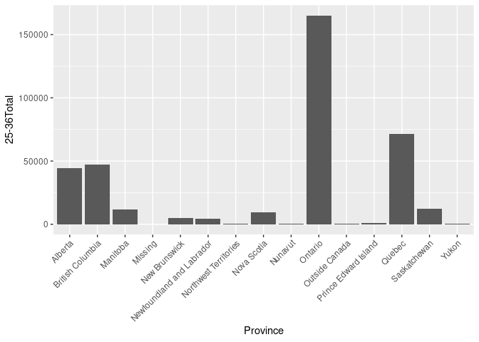
lab1 %>%
mutate(`25-36Total` = as.numeric(`25-36Total`)) %>%
filter(...1 != "Total") %>%
ggplot(aes(x = ...1, y = `25-36Total`)) +
geom_col() +
labs(x = "Province") +
theme(axis.text.x = element_text(angle = 45, hjust = 1, vjust = 1))

Created on 2021-05-09 by the reprex package (v2.0.0)
Yes! How did you get this ? I tried ggplot(lab1)+
geom_bar(mapping= aes(x="Total"))
but it only shows a dark rectangular
The code is included in my answer and is a reproducible example so it tells you exactly how I did it, take a look (you have to scroll down in the text box).
This topic was automatically closed 21 days after the last reply. New replies are no longer allowed.
If you have a query related to it or one of the replies, start a new topic and refer back with a link.

