Hi all,
I have general difficulty with unterstanding coloring data points in R:
- It is absolutely brilliant and understandable that attributes in the same script always get assigned the same color. However, if I execute the script again in another file, the plots again have the same colors. How can this be? Does R have an consistent algorithm here or a global overview of the coloring across different files?
- Does anyone have experience why a theme does not change the color of data points for certain graphics? No matter if I use
ggthemes(),ggthemr()orggtech(), all graphics of my whole Markdown are changed beautifully and consistently, except for the data points of the always same graphics. It is as if these were once set by R and protected.
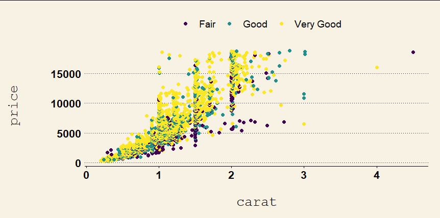
Does anyone know if I have a general thinking problem? As an example, I ran my code with the diamond dataset (see code and graphs below). I run different themes and the colors of the different sections always stayed the same. But with all other graphics like barplots etc. the colors of the fillings changed with the themes as it should be.
Does anyone knows how to change the colors of an attribute consistently?
Thank you a lot and have a nice weekend ![]()
library(tidyverse)
library(ggthemes)

data <- diamonds

data %>%
  select(carat, price, cut) %>%
  filter(cut == c("Fair", "Good", "Very Good")) %>%
  na.omit() %>%
  ggplot(aes(x = carat, y = price, color = cut)) +
  geom_point(size = 2) +
  theme_wsj() +
  scale_x_continuous(name = "\ncarat") +
  scale_y_continuous(name = "price\n\n") +
  theme(axis.text = element_text(size = 16),
        axis.title = element_text(size = 20),
        legend.title = element_blank(),
        legend.position = "top",
        legend.key.size = unit(1, 'cm'),
        legend.text = element_text(size=14))
With another theme:
library(tidyverse)
library(ggthemes)

data <- diamonds

data %>%
  select(carat, price, cut) %>%
  filter(cut == c("Fair", "Good", "Very Good")) %>%
  na.omit() %>%
  ggplot(aes(x = carat, y = price, color = cut)) +
  geom_point(size = 2) +
  theme_classic() +
  scale_x_continuous(name = "\ncarat") +
  scale_y_continuous(name = "price\n\n") +
  theme(axis.text = element_text(size = 16),
        axis.title = element_text(size = 20),
        legend.title = element_blank(),
        legend.position = "top",
        legend.key.size = unit(1, 'cm'),
        legend.text = element_text(size=14))
-> the result will have the same colors as above
Unfortunately I can just show one graph because I am a new user ![]()

