Why do these numbers appear on the y-axis on my plot?

Why do these numbers appear on the y-axis and not from 0 to 1?

EDIT:
This is my code and my df:

df %>%
  ggplot(aes(x = fecha, y= ..count.., fill= tipo_fecha)) +
  geom_density(alpha = 0.2) +
  labs(x = "Tiempo",
       y = "Densidad",
       title = "Distribución de fecha informe")

head(df, 15)

# A tibble: 15 × 2
   tipo_fecha      fecha              
   <chr>           <dttm>             
 1 fecha_informe_1 2015-08-04 00:00:00
 2 fecha_informe_2 2021-06-11 00:00:00
 3 fecha_informe_3 2022-12-14 00:00:00
 4 fecha_informe_4 NA                 
 5 fecha_informe_5 NA                 
 6 fecha_informe_6 NA                 
 7 fecha_informe_1 2015-08-11 00:00:00
 8 fecha_informe_2 2021-05-12 00:00:00
 9 fecha_informe_3 NA                 
10 fecha_informe_4 NA                 
11 fecha_informe_5 NA                 
12 fecha_informe_6 NA                 
13 fecha_informe_1 2015-08-11 00:00:00
14 fecha_informe_2 

They would seem to be years; and they might be expected if your x axis is a date field with many dates over a many year period.

Hi Nir, it appears you were the victim of a "binary flip", as we call them in my family (who regularly say "left" for "right", "up" for "down", etc.).

@juandmaz: You didn't supply any code, but I assume you're using the geom_density() function, which supply counts on the y-axis by default:

library(ggplot2)
ggplot(diamonds, aes(carat)) +
  geom_density()

Here is how you can have it supply values between 0 and 1:


ggplot(diamonds, aes(carat)) +
  geom_density(aes(y = after_stat(scaled)))

Created on 2024-03-25 with reprex v2.0.2

You may want to look at Change Formatting of Numbers of ggplot2 Plot Axis in R

my apologies; you are correct; I made a fault attributable to lack of coffee in the morning; I'm hopeful this will be patched in a future version of R.

1 Like

Hi, yes sorry I forgot to put my code. I edited the post and just in case I also put my df.

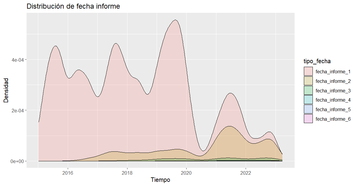
Just to finish understanding, in the first graph you posted, what does the y-axis represent?
And in the second graph it shows what percentage of the total represents each value of the x-axis?

Hi Juan,

I guess the better question is what do you want the y-axis values to be?

You have a few choices: The ..count.. value you used for y in your code gives you something like a smoothed histogram, so the height in any very small region corresponds roughly to the number of values in that region. The current syntax for that choice is y = after_stats(count).

If you wanted the maximum of the curve to be at y = 1, then you would use after_stat(scaled), and if you wanted the area under the curve to be 1, then you would use the default value, which is after_stat(density).

This topic was automatically closed 7 days after the last reply. New replies are no longer allowed.

If you have a query related to it or one of the replies, start a new topic and refer back with a link.