Why can't I use " $ " in allocating x = value and y = value. Creating a geom_boxplot with columns flightnumber, daymonth,time_difference, and status.

Hi there...

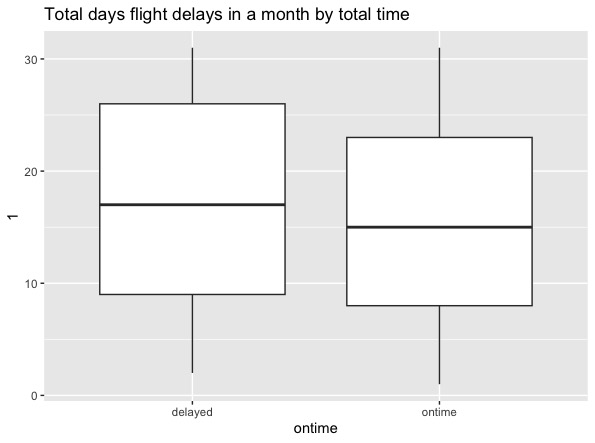
I need to plot the box plot to understand how many days in a month flights are delayed by what time.

1)How can I show time in the graph?
2)How can I improve the graph with better code?
3) Why can't I use the symbol $ during specify x = days_boxplot_df$status , y = days_boxplot_df$daymonth ?

Q9

dput(head(days_boxplot_df))
structure(list(flightnumber = c(5935, 6155, 7208, 7215, 7792,
7800), daymonth = c(1, 1, 1, 1, 1, 1), time_difference = structure(c(0,
0, 0, -6, -4, -1), class = "difftime", units = "mins"), status = c("ontime",
"ontime", "ontime", "ontime", "ontime", "ontime")), row.names = c(NA,
6L), class = "data.frame")

class(days_boxplot_df$daymonth)
[1] "numeric"

class(days_boxplot_df$time_difference)
[1] "difftime"

class(days_boxplot_df$status)
[1] "character"

box_plot <- ggplot(days_boxplot_df,aes(days_boxplot_df$status,days_boxplot_df$daymonth))

box_plot + geom_boxplot() + labs( x = days_boxplot_df$status , y = days_boxplot_df$daymonth )
Warning messages:
1: Use of days_boxplot_df$status is discouraged.
:information_source: Use status instead.
2: Use of days_boxplot_df$daymonth is discouraged.
:information_source: Use daymonth instead.

1)How can I show time in the graph?

What time? It is not clear to me what you are trying to show. Your code shows a boxplot representation of the days-of-the-month. Do you want to know if certain days-of-the-month are more common than others? I would use geom_freqpoly for that.

2)How can I improve the graph with better code?

With a better explanation of your goal, someone can probably help with this.

  1. Why can't I use the symbol $ during specify x = days_boxplot_df$status , y = days_boxplot_df$daymonth ?

ggplot is designed to use the bare column names. When you use days_boxplot_df as the first argument passed to ggplot() in this code

ggplot(days_boxplot_df, aes(days_boxplot_df$status,days_boxplot_df$daymonth))

you are telling the aes() function to look for column names in days_boxplot_df. Repeating days_boxplot_df in the aes() function is not necessary. Just write

ggplot(days_boxplot_df, aes(status, daymonth))

You should certainly not use the $ notation in the labs function. Each label should be a single string, like

 labs( x = "On time status" , y = "Day of Month")
1 Like

Hi there....

Time is the time_difference column in the graph. Apologies for the miscommunication. I want to show the time_difference in the graph.

Thank you FJCC. I shall get back to you after making the changes

Does this give you a better plot

 ggplot(days_boxplot_df,aes(x=time_difference , color = status)) + geom_freqpoly() +
   labs(x = "delay of departure", y = "Count")

Hi there..

I will try and let you know. Thank you.

This topic was automatically closed 21 days after the last reply. New replies are no longer allowed.

If you have a query related to it or one of the replies, start a new topic and refer back with a link.