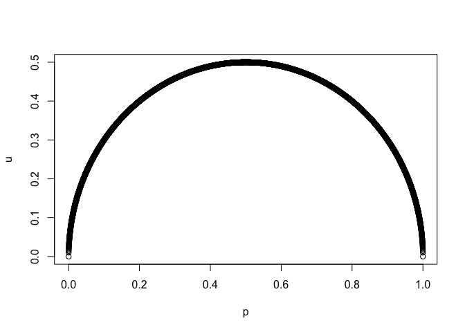
#rstats #statistics ...
p <- seq(0,1,.0001)
u <- sqrt(p*(1-p))
plot(p,u)

Created on 2019-05-15 by the reprex package (v0.2.1)
#rstats #statistics ...
p <- seq(0,1,.0001)
u <- sqrt(p*(1-p))
plot(p,u)

Created on 2019-05-15 by the reprex package (v0.2.1)
The equation of a circle is {(x-a)^2} + (y-b)^2=r^2. In this case, the equation is:
{(x-0.5)^2} + (y-0)^2=0.5^2
If you multiply out and collect x terms on one side and y terms on the other, you get:
y^2=x-x^2
y^2=x(1-x)
y=sqrt(x(1-x))
It is elementary geometry, yes. I am interested in how many statisticians knew/know that uncertainty over a Bernoulli trial relates to proportions in this way. Thanks for responding.
Interesting. I don't have an intuitive explanation and don't know whether the relationship to a circle is coincidental. Your example can be thought of as the probability of 0.5 successes in 1 trial (save for the missing binomial coefficient), which isn't meaningful for a discrete probability. However, if we proceed formally using the generalized binomial expansion, we can calculate what the "probability density" would be in an abstract, formal way.
Below is a function that calculates the generalized binomial probability for an equal number of successes and failures at a range of theta values (where theta is the probability of success in each trial). The function argument n is the number trials, which is 1 in your example, but would be an even number if we wanted only "real" probabilities.
# Return the probability of an equal number of successes and failures for any
# number of "trials", where the argument n is the number of trials. n can be
# any real number (it can even be a complex number in general, but the
# function isn't set up to work with complex numbers)
generalized.dbinom = function(n) {

  # The parameter for the success probability in the binomial distribution
  theta = seq(0,1,0.001)

  # The generalized binomial coefficient (see link above)
  binom.coef = gamma(n + 1)/(gamma(n/2 + 1)*gamma(n - n/2 + 1))

  # The product of the probability of success in all the trials
  prob = (theta*(1 - theta))^(n/2)

  # Return a data frame with the results
  data.frame(theta, prob=prob*binom.coef)
}
The code below plots the output of the function for your example, and for the real-world case of 1 success in 2 trials. The extra call to geom_line using dbinom is there just to show that the generalized binomial function gives the same result as dbinom in a standard discrete-probability case.
library(tidyverse)
theme_set(theme_classic())

ggplot(map_df(c(1,2) %>% set_names(./2), generalized.dbinom, .id="exponent"),
       aes(theta, prob)) +
  geom_hline(yintercept = 0.5, colour="grey70") +
  geom_line(data=tibble(theta=seq(0,1,0.01), prob=dbinom(1,2,theta)),
            linetype="12", size=1) +
  geom_line(aes(colour=exponent)) +
  scale_y_continuous(expand=expand_scale(mult=c(0,0.02)), breaks=seq(0,1,0.1)) +
  coord_equal()
The pattern of 0.5 being the mode and decreasing at the both end is quite intuitive, right? Obviously, the chance of equal numbers of success or failure is maximum when probabilities of success and failure are same at each trial, i.e. when p, the success probability, is 0.5. As deviation from that increases, obviously the chance decreases on both sides. Also, due to the symmetry of success and failure as one replaces p with (1 - p), the probability of equal number of success and failures decreases at the same rate on both sides of 0.5.
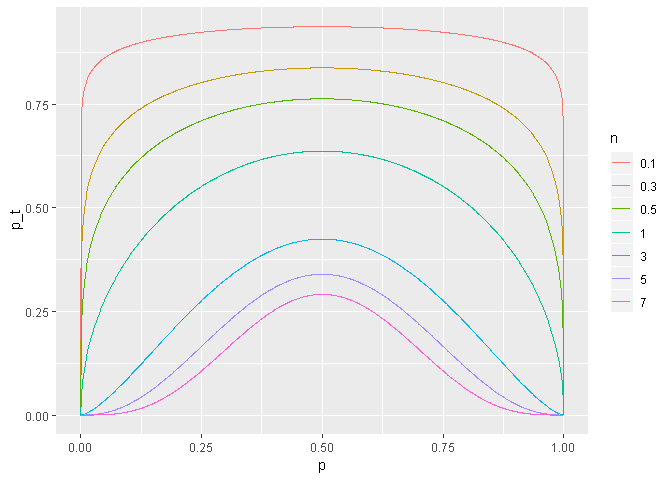
However, just as Joel has said, circular locus is not obvious to me. Indeed, as one changes n, the number of trials, which can be generalised to be considered as non-interger, it will change from circle to other form. Also, it need not be concave always. In some cases (which can be worked out considering the signs of the second derivatives of f(p) \propto (p(1-p))^{n/2}), it can be convex too.
library(ggplot2)
library(purrr)

# function to return probability of equal number of successes and failures
# in form a data frame for a series of success probabilities
g <- function(n)
{
  p <- seq(from = 0,
           to = 1,
           by = 0.001)
  inv_coef <- (n + 1) * beta(a = (1 + (n / 2)),
                             b = (1 + (n / 2)))
  prob <- ((p * (1 - p)) ^ (n / 2))
  p_t <- (prob / inv_coef)
  data.frame(p, p_t)
}

ggplot(data = map_df(.x = c(0.1, 0.3, 0.5, 1, 3, 5, 7) %>%
                       set_names(.),
                     .f = g,
                     .id = "n")) +
  geom_line(mapping = aes(x = p,
                          y = p_t,
                          colour = n))

This is actually quite beautiful. It is easy to see here that the distribution goes uniform (flat line) very quickly with increasing n.
This topic was automatically closed 7 days after the last reply. New replies are no longer allowed.
If you have a query related to it or one of the replies, start a new topic and refer back with a link.